There are pinks that arrive wearing glittery shoes, carrying a giant bow, and demanding to be the center of attention. Then there is Annie Sloan Antoinette: a soft, dusty, historically inspired pink that walks into a room, pours itself a civilized cup of tea, and quietly makes everything look better.
Although the original excitement around Antoinette described it as a brand-new Annie Sloan color, the shade has since become an established part of the Chalk Paint palette. Its staying power is easy to understand. Antoinette is not bubblegum pink, neon pink, or the kind of sugary pastel that immediately sends a room toward nursery territory. It is a muted pale pink with an earthy, grown-up character, inspired by decorative interiors and painted furnishings associated with 18th-century France. Annie Sloan describes the color as a soft pink with a natural quality rather than an overly sweet one.
In other words, this is pink for people who insist they are “not really pink people” right up until they see the finished dresser.
What Makes Annie Sloan Antoinette Different From Ordinary Pink?
The secret is restraint. Antoinette sits in that wonderfully flexible territory between blush, dusty rose, pale plaster, and soft French pink. Its muted quality prevents it from feeling juvenile, while its warmth keeps it from becoming icy or sterile.
Historically inspired colors often feel richer than straightforward modern pastels because they appear to contain a little earth, gray, brown, or another quieting influence. Annie Sloan connects Antoinette with 18th-century French decorative interiors, when red earth pigments mixed with white produced soft, dusky pinks for walls and furniture. That background gives the shade a sense of age and depth even on a freshly painted piece.
This is why Antoinette can behave almost like a neutral. Interior design publications have repeatedly demonstrated that pale and dusty pinks can work beyond children’s rooms, especially when paired with natural materials, aged metals, dark accents, muted greens, blues, warm whites, and earthy neutrals. Soft pink can be elegant, historic, modern, relaxed, or slightly eccentric depending on what surrounds it.
Why Antoinette Really Is a “Pink for Grown-Up Gals”
Calling a paint color “grown-up” does not mean it must be serious enough to file taxes. It means the color has complexity.
Antoinette does not rely on sweetness alone. Put it beside antique brass and it looks elegant. Pair it with charcoal and it becomes modern. Place it next to sage green and it feels botanical. Add aged wood and linen and suddenly you are somewhere between a French country house and the most charming vintage shop you have ever accidentally spent three hours in.
Design experts often pair pink with colors such as green, gray, blue, black, white, cream, and metallic finishes. Darker tones can give pale pink visual weight, while warm whites and natural textures keep it soft without making it precious. Brass and gold can add glamour; weathered wood can make the same pink feel rustic.
That versatility is exactly what separates a sophisticated muted pink from a one-note pastel.
Where Annie Sloan Antoinette Works Best
1. Vintage Dressers and Chests of Drawers
A vintage dresser may be the perfect canvas for Antoinette. The combination of a traditional furniture shape and unexpected soft pink creates immediate personality. Ornate drawer fronts, turned feet, carved details, and old hardware all benefit from the color’s subtle warmth.
For a refined result, keep the finish relatively smooth and pair it with brass, bronze, or dark metal hardware. For a more romantic French look, allow some brush texture and gently distress selected edges. The goal is not to attack the dresser with sandpaper until it looks as though it survived a small tornado. A little wear goes a long way.
2. Bedside Tables
A pair of Antoinette nightstands can introduce color without dominating a bedroom. Against warm white walls and neutral bedding, the pink becomes a quiet accent. Add dark lamps, natural linen, woven baskets, or an antique mirror to keep the palette layered and mature.
Soft pink is especially effective in bedrooms because it can create warmth without the visual heaviness of darker colors. Current decorating guidance also shows pale pink working successfully with navy, steely blue, gray, green, black, and natural wood.
3. Bathroom Vanities
Antoinette can turn an ordinary bathroom vanity into a custom-looking feature. Pair it with white tile for freshness, black hardware for contrast, or aged brass for a softer vintage mood.
Because bathrooms receive moisture and regular cleaning, however, the decorative finish and protective coating should be chosen for the specific surface and conditions. A beautiful color deserves a practical plan. Romance is wonderful; peeling paint around the sink is less poetic.
4. Accent Chairs, Benches, and Small Tables
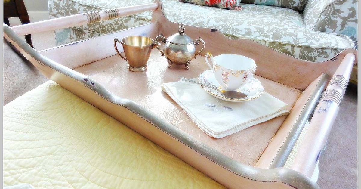
Not ready for a pink dresser? Start with something smaller. A wooden chair, plant stand, stool, side table, tray, or mirror frame provides enough surface area to appreciate Antoinette without asking the entire room to commit.
This approach is particularly useful in neutral interiors. One muted pink furniture piece can soften a room dominated by beige, cream, gray, or wood tones while still feeling intentional.
5. Walls and Larger Decorative Surfaces
Antoinette is not limited to tiny furniture projects. Annie Sloan has shown the shade used on walls, including in a hallway in her Normandy home. In larger applications, the color demonstrates just how architectural a dusty pink can become.
A pale pink wall can read almost like a warm neutral during the day, then become richer under evening light. As always, test the color in the actual room before committing to a large area. Natural light, artificial bulbs, flooring, nearby fabrics, and surrounding paint colors can all change how a pink appears.
The Best Colors to Pair With Antoinette
Antoinette and Warm White
This is the easiest combination. Warm white gives the pink breathing room while preserving its softness. Use white on walls, trim, upholstery, or nearby furniture for an airy result.
Antoinette and Sage or Olive Green
Muted green is one of the strongest companions for dusty pink because the colors balance one another naturally. The result can feel botanical, historic, and relaxed rather than sugary. Add real plants and natural fibers for extra depth.
Antoinette and Charcoal, Black, or Deep Gray
Dark accents are the fastest way to sharpen pale pink. Black frames, charcoal walls, dark hardware, or a black lamp can make Antoinette look surprisingly contemporary.
Antoinette and Blue
Dusty blue, steely blue, navy, and blue-gray can all work with muted pink. A deeper blue adds structure; a pale blue creates a softer, more romantic scheme. The combination is particularly effective when repeated through textiles or artwork rather than used as two isolated blocks of color.
Antoinette and Natural Wood
Leaving part of a furniture piece in natural wood is an excellent way to make pink feel grounded. Consider painting the base while retaining a wood top, or leaving drawer fronts natural while painting the frame.
The contrast between an organic wood grain and a matte muted pink can prevent a makeover from looking overly coordinated. It also respects beautiful original timber when you do not want to cover every square inch.
Antoinette and Metallic Accents
Brass and gold bring out Antoinette’s elegant side, while darker bronze or iron creates a more rustic effect. Interior design examples frequently use warm metallic accents with blush and dusty pink to add sophistication and contrast.
How to Paint Furniture With Annie Sloan Antoinette
Annie Sloan developed Chalk Paint in 1990 as a versatile decorative furniture paint, and the official product guidance emphasizes its ability to adhere to many surfaces with minimal preparation. Depending on the piece, surface condition, intended use, and desired finish, it can be applied to materials including wood, metal, laminate, concrete, and more.
Step 1: Start With a Clean, Sound Surface
“No sanding or priming” should never be translated as “paint directly over fifteen years of kitchen grease and hope for spiritual intervention.” Clean the piece carefully. Remove dust, waxy buildup, loose material, and anything that could interfere with adhesion.
Some challenging surfaces, stains, damaged finishes, or high-use applications may require additional preparation. Inspect the furniture rather than following a one-rule-fits-everything approach.
Step 2: Stir the Paint Thoroughly
Paint pigments and solids can settle, so mix the product well before starting. For a more textured finish, work with the paint at its natural consistency. For a smoother effect, some chalk-paint techniques involve adding a small amount of water and using controlled brushwork.
Step 3: Choose Your Finish Before You Paint
Antoinette can look completely different depending on technique.
- Smooth and tailored: Use controlled coats and minimize heavy brush texture.
- Rustic and expressive: Leave visible movement in the paint for a hand-finished appearance.
- Distressed: Reveal selected edges or an underlying color for an aged effect.
- Layered: Combine Antoinette with another shade to create depth.
- Decorative: Add stenciling, color blocking, or painted details.
Chalk-style paints are popular precisely because the final surface can range from polished to heavily textured. Layering and decorative techniques can transform an otherwise ordinary piece into something much more individual.
Step 4: Apply Additional Coats as Needed
Coverage varies with the original surface color, application method, paint consistency, and the effect you want. A dark piece being transformed into pale Antoinette may naturally need more attention than a light-colored surface.
Let each coat develop properly rather than repeatedly brushing a section that has begun to set. Overworking paint is one of the easiest ways to turn a pleasant Saturday project into an argument with a nightstand.
Step 5: Protect the Finish
A decorative chalk-painted surface generally needs an appropriate protective finish for durability. Annie Sloan offers wax and lacquer options for Chalk Paint projects, while furniture-finishing guidance from multiple home-improvement sources also emphasizes protecting chalk-style paint with a suitable topcoat.
Clear wax preserves the basic color while adding protection and subtle richness. Colored waxes can alter the visual effect, emphasizing texture, carvings, or age. Always follow the current instructions for the specific products and surface you are using.
How to Keep a Pink Furniture Makeover Sophisticated
The biggest fear surrounding pink furniture is that the result will feel too cute. Fortunately, this is largely a styling problem, not a pink problem.
First, vary the materials. Combine Antoinette with wood, linen, stone, woven fibers, leather, aged metal, or matte ceramics. A room becomes visually richer when every object does not share the same smooth, sweet personality.
Second, introduce contrast. A black lamp, dark painting frame, weathered tabletop, or deep green accessory can give pale pink enough tension to feel designed rather than decorated by a cupcake.
Third, avoid overmatching. You do not need pink curtains, pink cushions, pink flowers, pink candles, and a pink decorative flamingo simply because the dresser is pink. Let Antoinette be the star without hiring it an entire backup dance crew.
Finally, consider the room as a whole. Designers frequently use pale pink as a near-neutral and combine it with stronger colors, natural textures, and mixed levels of saturation. This broader palette is what allows a pastel to feel elegant rather than kitschy.
A 500-Word Experience: From “Absolutely Not Pink” to “Why Didn’t I Do This Sooner?”
Imagine the project: an old wooden dresser with a decent shape, questionable brown finish, and hardware that appears to have lost the will to live sometime around 1998. It is useful, sturdy, and completely forgettable. The original plan is safeperhaps white, cream, or gray.
Then Antoinette enters the conversation.
The first reaction is hesitation. Pink? On a full-size dresser? In an adult bedroom? There is an immediate mental picture of bubblegum, princess themes, and a room that looks as though Valentine’s Day has become a permanent legal requirement.
But the paint in the container tells a different story. Antoinette is quieter than expected. Against the wood, the color does not shout. It softens. The first coat looks imperfect, because first coats enjoy testing our emotional stability. Some of the darker original finish still influences the appearance, and the brush marks are more obvious than they will be later.
The temptation is to panic.
Do not panic.
As the project develops, the color begins to make sense. With fuller coverage, the brown furniture suddenly feels lighter and more intentional. Details that were nearly invisiblethe curve of a leg, the edge of a drawer, a small carved sectionbecome noticeable because the matte pink surface catches light differently.
Then comes the styling decision. Bright new hardware might make the piece look too polished, so aged brass is chosen instead. That one change transforms the personality of the dresser. The pink now feels less like a novelty and more like something that could have existed in an old European room for years.
A warm white wall behind it keeps the setting fresh. A dark-framed mirror adds contrast. A small green plant brings in an organic color. Suddenly the question is no longer, “Is this dresser too pink?” The question becomes, “Why does everything else in the room now look slightly boring?”
That is often the most surprising experience of using a muted statement color. Before the project, pink seems like the risky choice. Afterward, it is the beige furniture that begins looking suspicious.
The practical experience also teaches restraint. Distressing every corner would be too much, so only natural wear points receive attention. Decorative details do not need to be heavily emphasized. Antoinette already has enough character. The goal becomes supporting the color rather than burying it beneath techniques.
The finished piece changes throughout the day. Morning light makes the pink appear pale and airy. In warmer evening light, it becomes richer and cozier. Nearby colors matter too. A green branch makes it look earthier; black accessories make it sharper; cream textiles make it softer.
Most importantly, the project changes the way pink is understood. It stops being a category reserved for a particular age or decorating style and becomes simply another useful colorone with history, warmth, flexibility, and humor.
That may be Antoinette’s greatest trick. It persuades people who claim they dislike pink to live happily with a pink dresser, table, chair, or wall while continuing to insist, with complete sincerity, that they are “still not really into pink.”
Of course not. We believe you.
Final Thoughts: A Muted Pink With Serious Staying Power
Annie Sloan Antoinette proves that pink does not have to be loud, childish, trendy, or intimidating. Its dusty, historically inspired character gives it enough depth to work with vintage furniture, traditional rooms, cottage interiors, eclectic spaces, and even cleaner contemporary schemes.
The key is context. Pair Antoinette with natural wood for warmth, sage green for an earthy palette, navy or black for sophistication, warm white for freshness, or aged brass for a touch of old-world glamour. Choose the application technique and protective finish according to the piece and the way it will be used.
For anyone standing in front of a tired dresser wondering whether muted pink is too daring, Antoinette offers a reassuring answer: probably not. Sometimes the “grown-up” decorating choice is not another safe neutral. Sometimes it is the color that makes you smile every time you walk into the room.
Note: This article synthesizes real product guidance and decorating information from Annie Sloan, Better Homes & Gardens, Architectural Digest, House Beautiful, The Spruce, Real Simple, Martha Stewart, HGTV, Bob Vila, independent Annie Sloan retailers, and documented furniture-painting experiences. Product instructions can change, so current manufacturer guidance should be checked before beginning a specific project.