The all-white kitchen had a glorious run. It was bright, clean, photogenic, and about as subtle as a ring light at brunch. But design tastes evolve, and lately many homeowners and designers are trading icy whites and cool grays for something softer, warmer, and more lived-in. Enter the cashmere kitchen trend.
If the phrase sounds fancy, that is because it is supposed to. A cashmere kitchen is less about one exact paint swatch and more about a mood: warm neutrals, creamy taupes, soft putty tones, mellow mushroom shades, natural wood, lightly veined stone, and finishes that feel tailored rather than flashy. It is cozy without being rustic, elegant without being stiff, and polished without trying to win an argument on social media.
Designers love this look because it solves a problem many modern kitchens have had for years. They are beautiful in photos, but a little cold in real life. Cashmere kitchens warm things up. They make a space feel calmer, richer, and more human. They also happen to play very nicely with today’s biggest design priorities: timelessness, texture, natural materials, and homes that feel personal instead of showroom-perfect.
So why has this kitchen style become such a favorite among designers? Because it does something rare in interior design: it feels current and classic at the same time. That is the holy grail. Or in kitchen terms, the Le Creuset of design goals.
What Is a Cashmere Kitchen, Exactly?
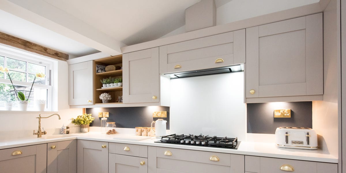
A cashmere kitchen is built around warm, layered neutrals. Think creamy off-whites, taupe, greige with actual warmth, soft khaki, sand, stone, oatmeal, mushroom, and light clay. The palette usually leans tonal, meaning the colors are close cousins rather than dramatic opposites. Instead of strong contrast, the look relies on variation in texture, sheen, and material.
That is why these kitchens often feature details like white oak or walnut cabinetry, brass or aged metal hardware, quartzite or marble with soft movement, textured tile, plaster-like walls, and upholstered or wood seating that keeps the room from feeling overly slick. The vibe is luxurious, but quietly so. No one is yelling. Even the countertops seem emotionally regulated.
The best way to understand the trend is to think of cashmere the fabric. It is soft, refined, comforting, and expensive-looking without needing sequins. A cashmere kitchen aims for that same effect. It wraps the room in warmth while still feeling crisp, modern, and intentional.
Why Designers Keep Falling for It
1. It Warms Up the Post-White Kitchen Era
For years, white kitchens dominated renovation wish lists. They felt safe, bright, and universally appealing. The problem is that too much white, especially when paired with cool gray undertones, can read a little sterile. Designers are seeing more clients ask for kitchens that still feel light and clean, but not chilly.
That is where cashmere shades shine. They offer the brightness people like in a neutral kitchen, but with more depth and softness. A warm beige cabinet, a putty-painted island, or an off-white with creamy undertones can make a room feel instantly more inviting. It is the design equivalent of swapping hospital socks for something actually comfortable.
This shift also reflects a larger move across interiors toward warmer palettes in general. In other words, the cashmere kitchen is not a random one-season fling. It is part of a broader design correction away from cool minimalism and toward spaces that feel grounded and welcoming.
2. It Looks Luxurious Without Looking Showy
Designers are increasingly drawn to interiors that feel elevated but restrained. The cashmere kitchen fits neatly into that “quiet luxury” mindset. It communicates quality through restraint, not spectacle.
Instead of relying on super-bold cabinetry or heavily patterned finishes, this trend creates richness through subtle choices. The cabinet color may be understated, but the grain of the wood is beautiful. The stone may be pale, but it has elegant movement. The backsplash may be neutral, but its handmade texture catches the light. Every element whispers, “I have excellent taste,” without needing a neon sign.
That makes the style especially appealing for homeowners who want a kitchen that feels expensive, but do not want it to become dated the moment a new color trend takes over Pinterest. Cashmere kitchens age better because they are built on nuance, not novelty.
3. It Gives Natural Materials Room to Shine
Designers love materials with character. Wood grain, stone veining, handmade tile, unlacquered brass, and natural fibers all bring depth to a kitchen. But those materials can get visually crowded when paired with overly busy colors or sharp contrast.
The cashmere palette acts like a flattering backdrop. It lets organic materials take center stage without making the room feel plain. A Taj Mahal quartzite countertop looks warmer against soft taupe cabinets. White oak feels richer next to creamy walls. Zellige tile pops more when the surrounding palette is calm and tonal.
This is one of the biggest reasons the trend resonates with professionals. It encourages thoughtful layering. Instead of asking, “What bold color should go everywhere?” designers can ask, “What material deserves the spotlight, and what tones will support it?” That shift usually leads to better kitchens.
4. It Is Incredibly Flexible Across Design Styles
One of the smartest things about the cashmere kitchen trend is that it is not married to a single style. It works beautifully in modern spaces with flat-panel cabinetry and clean lines. It also fits traditional kitchens with inset doors, classic millwork, and unlacquered brass. Transitional kitchens? Absolutely. Organic modern? Practically built for it. Even English-inspired and Scandinavian kitchens can interpret the look in their own way.
That flexibility makes it a favorite among designers, because they can adapt the palette to suit the architecture of the home and the personality of the client. A city condo might use pale mushroom lacquer and streamlined hardware. A suburban family kitchen might combine warm painted cabinetry with white oak lowers and a stone backsplash. A more classic home might lean toward cream cabinetry, antique brass, and marble with soft beige veining.
The common denominator is warmth, layering, and restraint. The look bends without breaking.
5. It Feels Better to Live With Every Day
Not every design trend improves daily life, but this one genuinely can. Warm neutrals tend to feel calming. Natural materials age gracefully. Layered textures make a room more forgiving and less clinical. Together, those qualities create a kitchen that feels comfortable to actually use.
That matters because kitchens are not just for cooking anymore. They are command centers, coffee stations, homework zones, late-night therapy booths, and accidental party venues. A cashmere kitchen supports all of that because it feels relaxed rather than precious.
Designers know the best rooms are not just attractive. They also support the way people want to feel at home. In that sense, the popularity of the cashmere kitchen is not only aesthetic. It is emotional.
What Colors Define the Cashmere Kitchen Trend?
The palette usually sits in the warm neutral family, but the trick is choosing tones with enough complexity to avoid looking flat. Good options include:
- Soft taupe
- Mushroom
- Putty
- Oatmeal
- Creamy off-white
- Warm greige
- Sand
- Light khaki
- Pale clay
- Subtle caramel-toned wood stains
These shades are often paired with white oak, walnut, limestone-look surfaces, quartzite, marble, or porcelain slabs in gentle beige or cream tones. Accents may include aged brass, brushed nickel, matte black in small doses, or muted green for an island or pantry if the homeowner wants a touch of color.
The palette is intentionally flexible, which is why designers like it. It can read airy in a bright kitchen, cocooning in a darker one, and sophisticated in almost any size space.
How Designers Build the Look Without Letting It Go Flat
Start With One Strong Anchor
Most designers begin with one major anchor element: cabinetry, countertop stone, flooring, or even a paint color. Once that choice is locked in, the rest of the palette is layered around it. This keeps the room cohesive and prevents the “I accidentally bought six different beiges and now my kitchen looks confused” problem.
Layer Texture Like It Is Your Job
In a neutral kitchen, texture does the heavy lifting. Designers use matte walls, polished or honed stone, wire-brushed wood, textured tile, woven shades, linen-look stools, and softly reflective metals to keep the room visually interesting. The goal is not more color. It is more dimension.
Use Contrast Carefully
Cashmere kitchens are not contrast-free. They just use it in a more disciplined way. A darker wood island, a black metal sconce, or a charcoal stool leg can sharpen the room without breaking the calm mood. The key is moderation. Too much black and the softness disappears.
Choose Hardware That Adds Warmth
Brass remains a favorite because it brings glow to warm neutrals. Designers also like aged finishes that develop character over time. Even when the cabinetry is understated, the hardware can provide a little jewelry for the room.
Think Beyond Paint
Cashmere is not just a cabinet color trend. It can show up in plaster-toned walls, textured backsplashes, wood stains, countertop choices, and even lighting. The best rooms do not look like someone painted everything one color and declared victory. They feel layered, collected, and quietly intentional.
Common Mistakes to Avoid
As dreamy as the trend is, there are a few ways to get it wrong.
- Going too gray: If the undertones turn cool, the whole point of the look gets lost.
- Using one flat tone everywhere: The room needs variation in material, finish, and shade.
- Skipping natural texture: Without wood, stone, tile, or tactile surfaces, a neutral kitchen can feel lifeless.
- Adding too many trendy accents: Bright hardware, loud light fixtures, or overly dramatic veining can pull the design away from the quiet elegance that makes this style work.
- Ignoring lighting: Warm neutrals change with daylight and bulbs, so testing colors in the actual room is essential.
Designers obsess over undertones for a reason. One “warm neutral” can look creamy and sophisticated, while another can look muddy, yellow, or oddly pink. Samples are not optional here. They are self-defense.
Why the Trend Has Real Staying Power
Some kitchen trends explode because they are eye-catching. Others last because they solve design problems in a smart, practical way. Cashmere kitchens fall into the second category.
They help homeowners move past sterile white kitchens without diving into a bold color they may regret. They make room for natural materials and layered finishes. They suit open-plan homes where the kitchen needs to connect gracefully with adjacent living spaces. They also adapt well over time. If tastes shift, a cashmere kitchen can evolve through bar stools, lighting, paint, or hardware rather than a full renovation.
That kind of flexibility is gold in kitchen design. Or brass, if we are staying on theme.
The Everyday Experience of Living With a Cashmere Kitchen
One reason this trend keeps winning people over is that it is not just beautiful in a reveal photo. It tends to feel genuinely good in daily life. That may sound dramatic for a room full of drawers and toast, but anyone who has lived with a kitchen that feels too cold, too shiny, or too harshly lit understands the difference immediately.
In the morning, a cashmere kitchen often feels softer than a bright white one. Natural light bounces around the room, but the warm undertones keep the space from looking clinical. Coffee feels more like a ritual and less like a survival exercise under stadium lighting. The stone looks creamy instead of icy. The wood feels alive. The room has a little visual exhale built into it.
By midday, the layered materials start doing their magic. The backsplash catches the light differently than the cabinets. The brass hardware looks a bit warmer. Honed stone reads differently than polished stone. A stool in linen or leather adds another texture to the mix. Even when the palette is calm, the room never feels one-note. That is something designers understand deeply: neutral does not have to mean boring. In fact, when done well, a tonal room can feel richer because your eye notices subtle differences instead of getting distracted by loud contrast.
There is also a practical side to the experience. Soft taupes, mushrooms, and creamy paints can be more forgiving than stark white when it comes to everyday smudges, dust, and general kitchen chaos. That does not mean the room hides everything forever, because no paint color is performing miracles against spaghetti sauce. But it can feel a little more relaxed and livable, especially in busy households.
Entertaining in a cashmere kitchen has its own appeal too. Guests tend to gather where a room feels warm, and this palette naturally creates that atmosphere. The kitchen blends more smoothly with living and dining spaces, which matters in open floor plans. It becomes a backdrop for conversation, food, music, and real life rather than a design object that demands everyone admire it from a respectful distance.
Many homeowners also find that the trend supports changing tastes. Seasonal decor, colorful flowers, wood boards, ceramic bowls, copper pans, black accents, or even a moody green vase all look good against a cashmere backdrop. The room is not locked into one narrow aesthetic. It has range. One month it can lean organic modern, the next month slightly classic, and during the holidays it can suddenly look like it belongs in a Nancy Meyers movie. That kind of versatility is part of the experience people respond to so strongly.
Most of all, living with a cashmere kitchen feels easy. It feels calm at 7 a.m., inviting at 6 p.m., and stylish without trying too hard at any hour in between. Designers love it because it photographs beautifully. Homeowners love it because it lives beautifully. And in a room used every single day, that is the kind of romance that actually lasts.
Conclusion
Designers love the cashmere kitchen trend because it delivers what many homeowners want right now: warmth, sophistication, texture, flexibility, and a sense of calm. It moves beyond the starkness of yesterday’s kitchens without swinging into something loud or overly themed. It embraces natural materials, flatteringly complex neutrals, and a softer style of luxury that feels timeless rather than trendy.
In other words, it is not just a pretty kitchen trend. It is a smarter way to design a room people truly live in. And honestly, after years of kitchens that looked like they were auditioning for a tech startup, that softer approach feels pretty refreshing.