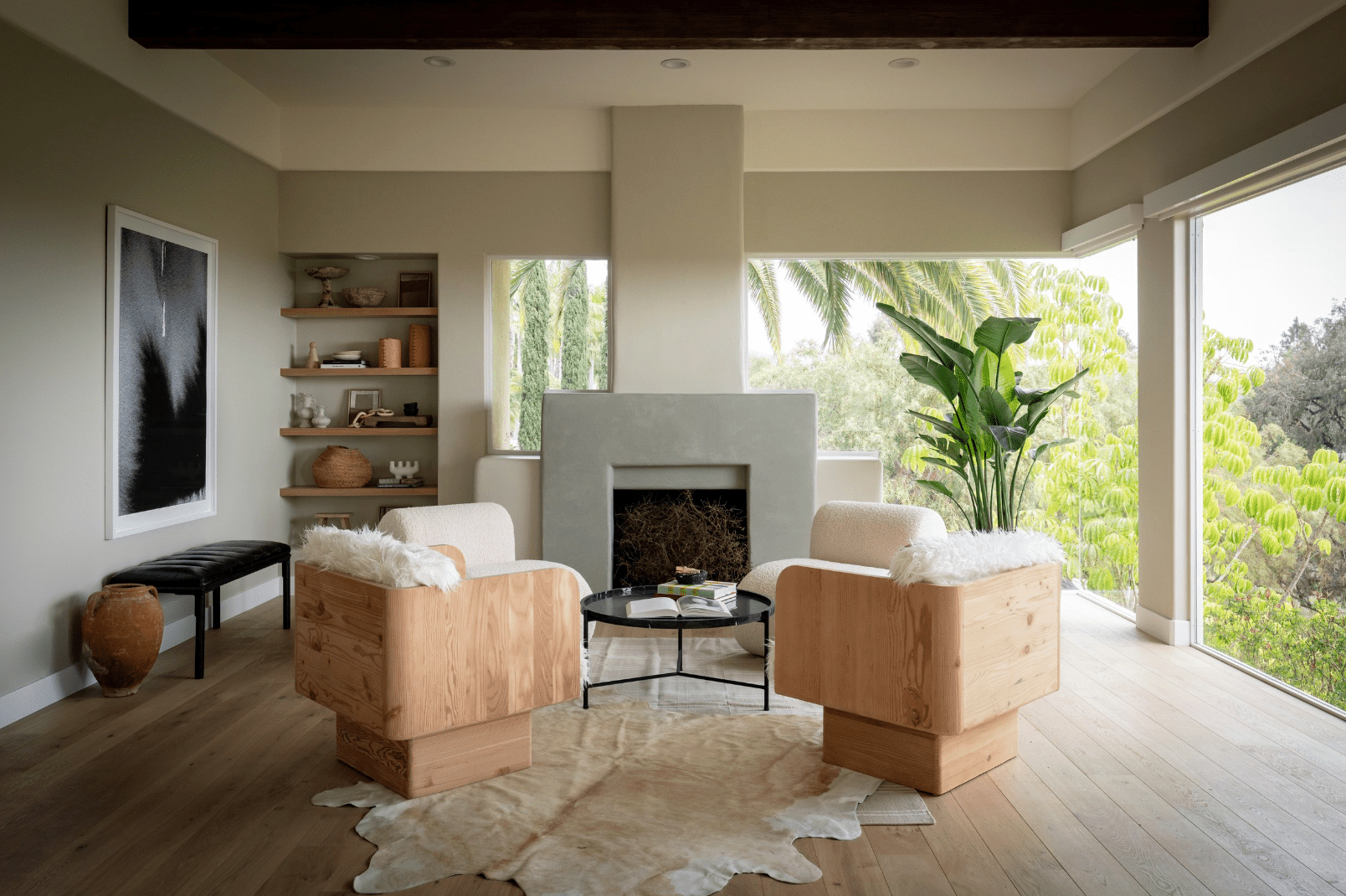
Taupe is one of those colors that walks into a room quietly, fixes the lighting, smooths the sofa cushions, and somehow makes everyone look more put together. But ask five people, “What color is taupe?” and you may get five answers: gray, brown, beige, greige, mushroom, dusty cocoa, or “the color of my landlord’s hallway, but nicer.”
In simple terms, taupe is a sophisticated neutral color that sits between brown and gray. Depending on the undertone, it can look warm and earthy, cool and smoky, soft and beige-like, or deep and moody. That flexibility is exactly why taupe has become a favorite in interior design. It gives you the calm of gray, the warmth of brown, and the decorating forgiveness of a best friend who never mentions your cluttered coffee table.
Whether you are painting walls, choosing a sofa, updating kitchen cabinets, or simply trying to make your home feel more grown-up without turning it into a museum, taupe is a dependable choice. Below, you will find a clear explanation of the color, how to choose the right shade, and 20 practical ways to use taupe around your home.
What Color Is Taupe?
Taupe is a neutral shade created from a blend of brown and gray. It can be light or dark, warm or cool, soft or dramatic. A classic taupe usually has enough brown to feel cozy and enough gray to feel refined. That balance keeps it from looking too yellow like some beiges or too chilly like some grays.
The tricky part is that taupe changes depending on lighting, nearby colors, flooring, and furniture. A taupe wall next to creamy white trim may look warm and sandy. The same color beside blue-gray tile may suddenly appear cooler. This is not taupe being dramatic. Well, maybe a little. But mostly, it is how undertones work.
Warm Taupe vs. Cool Taupe
Warm taupe usually has red, pink, yellow, or brown undertones. It feels inviting and pairs beautifully with wood, brass, cream, leather, terracotta, olive green, and natural fibers.
Cool taupe leans more gray, violet, green, or charcoal. It works well with crisp white, black accents, brushed nickel, slate blue, soft lavender, marble, and contemporary interiors.
If you want a cozy home, start with a warm taupe. If you want a cleaner, modern look, explore cooler taupe shades. If you want both, congratulations: you are exactly the person taupe was invented for.
Why Taupe Works So Well in Home Decor
Taupe is popular because it solves a common decorating problem: many people want a neutral home, but they do not want it to feel flat, cold, or boring. White can be crisp but sometimes stark. Beige can be warm but sometimes dated. Gray can be elegant but sometimes chilly. Taupe lands comfortably in the middle.
It also works with many design styles, including modern farmhouse, transitional, minimalist, coastal, rustic, traditional, organic modern, and even moody contemporary interiors. In other words, taupe is the Switzerland of paint colors: neutral, diplomatic, and surprisingly useful.
20 Ways to Use Taupe Around Your Home
1. Paint Your Living Room Walls Taupe
A taupe living room feels calm, comfortable, and polished. Use a light to medium taupe on the walls if you want a neutral backdrop that still has depth. Add cream upholstery, a wood coffee table, black picture frames, and a textured rug for a layered look that says, “Yes, I own coasters.”
2. Choose a Taupe Sofa
A taupe sofa is more forgiving than white and more flexible than dark brown. It pairs with blue pillows, green throws, rust accents, ivory rugs, and black metal lighting. For families, pets, or snack enthusiasts, textured taupe fabric is especially practical because it hides minor wear better than pale solids.
3. Use Taupe in the Bedroom for a Soft Retreat
Taupe is excellent for bedrooms because it creates a restful atmosphere without feeling sleepy in a dull way. Try taupe walls with white bedding, linen curtains, warm wood nightstands, and a soft wool rug. For a hotel-inspired look, add layered pillows in cream, mushroom, and muted bronze.
4. Paint Kitchen Cabinets Taupe
Taupe kitchen cabinets are a stylish alternative to white, gray, or navy. They feel warm but still elegant. Light taupe cabinets look beautiful with marble-look counters and brass hardware, while deeper taupe cabinets pair well with white walls, black fixtures, and natural stone backsplashes.
5. Try Taupe on a Kitchen Island
If you are not ready to paint every cabinet, use taupe on the island. A taupe island adds contrast without shouting across the room. Pair it with white perimeter cabinets, oak floors, and pendant lights in brass, bronze, or matte black.
6. Use Taupe Tile in the Bathroom
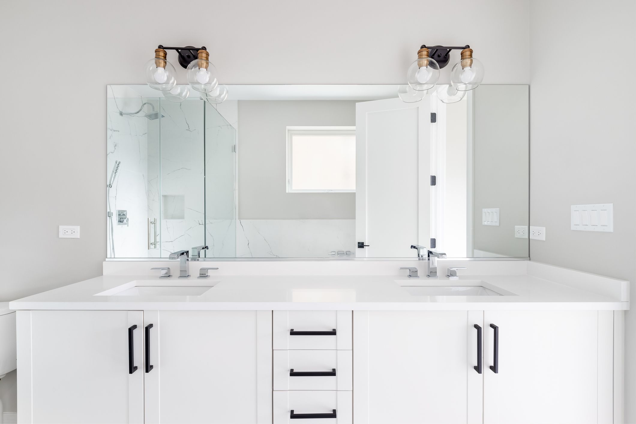
Taupe bathroom tile can look spa-like, especially when combined with warm white walls, stone counters, and simple fixtures. Large-format taupe tiles create a clean, seamless feel, while handmade-look taupe tiles add texture and charm. Add eucalyptus, fluffy towels, and suddenly your bathroom is emotionally charging resort fees.
7. Paint Interior Doors Taupe
Taupe interior doors are a subtle upgrade that can make a home feel custom. This works especially well with white or off-white walls. The contrast is softer than black but still more interesting than plain white doors. Use the same taupe on closet doors for a cohesive look.
8. Create a Taupe Accent Wall
A taupe accent wall behind a bed, sofa, or dining banquette adds depth without overwhelming the space. This is a good option for renters or cautious decorators who want to test the color before committing to a full room. Choose a shade two or three steps darker than your main wall color.
9. Pair Taupe With White Trim
White trim makes taupe look crisp and intentional. For warm taupe walls, use creamy white trim. For cool taupe walls, use a cleaner white. The goal is harmony, not a trim color that barges in wearing tap shoes.
10. Use Taupe With Natural Wood
Taupe and wood are a natural team. Oak, walnut, maple, and reclaimed wood all work well with different taupe shades. Warm taupe brings out the richness in wood floors and furniture, while cooler taupe can balance orange or yellow tones in older wood finishes.
11. Add Taupe Curtains
Taupe curtains soften a room without stealing attention from the furniture or view. Linen, cotton, velvet, or woven taupe drapes can make windows feel more finished. Hang them high and wide to make the ceiling look taller and the room feel more spacious.
12. Layer Taupe Rugs
A taupe rug is one of the easiest ways to introduce the color. It anchors the room and works with many palettes. Try a solid taupe rug for a minimalist space, a patterned taupe-and-cream rug for a classic look, or a vintage-style taupe rug for extra personality.
13. Use Taupe in a Home Office
Taupe is a smart home office color because it is calm but not distracting. A medium taupe wall behind a desk looks professional on video calls and pairs well with black shelving, wood desks, brass lamps, and framed art. It is serious enough for productivity but not so serious that your stapler feels judged.
14. Paint Built-Ins Taupe
Taupe built-ins can make bookshelves, mudroom storage, or media cabinets feel more architectural. A deeper taupe adds richness, especially when paired with warm lighting and carefully styled objects. Books, baskets, ceramics, and framed photos all look more curated against taupe.
15. Use Taupe Bedding
If painting feels like too much commitment, start with taupe bedding. A taupe duvet, quilt, or throw blanket brings quiet warmth to a bedroom. Mix it with white sheets, oatmeal linen, charcoal accents, or dusty blue pillows for a layered and relaxed look.
16. Combine Taupe With Green
Taupe and green are a strong pairing because both feel connected to nature. Use taupe walls with olive green chairs, sage cabinets with taupe tile, or a taupe sofa with forest green pillows. The result feels earthy, calm, and timeless.
17. Pair Taupe With Black Accents
Black gives taupe a modern edge. Try black window frames, black lamps, black cabinet pulls, or black-framed art. Taupe softens the contrast so the room feels stylish rather than harsh. This is a great approach for modern farmhouse and organic modern homes.
18. Use Taupe on the Exterior
Taupe can be beautiful outside, especially on siding, shutters, trim, or front doors. A medium taupe exterior pairs well with stone, brick, black accents, and warm wood. Always test exterior paint in daylight because sun exposure can make colors appear much lighter.
19. Decorate With Taupe Accessories
Small taupe accessories are perfect for beginners. Try lampshades, vases, pillows, baskets, picture mats, trays, or ceramic bowls. These pieces add softness and help connect stronger colors in a room. Taupe accessories are like the friendly host at a party, introducing the navy chair to the oak table.
20. Go Monochromatic With Several Taupe Shades
A monochromatic taupe room can look luxurious when you mix tones and textures. Use pale taupe walls, a deeper taupe sofa, cream pillows, a mushroom rug, and bronze accents. The secret is variety. If every item is the exact same taupe, the room may look like it got dressed in the dark.
Best Colors That Go With Taupe
Taupe is flexible, but some pairings are especially effective. For a soft and classic palette, combine taupe with cream, ivory, warm white, and natural wood. For a modern palette, use taupe with black, charcoal, white, and brushed metal. For an earthy palette, pair taupe with olive, sage, terracotta, clay, rust, and leather. For a romantic palette, try taupe with dusty rose, mauve, soft plum, or champagne.
Blue also works beautifully with taupe. A cool taupe with slate blue feels refined and calm, while a warm taupe with navy feels tailored and timeless. If your room has a lot of natural light, deeper taupe and richer accent colors can hold their own. In darker rooms, lighter taupe shades usually feel fresher.
How to Choose the Right Taupe Paint Color
Test Samples in Different Light
Never choose taupe from a tiny paint chip alone. Paint a sample on poster board or directly on the wall and check it morning, afternoon, and evening. Taupe can shift dramatically as the light changes. A shade that looks warm at noon may look gray at night.
Compare It With Fixed Elements
Look at your floors, countertops, tile, fireplace stone, and cabinets. These fixed elements already have undertones. Your taupe should cooperate with them. If your floors are golden oak, a slightly warm taupe may look more natural. If your kitchen has cool marble, a cooler taupe may feel more balanced.
Pick the Mood First
Before choosing a shade, decide how you want the room to feel. Cozy? Choose a warm taupe. Elegant? Try a gray-brown taupe. Airy? Go light. Dramatic? Go deeper. Taupe has range, so give it a job description before hiring it for your walls.
Common Mistakes to Avoid With Taupe
The biggest mistake is assuming all taupes are the same. They are not. Some lean pink, some green, some purple, some beige, and some charcoal. Another mistake is pairing taupe with a white that is too stark or too creamy. The wrong white can make taupe look muddy or dull.
Also, avoid using only smooth, flat taupe surfaces. A taupe room needs texture: linen, boucle, wood grain, stone, woven baskets, leather, wool, or ceramic. Texture keeps neutral rooms alive. Without it, taupe can go from “quiet luxury” to “forgot to finish decorating” surprisingly fast.
Conclusion: Is Taupe a Good Color for Your Home?
Yes, taupe is a great color for the home because it is warm, versatile, timeless, and easy to layer. It works as a wall color, cabinet color, upholstery choice, exterior shade, or small decorative accent. The key is choosing the right undertone for your lighting and existing finishes.
If you want a neutral that feels softer than gray, more modern than beige, and more interesting than plain white, taupe deserves a serious look. It is not loud, trendy, or flashy. It is the color equivalent of a perfectly tailored jacket: simple, useful, and quietly impressive.
Real-Home Experiences With Taupe: What It Feels Like to Live With This Color
One of the best things about taupe is that it tends to get better once you actually live with it. Some colors look exciting on day one and exhausting by day thirty. Taupe usually does the opposite. It may seem simple at first, but over time, you start noticing how kindly it treats everything around it. Your wood table looks warmer. Your white curtains look softer. Your black frames look less severe. Even that one chair you bought during a “bold design era” suddenly seems less confused.
In a living room, taupe creates a comfortable background for real life. It does not demand that the pillows stay perfectly chopped or that the coffee table hold exactly three art books and one sculptural object. Taupe can handle a blanket tossed over the sofa, kids’ toys in a basket, a dog bed in the corner, or a laptop left open after an ambitious attempt at productivity. It looks polished, but it does not act precious.
In bedrooms, taupe has a wonderfully calming effect. Warm taupe walls can make a room feel wrapped and restful, especially at night with soft lamps turned on. Cool taupe bedding can make a bedroom feel crisp without turning it icy. Many homeowners find that taupe is easier to live with than pure gray because it has more warmth, and easier than beige because it feels more updated. It is a middle path, but not a boring one.
The biggest lesson from using taupe is this: lighting matters more than the paint name. A shade that looks perfect in a store may look pink, purple, green, or flat in your own room. That is not a failure; it is normal. Testing samples is not optional unless you enjoy repainting while muttering things at the wall. Put samples beside trim, floors, cabinets, and furniture. Look at them on sunny days and cloudy days. Check them under your actual bulbs at night. Taupe rewards patience.
Taupe also teaches the importance of contrast. A taupe room looks best when it includes light, dark, smooth, rough, shiny, and matte elements. Add cream trim, black lamps, woven baskets, velvet pillows, wood furniture, or stone accessories. These layers keep taupe from feeling flat. Think of taupe as the background music of a home: it sets the mood, but the instruments still matter.
For anyone nervous about color, taupe is a friendly starting point. Begin with a rug, throw blanket, curtains, or accent chair. If it works, move to walls, cabinets, or built-ins. Taupe is forgiving, adaptable, and surprisingly elegant. It does not beg for attention, but it makes the whole room feel more intentional. That is why designers love it, homeowners keep returning to it, and beige and gray are probably somewhere in the corner trying to form a support group.