The kitchen is where coffee happens, dinner negotiations begin, and somebody always opens the fridge just to “see what’s in there” for the ninth time. In other words, it is not just another room. It is a hard-working, high-traffic, high-visibility space that has to look good in daylight, under pendants, beneath under-cabinet lighting, and during those late-night snack raids when nobody is feeling especially glamorous.
That is why kitchen paint color mistakes hit harder than paint mistakes anywhere else. A bad bedroom color can hide behind a closed door. A bad kitchen color greets you every morning, clashes with your cabinets, makes your countertops look weird, and somehow turns toast-making into a mildly stressful event. Interior designers and paint experts agree on one thing: kitchens demand colors that are practical, flattering, and flexible. Shades that are too harsh, too cold, too dark, or too loud can make the room feel smaller, dirtier, more chaotic, or just plain dated.
So which hues are most likely to backfire? Based on consistent advice from design pros, these are the five paint colors you should think twice about before bringing them into your kitchen. Some are trendy traps. Some are “safe” colors that are not actually safe at all. And a few are the design equivalent of inviting a marching band into a room meant for pancakes.
Why Kitchen Paint Is Different From Paint in Other Rooms
Before we get into the no-go list, it helps to understand why kitchen paint color is such a big deal. Kitchens have a lot going on visually: upper and lower cabinets, hardware, backsplash tile, stone counters, appliances, flooring, stools, and often mixed metals. The wall color has to play nice with all of it. It also has to survive shifting light throughout the day and still look appealing next to both a lemon and a stainless steel refrigerator.
Designers often say the best kitchen paint colors have nuance. They are rarely too flat, too pure, or too one-note. Colors with subtle warmth or complexity tend to age better and feel more welcoming. In a space built for gathering, eating, and everyday mess, that matters a lot.
1. Stark White
Why pros avoid it
White kitchens are classic. Stark white kitchens are another story. That bright, icy, ultra-clean white people often choose because it feels “safe” can read sterile, clinical, and unforgiving in real life. In a kitchen, that is a problem. This is not a laboratory. It is the room where spaghetti sauce splatters, fingerprints appear out of nowhere, and one mysterious drip on the cabinet somehow survives three cleanings.
Stark white also has a sneaky habit of amplifying the wrong things. It can make inexpensive finishes look cheaper, highlight uneven walls, emphasize shadows, and turn cool artificial lighting into something that feels more dentist’s office than dinner party. If your kitchen lacks abundant natural light, a cold white can feel especially flat and chilly.
What happens in real kitchens
Many homeowners choose crisp white expecting airy and timeless. Then the room ends up feeling hard-edged rather than fresh. White backsplashes can suddenly look blue. Creamy cabinets can look yellow in comparison. Marble veining can appear dingier. Instead of creating a clean backdrop, the color starts picking fights with every finish in the room.
What to use instead
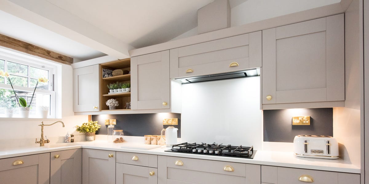
Try a warm white or soft off-white with a gentle undertone. These shades still feel bright and versatile, but they add softness and forgiveness. Think creamy white, ivory, or a white with subtle beige, greige, or putty undertones. You still get the light-reflecting benefits without the “welcome to the operating room” energy.
2. Cool Gray or Icy Gray
Why pros avoid it
Gray had a very long moment, and many designers believe the iciest versions have overstayed their welcome in the kitchen. Cool gray can make the room feel lifeless, especially when paired with stainless steel appliances, white quartz, and cool-toned flooring. That combination often creates a space that feels more corporate than cozy.
The issue is not all gray. It is the flat, cold, blue-leaning gray that drains warmth from the room. Kitchens already contain hard surfaces, reflective finishes, and plenty of practical materials. Add a chilly wall color, and the entire space can start to feel emotionally unavailable.
Why it is tricky
Cool gray is particularly sensitive to lighting. In north-facing kitchens or rooms with cool LED bulbs, it can become drab, shadowy, or even slightly bluish. That might sound sophisticated on a paint chip, but on four walls it can make the room feel smaller and less inviting. Not ideal for a place designed for conversation, cooking, and second helpings.
What to use instead
If you like neutral paint colors in a kitchen, lean warmer. Greige, mushroom, taupe, soft putty, and warm stone shades offer the calm effect people want from gray without the coldness. These colors also play better with wood tones, brass hardware, mixed metals, and natural stone.
3. Saturated Yellow
Why pros avoid it
Yellow sounds cheerful on paper. In reality, saturated yellow can become exhausting fast. A bold lemon, school-bus yellow, or mustard-leaning wall can dominate the room and make the kitchen feel overstimulating. Designers often warn that bright yellow is one of those colors that looks fun in tiny doses but becomes a full-time personality when spread across a large surface.
It is also one of the trickiest paint colors to control. Yellow shifts dramatically depending on sunlight, bulb temperature, and surrounding finishes. A shade that seems sunny in the store can look acidic, muddy, or oddly greenish once it is actually on the wall.
The appetite argument
Some color psychology discussions say yellow can energize a space, which is true to a point. But too much energy in a kitchen can read as visual noise. Instead of creating a happy room, strong yellow can make it feel hectic. It may also date the space quickly, especially when paired with older cabinetry styles or warm wood finishes.
What to use instead
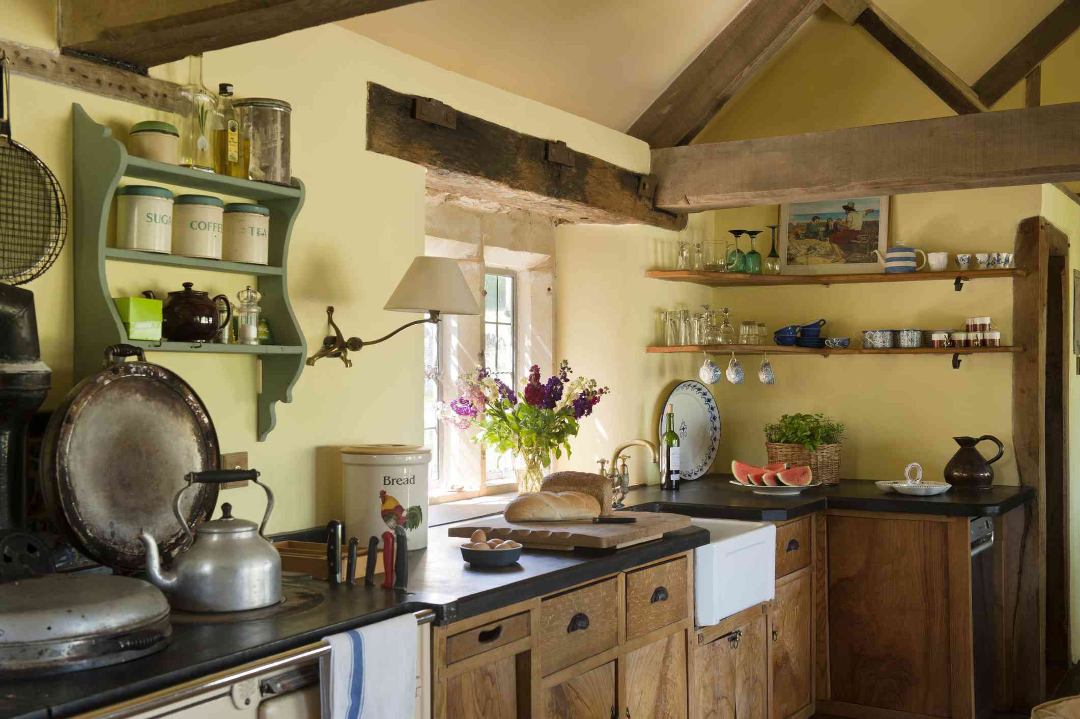
If you want a sunny kitchen, choose restrained warmth. Buttercream, soft straw, pale ochre, warm cream, or muted clay-adjacent neutrals can give you brightness without the shouty effect. Another smart move is to bring yellow in through accessories such as dishware, art, or textiles rather than permanent wall color.
4. Bright Red
Why pros avoid it
Red is dramatic, energetic, and not exactly known for its chill. In a kitchen, bright red can feel overpowering almost immediately. It tends to dominate the visual field, making the room seem busier and more intense than it needs to be. A little red can be lively. A whole red kitchen can feel like your walls are trying to win an argument.
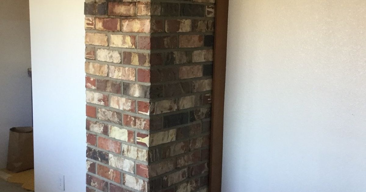
Designers frequently dislike red in kitchens because it is hard to balance. It can skew theme-y, look dated, or create a restaurant-like effect rather than a lived-in home atmosphere. Bright reds can also clash with common kitchen materials, especially warm woods, patterned stone, brick, and mixed metallic finishes.
Why it dates quickly
Red tends to tie a kitchen to a very specific era or design mood. Tuscan-inspired interiors, retro diner looks, and lacquered statement kitchens can all use red, but most homeowners are not actually trying to live inside a design time capsule. Because kitchens are expensive to update, pros usually steer clients toward colors with longer staying power.
What to use instead
If you love warmth and drama, go deeper and dirtier. Earthy terracotta, oxblood accents, muted brick, dusty rose-brown, or aubergine used sparingly can feel richer and more sophisticated. These shades provide personality without screaming over the blender.
5. Jet Black and Other Very Dark Hues
Why pros avoid them
Dark kitchens can look stunning in photos. That does not mean they are easy to live with. Jet black walls or very dark brown tones can make a kitchen feel smaller, moodier, and harder to maintain than expected. They also show dust, grease, smudges, and fingerprints with remarkable enthusiasm.
In a room that already has a lot of movement and mess, black can become high maintenance fast. If the kitchen lacks strong natural light or generous square footage, deep wall colors may absorb too much light and leave the room feeling heavy. The result can be stylish for five minutes and gloomy for five years.
Where dark paint goes wrong
Very dark colors can flatten architectural detail and swallow contrast if the rest of the palette is not carefully layered. They also make bad lighting even more obvious. A moody charcoal kitchen with warm wood and polished brass can be gorgeous. A jet-black kitchen with weak overhead lighting and standard builder finishes can feel like a cave that serves snacks.
What to use instead
If you want depth, choose softer darks with undertones. Charcoal, smoky olive, deep mushroom, brown-black, or blue-black used selectively can feel more dimensional and forgiving. Better yet, put darker color on the island, lower cabinets, or pantry door, and keep the walls lighter to preserve balance.
How Pros Actually Choose Better Kitchen Paint Colors
The smartest kitchen paint decisions usually come down to restraint and testing. Designers do not just pick a trendy swatch and hope for the best. They consider undertones, cabinet color, stone pattern, backsplash reflectivity, natural light, bulb temperature, and how the kitchen connects to nearby rooms.
That is why the “never use” list is really a warning against extremes. Colors that are too stark, too cold, too bright, or too dark tend to create problems because kitchens need adaptability. A slightly softened shade almost always performs better than its more intense cousin.
Here are a few quick guidelines designers use:
- Test paint on multiple walls and view it morning, afternoon, and night.
- Compare samples directly against cabinets, counters, backsplash tile, and flooring.
- Be careful with cool undertones in kitchens that lack strong natural light.
- Use bolder color in accents if you are nervous about committing.
- Choose a finish appropriate for kitchens so the paint can handle moisture and cleaning.
The Best Kitchen Color Direction Instead
If you want a kitchen that feels current but not trendy, welcoming but not bland, pros usually point toward these families of color:
- Warm whites and soft creams for brightness without sterility
- Greige, taupe, and mushroom for flexible neutrals with depth
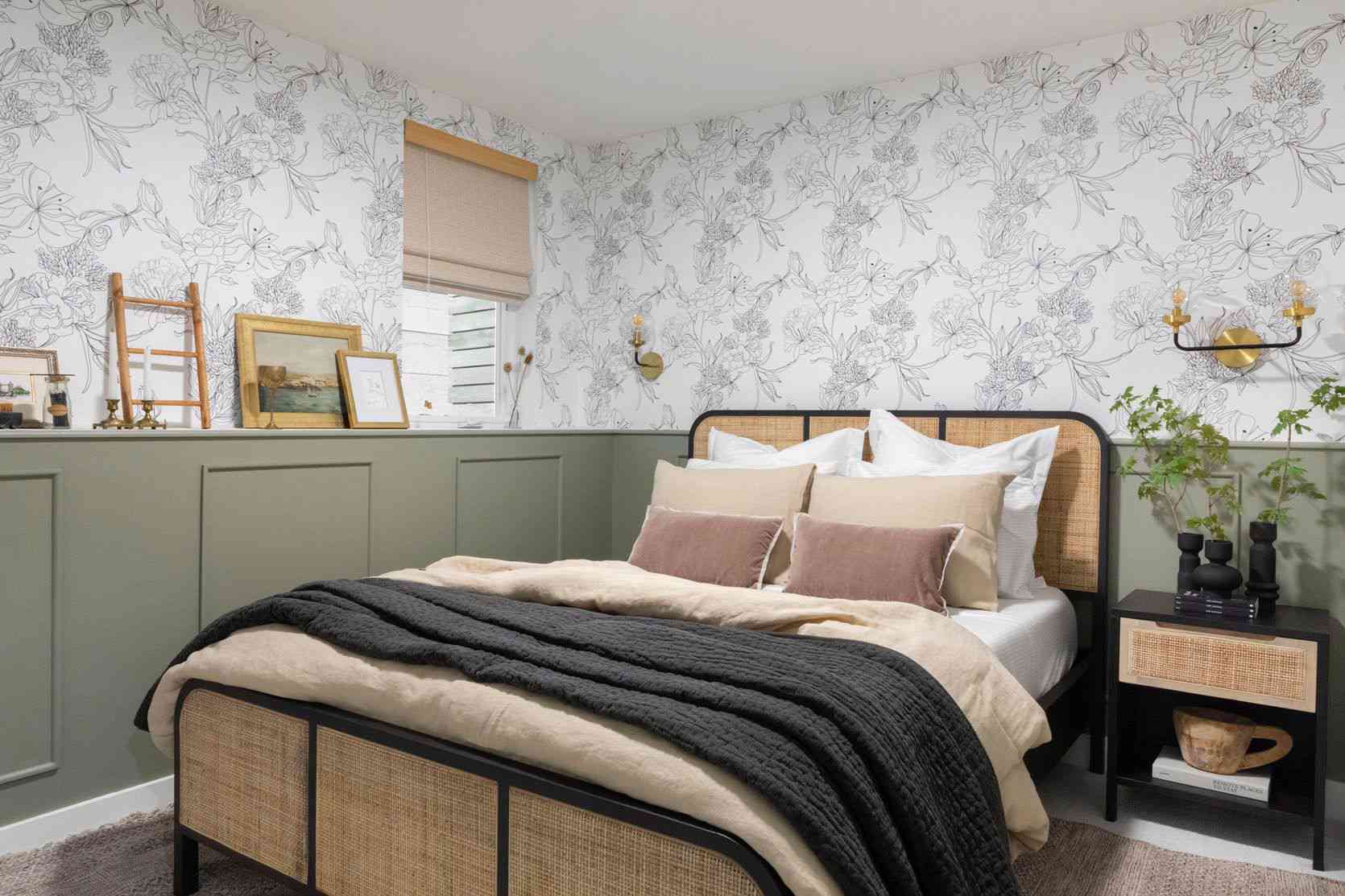
- Muted greens for a fresh but grounded look
- Earthy clay and soft brown undertones for warmth and character
- Complex charcoals for drama without harshness
These shades work because they leave room for the rest of the kitchen to shine. Cabinets can be the star. Stone can be the star. Even a very good toaster can have a moment. The walls do not need to perform stand-up comedy.
of Real-World Experience: What People Learn the Hard Way About Kitchen Paint
One of the most common experiences people have with kitchen paint is realizing that the color they loved on a tiny sample card behaves like a completely different person once it covers an entire room. In the store, stark white looks crisp and elevated. In a finished kitchen, especially under cool bulbs and next to stainless steel, it can suddenly feel sterile and sharp. Homeowners often describe that moment with some version of, “Why does this room feel colder even though I painted it white?” The answer is usually undertone, lighting, and contrast. A kitchen is full of surfaces that bounce light back at the walls, so a paint color rarely stays neutral for long.
Another classic experience involves gray. People choose cool gray because it seems modern and safe, especially if they are trying to avoid anything too beige or too yellow. But after a few days of living with it, the room can feel flat and gloomy. Morning light may make it seem blue. Evening light may turn it muddy. Once food, wood cutting boards, brass hardware, and warm flooring enter the picture, the gray often starts to feel disconnected from everything else. What looked polished in a showroom can feel emotionally distant at home.
Bright yellow and red usually create a different kind of regret. These colors are often chosen with good intentions. Yellow is supposed to feel cheerful. Red is supposed to feel energetic. But kitchens are already active rooms. When the wall color adds even more stimulation, people start to feel visually tired. What seemed playful during the painting process can become surprisingly stressful during everyday use. Homeowners notice it while making coffee, cleaning up after dinner, or trying to enjoy a quiet breakfast. The color is not technically wrong, but it is always “on,” and that gets old quickly.
Dark colors bring their own real-life lessons. Many people fall in love with dramatic black kitchens on social media because the photos are gorgeous. Then they try a similar shade in a smaller or dimmer room and discover every crumb, smudge, and fingerprint has decided to become part of the decor. Instead of looking luxe, the kitchen starts to feel heavy and demanding. It asks for better lighting, more contrast, and much more frequent wiping than expected. In real life, that can be exhausting.
The best experiences usually happen when people slow down and sample widely. They tape swatches next to the cabinets. They check the color in daylight and again at night. They compare it to the countertop instead of judging it in isolation. And most importantly, they stop chasing the most dramatic option in favor of the most livable one. That is the professional lesson running through all good kitchen design advice: the winning color is rarely the loudest. It is the shade that still looks good on a busy Tuesday, in January light, with groceries on the counter and a sink full of dishes. In other words, the color that can handle real life deserves the wall space.
Final Thoughts
Picking the right kitchen paint color is less about following strict rules and more about avoiding shades that make daily life feel harder, colder, or visually louder than necessary. According to design pros, stark white, cool gray, saturated yellow, bright red, and jet black are the biggest risk colors because they tend to exaggerate the wrong things: mess, shadows, harsh lighting, visual clutter, and trend fatigue.
A better kitchen palette usually has softness, warmth, and complexity. That does not mean boring. It means balanced. When the paint supports the room instead of dominating it, the whole kitchen feels more timeless, more flattering, and much easier to live with. And honestly, that is a far better recipe than a wall color that looks amazing for one photo and annoying for the next ten years.