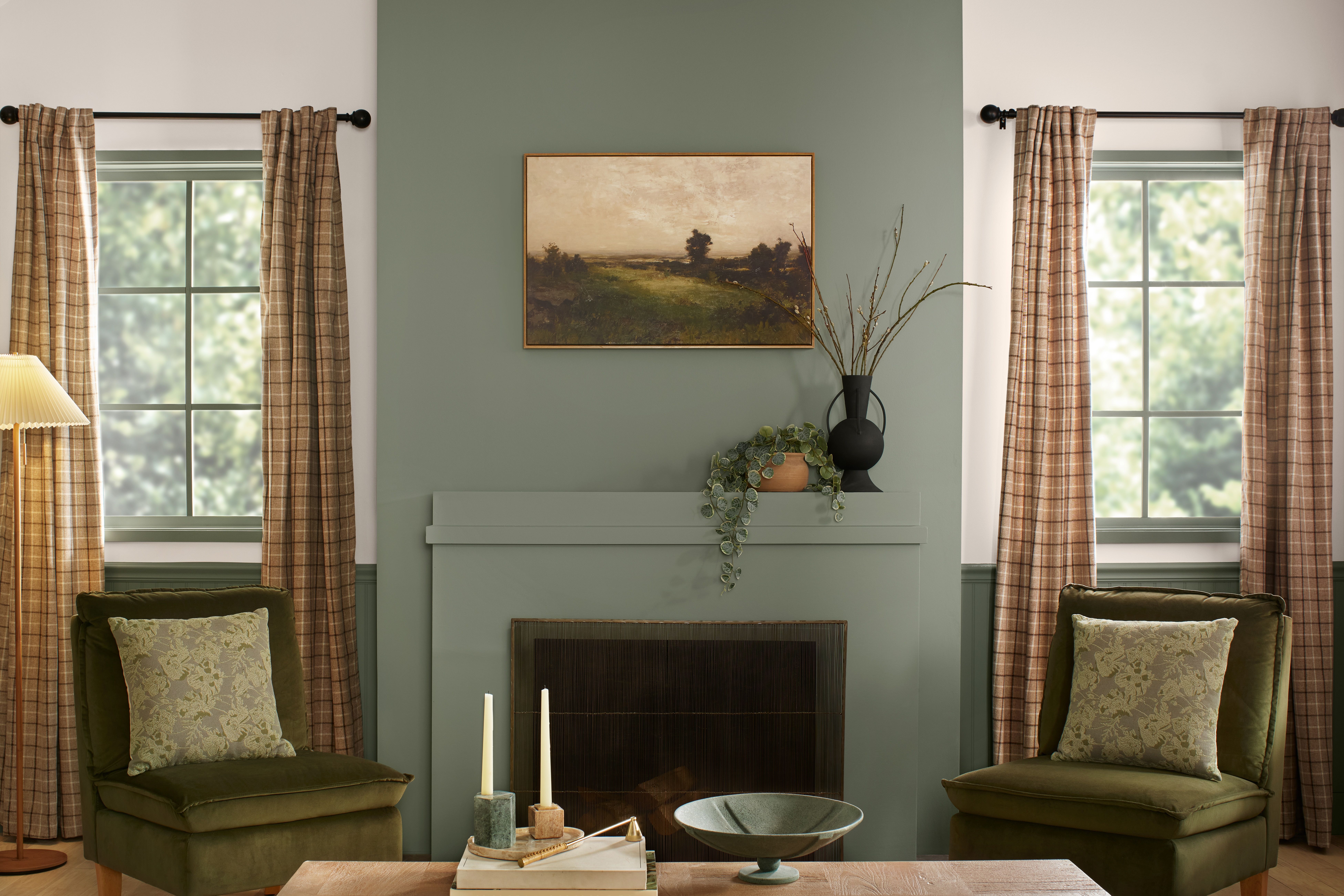
Fall 2025 is not here to whisper from the corner in a sad little beige cardigan. It is here to wrap your home in warmth, depth, and personality. After years of cool grays, safe whites, and “minimalist” rooms that sometimes looked suspiciously like unfinished rentals, this season’s paint trends are heading somewhere richer. Think cinnamon-brown neutrals, ruby reds, olive greens, stormy blues, terracotta clay shades, and soft sandy colors that feel polished instead of plain.
What makes the fall paint color trends of 2025 especially interesting is that they do not chase loud novelty for the sake of it. They lean into comfort, nostalgia, and emotional design. In other words, these colors want your home to feel like a place where real people live, drink coffee, read books, host friends, lose one sock in the laundry, and still somehow look stylish. That is a trend worth inviting inside.
If you are planning a full repaint, updating one room, or just collecting ideas for your next home refresh, this guide breaks down the biggest 2025 paint color trends for fall, how to use them, and which rooms wear them best.
Why Fall 2025 Paint Trends Feel So Different
The biggest shift this year is emotional. Homeowners are no longer choosing paint only to make a room look bigger, brighter, or more “resale friendly.” They are choosing color to create a mood. That is why the dominant shades for fall 2025 feel layered and a little moody, but still approachable. Even bold colors are showing up in softer, more livable versions.
Instead of flat neutrals, we are seeing nuanced neutrals. Instead of primary red, we are seeing red with wine, clay, or mahogany undertones. Instead of bright green, we are seeing sage, olive, moss, and eucalyptus. Even blue has grown up this year. It is deeper, dustier, and more atmospheric. Basically, the palette has entered its “interesting but still dependable” era.
Another major influence is the rise of cozy, layered interiors. Paint is now expected to work with wood tones, natural stone, vintage décor, brushed brass, woven textures, and tactile fabrics. The trending colors of fall 2025 do exactly that. They make a room feel designed, not decorated by panic-clicking on a home goods sale at midnight.
The Biggest Fall Paint Color Trends of 2025
1. Cinnamon Browns and Plum-Tinted Neutrals
One of the standout directions this season is the rise of brown with personality. Not boring office brown. Not muddy builder brown. The new version is richer and more complex, often touched with plum, mauve, cocoa, or mushroom undertones. These colors feel especially right for fall because they deliver warmth without screaming “holiday cabin.”
Plum-brown shades work beautifully in bedrooms, dining rooms, powder rooms, and reading nooks. They feel elegant in low light and cozy in evening spaces. Pair them with creamy trim, aged brass, dark walnut wood, and linen textiles for a soft-luxury look that feels current but not trendy in a disposable way.
This category is perfect for anyone who wants color but still feels nervous about commitment. A cinnamon-plum neutral reads sophisticated and grounded, almost like a traditional neutral that went to therapy and came back with boundaries.
2. Deep Reds, Burgundy, and Ruby Tones
Yes, red is back, and this time it arrived wearing loafers, carrying good wine, and speaking in a calm voice. The fall 2025 paint color trends favor reds that feel refined rather than flashy. Think burgundy, oxblood, dark auburn, berry red, and ruby tones with warm brown depth.
These shades are especially effective in dining rooms, libraries, entryways, and accent walls. They make large spaces feel intimate and small spaces feel intentional. Used on cabinetry, a deep red can look surprisingly timeless. Used on all four walls, it creates a cocooning effect that feels dramatic in the best way.
The trick is balance. Red looks richest when paired with warm whites, sand tones, black accents, natural oak, or bronze finishes. If you want a fall update without repainting an entire room, start with a red pantry door, lower kitchen cabinets, or built-ins. A little goes a long way, but the payoff is delicious.
3. Terracotta, Clay, and Caramelized Earth Tones
If fall had a signature family of colors in 2025, this would be it. Terracotta, clay, adobe, cinnamon, rust, and caramelized brown are everywhere for good reason. These colors feel grounded, familiar, and beautifully sunbaked. They bring warmth without turning orange in a cartoonish way.
Earthy browns and clay-based colors are especially strong in living rooms, mudrooms, dining rooms, and exteriors. They also look fantastic in homes with lots of texture: plaster walls, wood beams, rattan, leather, jute, and stone. If your space already has warm wood flooring, this trend practically does half the decorating for you.
One reason these shades are winning is that they bridge old and new. They can feel rustic in a farmhouse, tailored in a traditional home, or sleek in a modern space with clean lines. That range makes them one of the smartest paint choices of the year.
4. Olive, Moss, Sage, and Other Nature-Soaked Greens
Green remains a major player in 2025 interior color trends, but fall pushes it in a more grounded direction. Instead of minty freshness or loud emerald, the season favors olive, moss, sage, eucalyptus, and muted forest tones. These greens feel restorative, collected, and mature.
Olive green is especially strong for kitchens, offices, and den spaces. Sage remains a favorite for bathrooms and bedrooms because it feels calm without fading into the background. Deeper moss and forest shades are ideal for accent walls, cabinetry, and dramatic color drenching.
Green works so well because it behaves like a neutral when it carries gray or brown undertones. It pairs naturally with cream, beige, brass, black, and all shades of wood. It also plays nicely with fall’s richer supporting colors, including terracotta, plum-brown, and mustard yellow.
5. Moody Blues With Gray or Violet Undertones
Blue is not gone. It just got moodier. Fall 2025 blues lean toward storm cloud, deep denim, oceanic navy, and blue-violet shades that feel restful but not sleepy. These colors are an ideal choice for anyone who wants sophistication without stepping into brown or red.
Moody blue works beautifully in bedrooms, studies, laundry rooms, and even on kitchen islands. It has a classic quality, but its undertones determine the vibe. A blue with gray undertones feels tailored and serene. A blue with violet undertones feels richer, more atmospheric, and slightly dramatic.
To keep the look from becoming heavy, pair deep blue walls with warm off-whites, camel leather, brushed brass, or pale wood. If you want a modern fall palette, combine stormy blue with olive and clay. It sounds unexpected, but the result is balanced, layered, and very designer approved.
6. Soft Sanded Neutrals and Warm Whites
Not everyone wants their walls to look like a moody novel cover, and that is where warm neutrals come in. Fall 2025 neutrals are less icy and more buttery, sandy, almond, oat, mushroom, and soft beige. These shades act as the quiet backbone of the season’s bolder colors.
The beauty of these colors is their flexibility. They can brighten a room without making it feel sterile, and they help richer colors look more intentional. A warm neutral wall can support a burgundy sofa, a moss velvet chair, terracotta pottery, and dark wood without breaking a sweat.
If your goal is resale-friendly but still stylish, this is one of the safest ways to update a home in 2025. Just be sure to sample before committing. Warm neutrals can shift dramatically depending on natural light, trim color, and flooring. A “perfect beige” in one room can become “sad oatmeal under fluorescent judgment” in another.
7. Ochre, Honey, and Soft Mustard Yellows
Yellow is making a quieter comeback this year, especially in warm, earthy versions. We are not talking about neon lemon or school bus chaos. Fall 2025 favors ochre, golden honey, muted marigold, and soft mustard. These shades bring optimism and warmth while still fitting into the season’s grounded palette.
Used on ceilings, breakfast nooks, front doors, or accent furniture, yellow adds energy without overwhelming a room. It pairs especially well with olive green, denim blue, clay brown, and creamy white. In smaller doses, it can function almost like a metallic, giving a space a subtle glow.
This is a smart choice if your home needs brightness but you are tired of defaulting to white. A muted yellow can make a room feel sunny even on gray days, which is frankly a public service during fall and winter.
8. Full-Room Color Drenching
Fall 2025 is not just about which colors are trending. It is also about how they are used. One of the most important techniques this year is color drenching, where walls, trim, ceiling, and sometimes doors are painted in the same color or in closely related tones. The effect is immersive, polished, and surprisingly calming.
This approach works especially well with plum-browns, olive greens, deep blues, and terracotta neutrals. Instead of chopping a room into separate visual zones, color drenching creates a smooth envelope of color that feels intentional and high-end. It is especially helpful in small rooms, where contrast-heavy trim can make the space feel busier.
If you are nervous, start with a powder room, office, or guest bedroom. These smaller spaces are perfect places to experiment. Once you see how chic it looks, you may find yourself eyeing the dining room with fresh ambition and possibly a paint roller.
How to Use Fall 2025 Paint Colors Room by Room
Living room: Choose an earthy neutral, muted olive, or soft clay if you want warmth without too much drama. These colors play nicely with layered textiles and wood furniture.
Bedroom: Go for plum-brown, stormy blue, sage, or a warm mushroom neutral. These colors create the restful, tucked-in atmosphere most bedrooms desperately need.
Kitchen: Try olive or moss cabinetry, deep blue islands, or sandy neutrals on walls. For a bolder move, use burgundy or clay on a pantry door or lower cabinets.
Dining room: This is where fall color can really show off. Deep reds, cinnamon browns, and drenching-worthy plum tones all make a dining room feel intimate and memorable.
Bathroom or powder room: A small room can handle big personality. Try a saturated green, rich blue, or moody brown on walls and trim for a jewel-box effect.
Entryway: Olive, terracotta, deep red, and warm beige all create a welcoming first impression. This is your home’s handshake, so make it firm, stylish, and not weirdly cold.
What to Pair With These Colors
The best fall palettes of 2025 are layered, not matchy. Rich paint colors shine brightest when paired with materials that add texture and contrast. Warm woods, linen, boucle, leather, natural stone, brushed brass, matte black, and antique-inspired pieces all work beautifully with this year’s paint direction.
If you are using a bold wall color, let the rest of the room breathe. Keep major furniture shapes simple, bring in a few lighter tones for balance, and use texture to add richness rather than adding ten more competing colors. Fall 2025 style is curated, not chaotic.
Mistakes to Avoid With Fall Paint Trends
The first mistake is choosing a trending color without checking its undertones in your space. Brown can skew purple, green can go muddy, and warm neutrals can suddenly look peachy if your flooring has strong yellow tones. Always test samples in natural morning light, afternoon light, and evening lamp light.
The second mistake is forgetting the finish. A flat deep red feels cozy and sophisticated. The same red in the wrong sheen can look like a fire truck with opinions. Eggshell or matte often gives these trend colors their richest appearance.
The third mistake is trying to make every room trend at once. You do not need burgundy walls, olive cabinets, blue trim, and a mustard ceiling all in the same visual field unless your design plan is “European café meets very brave aunt.” Pick one main story per space and let it breathe.
Experiences With Fall Paint Color Trends of 2025
One of the most interesting things about the fall paint color trends of 2025 is how they change the feeling of everyday life. A room painted in a warm cinnamon-brown does not just look different; it feels different the moment you walk in. Morning light makes it feel gentle and cocooning, while evening light turns it velvety and intimate. Suddenly, a boring corner with a chair and a lamp becomes a place where you actually want to sit, read, or pretend you are the kind of person who journals consistently.
Deep reds create a different kind of experience. They make a room feel alive. In dining spaces especially, burgundy and ruby tones add a sense of occasion even when dinner is just takeout and a salad you are trying to be enthusiastic about. The room feels warmer, conversations tend to linger, and candlelight looks outrageously good against these richer backgrounds. It is the kind of color that makes guests think you have your life together, even if there are still unopened packages on the hallway table.
Green shades, especially olive, sage, and moss, bring a quieter emotional shift. People often describe them as calming, but that undersells them. These colors can make a room feel steadier. A home office painted in muted green feels less frantic and more focused. A bedroom in a soft sage feels like an exhale at the end of a long day. These shades do not beg for attention. They simply make the room easier to be in, which may be the highest compliment a paint color can earn.
Moody blue has its own magic. In the daytime, it reads polished and thoughtful. At night, it becomes almost cinematic. Bedrooms painted in stormy blue feel especially restful because the color softens the edges of a room. It makes bright white bedding glow, brass lighting look richer, and dark wood furniture feel more substantial. There is a reason homeowners keep returning to blue even as trends change. When done well, it feels timeless, but in 2025 the deeper, dustier versions feel more personal and more grown up.
Then there are the warm neutrals, which may sound less exciting on paper but often become the real heroes of daily life. A beautifully chosen sand, oat, or almond shade can make the whole home feel cleaner, warmer, and more expensive without drawing attention to itself. These colors are incredibly forgiving. They flatter wood tones, soften harsh light, and make it easier to rotate décor seasonally. If bold fall colors are the statement coat, warm neutrals are the perfect cashmere sweater underneath: dependable, flattering, and always worth having around.
What many people discover after living with these 2025 fall colors is that the best paint choices are not the ones that impress for five minutes on social media. They are the ones that keep feeling right on an ordinary Tuesday. They make coffee taste better in the kitchen, make the bedroom feel quieter at night, and make the living room more inviting when friends drop by. That is why this year’s palette works so well. It is stylish, yes, but it is also human. It understands that the real goal of paint is not just to change walls. It is to change how home feels.
Conclusion
Fall 2025 is shaping up to be one of the most inviting paint seasons in years. The biggest trends are warm, grounded, and deeply livable: plum-tinted browns, sophisticated reds, clay and caramel earth tones, restorative greens, moody blues, buttery neutrals, and soft golden yellows. Together, they create homes that feel layered, comforting, and full of personality.
If there is one takeaway from the best fall paint colors for 2025, it is this: sterile is out, story is in. Choose the color that makes your room feel more like your life and less like a waiting room with throw pillows. Your walls have suffered enough.