Every year, design lovers wait for the REAL SIMPLE Home the way some people wait for a new phone launch, a favorite coffee flavor, or the moment their laundry finally folds itself. The 2025 REAL SIMPLE Home delivered plenty of clever organizing ideas, practical design moves, and pretty rooms worth saving to a dozen Pinterest boards. But one detail stood out: four different designers, working in different rooms with different visions, all leaned into the same surprisingly powerful color trend.
The trend? Earthy, soft neutrals. Not plain white. Not cold gray. Not the “landlord special” beige that quietly drains the personality out of a room. These are warm, grounded, nature-inspired shadesyellowy cream, nude pink, pale green, and tan brownthat make a space feel calm, layered, and lived-in without shouting for attention.
In a design world that has spent years debating minimalism, maximalism, dopamine decor, quiet luxury, and whether brown furniture owes everyone an apology, this shared color choice feels refreshingly human. The 2025 REAL SIMPLE Home proves that the most modern rooms do not always need the loudest paint color. Sometimes, the smartest color trend is the one that makes a room exhale.
Why Earthy Soft Neutrals Became the Surprise Star of the 2025 REAL SIMPLE Home
The phrase “neutral paint color” can sound about as exciting as a tax form, but the 2025 version is different. Today’s neutrals are warmer, richer, and more emotional. Instead of acting like blank backgrounds, they help tell the story of a room. They have undertones, personality, and enough depth to make furniture, art, textiles, and wood finishes look intentional.
That is why the designers behind the 2025 REAL SIMPLE Home gravitated toward earthy soft neutrals. These hues work like a friendly host at a dinner party: they introduce every element, smooth out awkward transitions, and somehow make everything feel more comfortable.
The larger 2025 color conversation supports this shift. Paint brands and design experts have been moving toward rich browns, muted greens, complex reds, soft mauves, creamy yellows, and mineral-inspired shades. Pantone selected Mocha Mousse, a warming brown, as its 2025 Color of the Year. Benjamin Moore chose Cinnamon Slate, a nuanced mix of plum and brown. Dunn-Edwards named Caramelized, a warm terracotta brown, as its Color of the Year. Even when brands chose bolder colors, the mood still leaned cozy, grounded, and expressive.
In other words, the REAL SIMPLE Home designers were not just having a group mind-meld over a paint deck. They were tapping into a major design movement: homeowners want rooms that feel comforting, personal, and connected to nature.
The Four Designer Color Choices That Defined the Trend
Each designer used the earthy neutral trend differently, which is exactly why it works so well. A yellowy cream does not behave like a pale green. A nude pink does not create the same mood as tan brown Venetian plaster. Yet all four shades share a grounded softness that makes the home feel cohesive.
1. Yellowy Cream: Warmth Without Losing Airiness
Drew Michael Scott of Lone Fox Home used a light, warm yellowy cream in the DIY Annex living room. The space started with standard new-apartment white walls, which many people know well: technically clean, emotionally empty, and always one overhead light away from feeling like a waiting room.
The yellowy cream changed the mood instantly. A shade like Valspar’s Daybreak brings warmth while keeping the room bright. It is not a loud yellow, and it is not a heavy beige. It sits in that sweet spot between buttery, vintage, and sunlit. That makes it especially useful in rooms with antique furniture, varied wood tones, woven textures, and layered decor.
This color also solves a common design problem. Many homeowners want character, but they are afraid a strong wall color will make a room feel smaller or harder to decorate. Yellowy cream offers a gentle bridge. It adds personality without demanding that every pillow, lamp, and framed print sign a lifelong contract with one specific palette.
For a living room, this kind of warm neutral is practical. It flatters natural light during the day and feels cozy under lamps at night. It pairs beautifully with sage green, walnut, brass, linen, rattan, rust, navy, and deep brown. Basically, it is the paint equivalent of a friend who gets along with everyone at brunch.
2. Nude Pink: Romantic, Relaxed, and Surprisingly Versatile
Mallory Fletchall of Reserve Home leaned into nude pink for an office space with a European-inspired, relaxed elegance. At first, pink may sound risky. Many people hear “pink room” and immediately imagine either a nursery, a candy shop, or a perfume ad from 2003. But nude pink is not that kind of pink.
This shade is muted, dusty, and sophisticated. It behaves more like a warm neutral than a sugary accent color. It can make a room feel soft and romantic without becoming overly sweet. When paired with rich brown furniture, golden linen, botanical prints, vintage artwork, or moody accent colors, nude pink becomes surprisingly grown-up.
The beauty of this color is its adaptability. In a home office, it can feel creative and calming. In a bedroom, it feels restful. In a powder room, it feels polished. In a hallway, it adds warmth to a pass-through area that might otherwise be ignored. It also works beautifully with both old and new pieces, which is why designers love it for collected interiors.
Nude pink is also one of the best examples of the “new neutral” idea. It is not colorless, but it is easy to live with. It brings warmth to the walls and makes wood, cream, olive, chocolate, black, and brass look richer. If beige had a stylish cousin who studied abroad and came back with excellent taste, it would be nude pink.
3. Pale Green: Nature’s Calm Button
Mandy Cheng selected a gentle green shade for a study and guest room in the penthouse. This choice makes perfect sense in the broader 2025 design world, where soft greens continue to appear in bedrooms, kitchens, living rooms, laundry rooms, and wellness spaces.
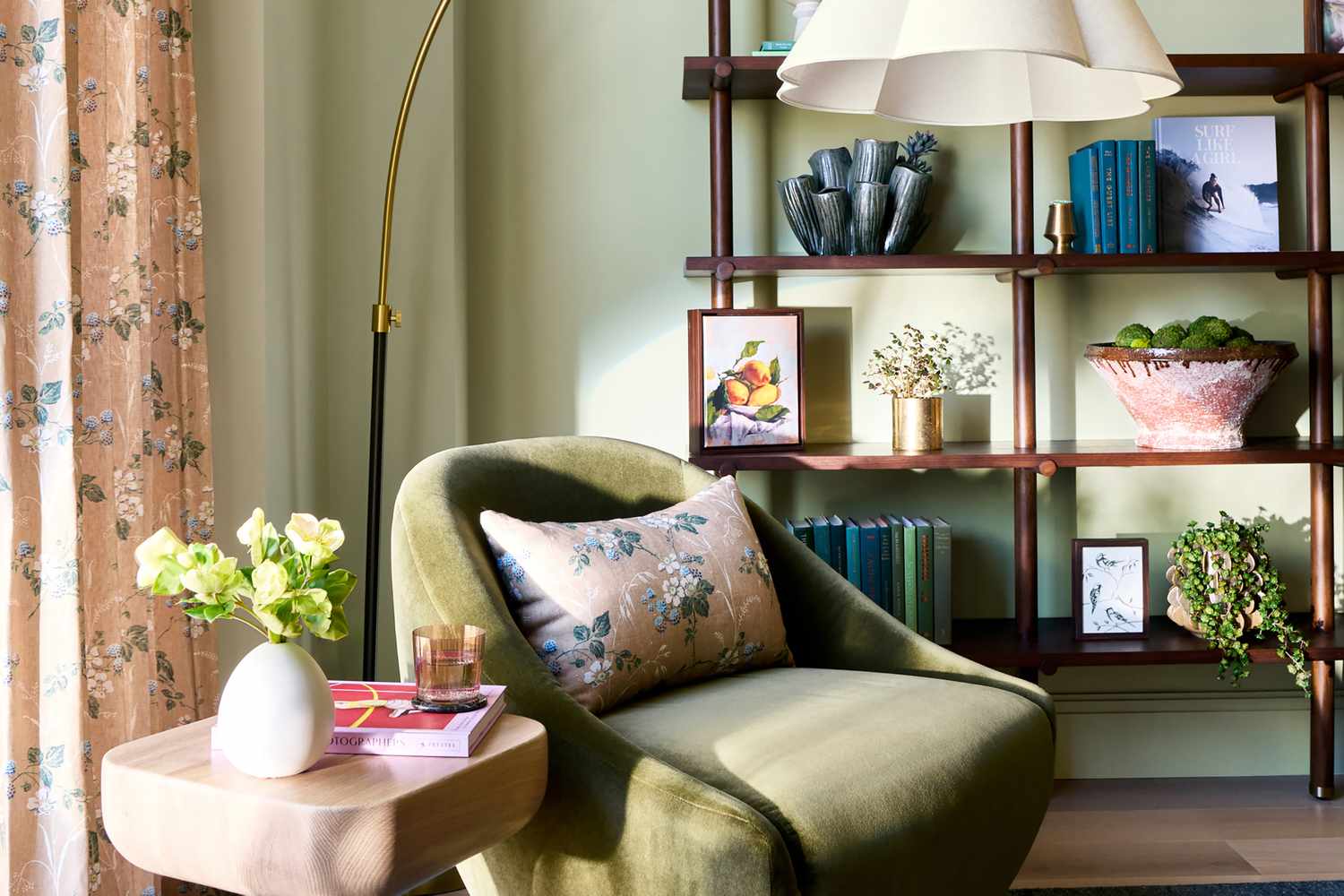
Pale green works because it carries an immediate connection to nature. It suggests leaves, gardens, herbs, and quiet mornings. Unlike brighter greens, a soft sage or muted botanical green does not overwhelm the room. It settles into the background while still giving the space identity.
In a study or guest room, pale green is especially smart. A study needs focus without feeling sterile. A guest room needs comfort without feeling bland. Pale green handles both jobs. Add wood furniture, rattan accents, linen bedding, warm white trim, or handmade ceramics, and the room starts to feel calm in a very believable waynot showroom calm, but “I could actually read a book here” calm.
This shade is also useful for homes that do not have easy indoor-outdoor flow. If you live in an apartment, a dense city, or a place where opening the windows invites traffic noise and mysterious smells, green can bring a little outdoor energy inside. It is a design shortcut to serenity, minus the mosquitoes.
4. Tan Brown: Texture, Depth, and Restful Drama
Alvin Wayne chose an earthy tan brown for the penthouse primary bedroom and used Venetian plaster to add texture. This is where the trend becomes especially interesting. Many people assume a room needs a bold color to feel dramatic. But Wayne’s approach shows that texture can create just as much impact as saturated color.
Tan brown is restful because it feels grounded. It connects to clay, sand, wood, leather, coffee, stone, and natural fibers. When used in a bedroom, it creates a cocoon effect without the heaviness of black, charcoal, or deep navy. Add the subtle movement of Venetian plaster, and the walls become dimensional rather than flat.
This is a key lesson for anyone decorating in 2025: paint color is only part of the story. Finish matters. Texture matters. Light matters. A simple earthy brown in a flat, poorly lit room may feel dull. But that same color in a plaster finish, paired with soft bedding, warm lighting, and sculptural furniture, can feel luxurious and deeply calming.
Tan brown also reflects the larger return of brown in interiors. After years of cool gray dominance, brown is back with better styling and fewer regrets. It feels mature, warm, and flexible. It pairs with cream, muted blush, olive green, terracotta, black, ivory, and even powder blue. It is no longer the forgotten color of old recliners. It is officially invited to the design party.
Why Designers Are Choosing Soft Earth Tones Over Plain White
White walls will always have a place in interior design. They can be crisp, gallery-like, and useful in spaces with strong architecture or colorful furnishings. But plain white is not always the safest choice. In many homes, especially new builds or rentals, stark white can make a room feel unfinished.
Soft earth tones solve that problem. They add warmth without clutter. They give rooms a finished look even before the final accessories arrive. They also make everyday materials feel more intentional: wood grain looks richer, woven baskets look more textural, brass looks warmer, and upholstery looks more layered.
Another advantage is emotional comfort. Many people are designing homes that support rest, focus, and well-being. A wall color cannot solve your inbox, your laundry pile, or the fact that someone keeps putting empty cereal boxes back in the pantry. But it can influence the atmosphere of a room. Earthy neutrals create visual softness, which can make a home feel less chaotic.
How to Use This 2025 Color Trend in Your Own Home
You do not need a penthouse, a design team, or a dramatic before-and-after reveal to use this trend. Earthy soft neutrals are refreshingly practical for real homes, including apartments, rentals, small houses, and rooms with awkward lighting.
Start With the Room’s Natural Light
Before choosing a color, study the room throughout the day. North-facing rooms may make colors look cooler, so creamy yellows, nude pinks, and warm browns can help balance the chill. South-facing rooms often receive warmer light, so pale greens and soft taupes may feel fresh without becoming too intense.
Always test samples on multiple walls. A paint chip in the store is not a promise; it is more like a first date. You need to see how the color behaves in your actual space before committing.
Pair Earthy Neutrals With Natural Materials
These colors shine when paired with materials that feel tactile and organic. Think oak, walnut, rattan, linen, cotton, wool, stone, clay, leather, plaster, and aged brass. A pale green room with rattan and wood feels serene. A nude pink office with dark brown furniture feels elegant. A yellowy cream living room with vintage art feels collected rather than staged.
Use Contrast to Keep the Room From Looking Flat
Soft neutrals need contrast. Without it, a room can look washed out. Add deeper tones through furniture, frames, lamps, rugs, or textiles. Cream walls look better with walnut or black accents. Nude pink becomes more sophisticated with chocolate brown or olive green. Tan plaster feels richer next to ivory bedding and dark wood.
Try the Color on Trim, Cabinets, or Ceilings
If you are nervous about painting all four walls, use the color strategically. A pale green ceiling can soften a bedroom. Nude pink trim can add charm to a hallway. Tan brown built-ins can ground a living room. Yellowy cream cabinets can warm up a kitchen without making it feel dated.
The best part of this trend is that it does not demand perfection. Earthy neutrals are forgiving, flexible, and easy to personalize. They are designed for homes with real lives happening inside them.
What This Trend Says About 2025 Interior Design
The 2025 REAL SIMPLE Home color choices reveal a bigger shift in how people want to live. The goal is no longer simply to make a room look impressive in a photo. The goal is to make a room feel good in daily life.
That is why earthy soft neutrals are so appealing. They offer comfort without boredom, color without chaos, and timelessness without stiffness. They work with vintage pieces, modern silhouettes, handmade objects, family heirlooms, and practical storage. They also give homeowners permission to move away from cold, generic spaces and toward rooms with warmth and personality.
This does not mean bold color is disappearing. Deep reds, blues, purples, and greens are still having a major moment. But even the bolder 2025 colors tend to feel grounded rather than artificial. The common thread is depth. People want colors that feel connected to food, soil, minerals, plants, spices, and memory.
Common Mistakes to Avoid With Earthy Soft Neutrals
Although this trend is easy to love, it can go wrong if the room lacks balance. The first mistake is choosing a color that is too close to the floor, sofa, and curtains. If everything is the same mid-tone beige, the room may feel muddy. Instead, layer light, medium, and dark shades.
The second mistake is ignoring undertones. Nude pink can lean peach, mauve, or beige. Cream can lean yellow or gray. Green can lean blue, gray, or olive. Brown can lean red, orange, or taupe. Undertones determine whether a color feels fresh, cozy, or accidentally “old basement.”
The third mistake is using cool lighting with warm paint. Bulbs that are too cool can make earthy colors look strange or dull. Warm white bulbs usually make these shades feel more inviting.
Finally, do not forget texture. Earthy neutrals come alive with woven rugs, matte ceramics, natural wood, linen curtains, and layered textiles. Without texture, even a beautiful color may feel flat.
Experience Notes: What It’s Like to Live With This Color Trend
One of the best things about earthy soft neutrals is that they do not feel like a trend once you live with them. They feel more like a better version of home. A yellowy cream living room, for example, changes throughout the day in a way bright white rarely does. In morning light, it can feel cheerful and clean. In the afternoon, it becomes warmer and more relaxed. At night, with lamps on, it turns cozy without making the room feel dark.
In my experience studying and writing about home design, the most successful rooms are rarely the ones built around a single dramatic choice. They are the rooms where every element quietly supports the next. Earthy soft neutrals make that easier. They allow a vintage coffee table, a striped pillow, a family photo, a modern lamp, and a slightly chaotic stack of books to coexist without looking random.
Nude pink is a great example. On paper, it sounds specific. In real life, it can be shockingly flexible. It softens black furniture, warms up white trim, and makes brass hardware glow. It also flatters natural fibers like jute, linen, and cane. People who are scared of pink often like it once they see it in a muted, plaster-like tone because it reads less like a “theme” and more like atmosphere.
Pale green has a different effect. It can make a room feel instantly calmer, especially when paired with wood. It is one of the easiest colors to use in a bedroom, guest room, or home office because it does not fight for attention. If you have ever tried to work in a room painted a color that feels too loud, you know the problem. The walls start participating in the meeting. Pale green politely stays in the background.
Tan brown may be the most underrated of the group. Many homeowners hesitate because brown has carried some outdated associations. But the newer browns are softer, warmer, and more refined. When used with texture, especially plaster or limewash-style finishes, tan brown can feel boutique-hotel calm. It is restful without being sleepy and dramatic without being theatrical.
The real-life benefit of these colors is that they age gracefully. Trendy colors can be exciting for a season and exhausting the next. Earthy soft neutrals have a slower rhythm. You can update the room with new pillows, art, lamps, or bedding without repainting immediately. That makes them practical for people who love design but do not want every home refresh to become a full weekend production involving painter’s tape, regret, and three emergency hardware-store trips.
Another lived-in advantage is how forgiving these colors are. They handle imperfect walls better than stark white. They make older furniture feel intentional. They help newer rooms feel less sterile. They also photograph well, which matters if you enjoy sharing your space online, but they still feel comfortable when the camera is gone and real life returns.
That is why the 2025 REAL SIMPLE Home color trend feels so useful. It is aspirational, but not unreachable. It gives homeowners a way to make their spaces warmer, calmer, and more personal without chasing every micro-trend. The result is a home that feels designed, but not overdesignedthe sweet spot where style meets actual living.
Conclusion
The surprising color trend chosen by four designers for the 2025 REAL SIMPLE Home is not surprising because it is strange. It is surprising because it is subtle. Earthy soft neutrals prove that quiet colors can have a strong point of view. Yellowy cream brings warmth, nude pink adds romance, pale green creates calm, and tan brown delivers depth and texture.
Together, these shades reflect where home design is heading: away from cold, generic interiors and toward spaces that feel grounded, personal, and emotionally comfortable. They are easy to live with, easy to layer, and flexible enough to support many styles. In a busy world, that may be the real luxurynot a room that screams for attention, but a room that welcomes you in and lets you breathe.