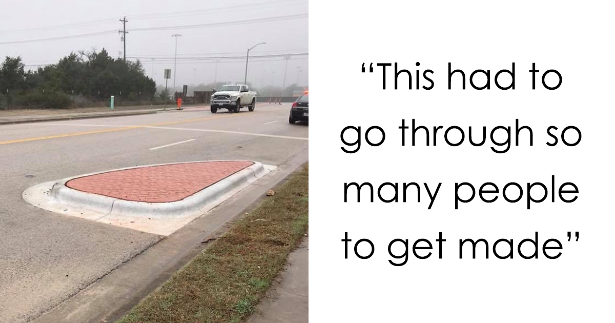
Great design quietly helps people get things done. Bad design loudly asks, “What could possibly go wrong?” and then answers its own question with an upside-down exit sign, an unusable staircase, or a children’s product that looks as though it was illustrated during an earthquake.
The internet’s most memorable design fails range from harmless visual accidents to products and spaces that are confusing, inaccessible, or genuinely unsafe. Collections built around the 186 Epic Design Fails We Can’t Believe Actually Happened theme demonstrate how one misplaced image, unfortunate line break, backward door, or untested feature can turn an ordinary object into accidental comedy.
These disasters are funny because the problem often seems obvious after the fact. Before production, however, a design may pass through sketches, meetings, revisions, approvals, manufacturing, installation, and quality checks without anyone viewing it as an actual user would. The result is a permanent monument to the sentence, “It looked fine on the computer.”
What Makes a Design Fail Truly Epic?
An ugly object is not automatically a design failure. Taste is subjective, and one person’s minimalist masterpiece is another person’s suspiciously expensive beige rectangle. A true design fail prevents a product, sign, room, package, or interface from doing its job properly.
Usability specialists generally emphasize visibility, consistency, familiar language, error prevention, feedback, and straightforward recovery when something goes wrong. When a design ignores several of those principles simultaneously, it stops being a small mistake and becomes an epic failure with excellent meme potential.
It Confuses the User
A restroom sign should identify a restroom. It should not require visitors to interpret an abstract dance performance composed of circles, triangles, and emotionally complicated stick figures. Likewise, a door should make it clear whether it must be pushed or pulled. When people repeatedly perform the wrong action, the problem may not be the people. The door might simply be auditioning for a career in psychological warfare.
It Prevents Normal Use
Consider a toilet-paper holder positioned where a user cannot comfortably reach it, a balcony facing a concrete wall, or a locker fitted with shelves that leave no room for a backpack. Each object technically exists. None performs its basic purpose without negotiation.
It Creates an Avoidable Risk
The funniest design mistakes become much less amusing when they can burn, trap, cut, shock, or trip someone. The U.S. Consumer Product Safety Commission recommends addressing hazards during the design stage, considering predictable misuse, and eliminating or guarding against risks rather than relying entirely on warnings.
The Most Common Categories of Hilarious Design Fails
Graphic Design That Says the Wrong Thing
Words and images are surprisingly dangerous roommates. A designer may intend a cheerful advertisement, but a badly placed photograph can cover half the headline and create a completely different message. A fold through one letter can transform a respectable company name into playground vocabulary. A line break can make a friendly slogan sound threatening, romantic, or medically concerning.
These errors often occur because layouts are evaluated at full size on a bright monitor instead of under real conditions. Nobody checks how the advertisement wraps around a bus, where a magazine staple lands, what portion of a banner will be hidden by a railing, or whether a social media crop removes the one word keeping the sentence respectable.
Typography fails deserve their own hall of shame. Decorative fonts may look elegant in a logo presentation but become unreadable on a distant sign. Excessively tight spacing can merge letters into new words. Poor contrast can make important information disappear. In public communication, clarity must win its argument with creativity.
Packaging That Betrays the Product
Packaging has several jobs: protect the product, explain what it is, communicate essential information, and help people use it. Bad packaging sometimes manages to fail all four before breakfast.
Transparent windows can interact with the product inside to create an unfortunate face or body part. Labels may be positioned across a cap or seam, causing essential words to vanish when the package is opened. Instructions may be printed in lettering apparently intended for ants with excellent vision. Some packages require scissors to access the scissors inside, creating a retail version of a locked-room mystery.
The consequences become more serious when similar containers hold very different products. Medication, household chemicals, food, and cosmetics need clear visual identities. Human-factors guidance from the FDA focuses on reducing use-related errors by designing products for intended users, environments, and foreseeable tasks. A package should not make a customer pause and wonder whether it contains eye drops, glue, or an aggressively branded energy shot.
Architecture That Appears to Dislike Humans
Architectural design fails are especially impressive because they require materials, labor, money, and several opportunities for someone to ask, “Should that staircase connect to anything?”
Classic examples include doors blocked by toilets, windows facing brick walls, support columns placed directly in front of seats, balconies without usable access, and stairs that lead confidently into ceilings. Then there are ramps that end at steps, handrails positioned beyond reach, and accessible routes interrupted by curbs or permanent obstacles.
Accessibility is not a decorative feature to be added after the attractive parts are finished. U.S. accessibility standards establish requirements intended to make facilities usable by people with disabilities, including provisions for routes, entrances, signage, ramps, and other building elements. A beautifully tiled ramp that leads nowhere is not inclusive design. It is an expensive slope.
Signs That Deliver Their Message Too Late
A sign must be visible, readable, understandable, and positioned where the information is useful. “Turn left” is excellent advice unless the sign appears five feet after the turn. “Low clearance” loses some value when mounted directly on the object that has already removed the top of a truck.
Road-sign guidance emphasizes legibility and comprehension with enough time for users to respond. That principle applies beyond highways. Airport directions, hospital wayfinding, parking instructions, warning labels, and building maps all fail when users must stop, squint, reverse direction, and form a small committee to interpret them.
Some signs are undermined by their surroundings. A “Do Not Block” notice may be hidden behind a cabinet. A directional arrow may point at two equally plausible hallways. A floor sign can become unreadable when people stand on itwhich, surprisingly, is something people often do to floors.
Products With Hostile Personalities
Product designers must account for hands, faces, gravity, heat, motion, cleaning, storage, and the remarkable human talent for using objects in unintended ways. Ignore any one of these variables and a simple household product can become an opponent.
Imagine a mug whose decorative handle presses against the drinker’s cheek, a bench that collects rainwater exactly where someone sits, or a kitchen utensil with a metal grip positioned beside the hottest surface. These objects may photograph beautifully. They simply become less charming when introduced to physics.
Furniture supplies another dependable source of bad design. Tables may contain crossbars that attack knees. Chairs may look comfortable while directing the sitter’s entire body weight onto one narrow edge. Transparent glass surfaces can disappear under certain lighting, causing users to discover them through the ancient testing method known as walking directly into them.
Digital Interfaces That Turn Simple Tasks Into Quests
Digital design fails lack the satisfying permanence of a staircase into a wall, but they can frustrate millions of people before lunch. Common offenders include tiny close buttons, hidden navigation, unlabeled icons, vague error messages, forms that erase all entered information, and confirmation buttons placed beside destructive actions.
A system should explain its current state, provide meaningful feedback, use familiar terms, and help people recover from mistakes. “Error 0x91F” does not help a customer understand why payment failed. Neither does “Something went wrong,” the digital equivalent of a mechanic opening the hood and announcing that the car appears unhappy.
Dark patterns make the situation worse by deliberately steering users toward subscriptions, data sharing, or purchases. The “accept” button may glow like a Broadway marquee while the refusal option is disguised as pale gray punctuation. The interface technically offers a choice, much as a magician technically offers you the freedom to select the card already hidden in his sleeve.
Accessibility Failures Are Design Failures
Low-contrast text, color-only instructions, missing labels, tiny touch targets, keyboard traps, and inaccessible entrances are not minor inconveniences. They can prevent people from obtaining information, entering a building, completing a purchase, or using an essential service.
Web accessibility guidance organizes good practice around content being perceivable, operable, understandable, and robust. Contrast guidance also emphasizes that users must be able to distinguish text and interface elements from their backgrounds. Apple and Mozilla similarly treat accessibility as a core design consideration rather than an optional finishing touch.
Accessible design frequently improves the experience for everyone. Captions help people in noisy places. Strong contrast helps users viewing a screen in sunlight. Clear labels assist rushed customers. Large controls help anyone carrying groceries, holding a baby, wearing gloves, or attempting to operate a phone with one clean finger while making dinner.
How Do So Many Obvious Mistakes Get Approved?
The Design Is Reviewed Without Context
A poster may look perfect as a flat file but fail when wrapped around a column. A bathroom layout may function in an architectural plan but become unusable after the door swing, plumbing fixtures, and wall-mounted accessories are installed. Context is not an inconvenience added to design. Context is the design.
Nobody Tests It With Real Users
Creators know what their work is supposed to mean, making them poor substitutes for first-time users. Once a designer knows that an icon represents “download,” it becomes difficult to see that everyone else thinks it resembles a flowerpot.
Testing does not always require a laboratory with two-way mirrors and dramatic clipboards. Asking a few representative users to find information, open a package, follow a sign, or complete a task can reveal major failures quickly. Good testing watches what people do rather than asking whether they “like the concept.”
Too Many People Improve It
Committee-driven design can combine incompatible requests until the result satisfies every stakeholder and no human being. One manager wants the logo larger. Another wants eight promotional messages. Legal adds three warnings. Marketing requests more excitement. The final poster contains 14 fonts and the visual confidence of a ransom note.
Production Changes the Original Design
A strong concept can collapse during manufacturing or installation. Colors shift. Images are stretched. Materials are substituted. Dimensions are rounded. A sign is mounted on the wrong wall because the installer never received the site plan. Every handoff creates an opportunity for a small assumption to become a large physical object.
Aesthetics Defeat Function
Designers understandably want work to look distinctive. Trouble begins when originality requires users to relearn familiar actions. A handle should look graspable. A button should look clickable. A warning should look important. Minimalism stops being elegant when it removes the information needed to operate the product.
What Good Designers Can Learn From 186 Bad Examples
The first lesson is wonderfully unglamorous: check the basics. Read every line aloud. View the design from the expected distance. Test folds, crops, reflections, shadows, door swings, hand positions, and screen sizes. Inspect the work in bright light, low light, motion, noise, and crowded conditions.
The second lesson is to communicate one important idea clearly. CDC communication guidance recommends putting essential information first, dividing content into manageable sections, using useful headings, avoiding unnecessary jargon, and positioning visuals near the information they support. Those principles work for websites, warnings, instructions, signs, and packaging.
The third lesson is to design for errors. People will tap the wrong control, approach from an unexpected direction, overlook an instruction, lose their glasses, carry something in one hand, or use a product while distracted. Good design accepts this reality and provides constraints, confirmations, undo options, guards, clear warnings, and safe recovery paths.
Finally, designers should evaluate success by observing whether people can use the resultnot by counting how many people approved the presentation. A successful design does not need to explain how clever it is. It simply works.
Conclusion and Experience Notes: What Design Fails Feel Like in Real Life
Design failures become memorable because users experience them as interruptions. A small mistake forces a person to stop, reconsider, experiment, or ask for help. One confusing door may waste only five seconds, but those five seconds contain an entire emotional journey: approach confidently, push, pause, pull, inspect hinges, question intelligence, glance around to see whether anyone witnessed the performance, and finally discover the tiny “slide” label near the floor.
Consider the experience of entering an unfamiliar medical building. The visitor may already be worried, late, or physically uncomfortable. A beautiful lobby offers no comfort when directional signs use inconsistent department names. One sign says “Imaging,” another says “Radiology,” and the elevator directory lists “Diagnostic Services.” Employees understand that these labels refer to related destinations. A patient sees three possible ways to miss an appointment.
Now imagine receiving a flat-pack product with instructions that contain only tiny illustrations. The first diagram shows six pieces floating in space. The second introduces a mysterious screw that was not included in the parts list. The third requires the builder to rotate the entire cabinet without explaining that it now weighs as much as a refrigerator. By step nine, the user has installed one panel backward, used the long screws where the short screws belonged, and developed strong personal opinions about anonymous Swedish illustrators.
Packaging failures create a different kind of experience. A shopper may purchase a bottle because the label looks clean and modern, only to discover that the cooking instructions were printed beneath an opaque flap. A parent may struggle with a supposedly child-resistant closure that is also adult-resistant, grandparent-resistant, and apparently resistant to several common tools. When opening the container becomes harder than using the product, packaging has mistaken obstruction for safety.
Digital frustrations are often quieter but more frequent. A customer fills out a lengthy form, presses “Submit,” and receives a red message stating that one field contains an error. The page does not identify the field. The user scrolls upward, hunting for a tiny red border among 30 boxes. When the missing item is finally found, the form refreshes and deletes half the answers. At that moment, the website is no longer a service. It is a test of whether the customer wants the service badly enough to begin again.
Accessibility problems reveal the deepest weakness in careless design: they transfer the cost of the mistake to the user. A step without an alternative route tells a wheelchair user to find another entrance. An unlabeled control asks a screen-reader user to guess. Pale text asks a person with low vision to enlarge, adjust, or abandon the content. The organization saves time during design, while users pay for that decision during every interaction.
The best real-world design experiences feel almost uneventful. The correct entrance is easy to find. The handle suggests the right movement. The sign appears before the decision point. The package opens without tools or rage. The website confirms progress, preserves information, and explains errors in ordinary language. Nobody takes a photograph because nothing ridiculous happenedand that is the quiet victory of competent design.
The 186 epic design fails may make us laugh, but they also provide an unusually effective education. Each backwards sign, blocked doorway, unfortunate advertisement, and hostile product demonstrates the same principle: design is not what an object looks like in isolation. Design is what happens when a person tries to use it.
A polished appearance can attract attention, but usefulness earns trust. Before approving the next brilliant concept, test it in context, invite unfamiliar users, examine failure scenarios, and ask the least glamorous question in the room: “Does this actually work?” That single question could prevent the next viral masterpiece from joining the internet’s ever-growing Museum of Unbelievable Decisions.