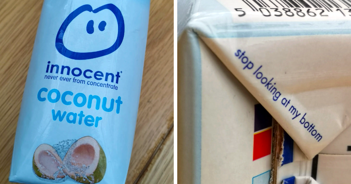
Everyday products are sneakier than they look. Your cereal box, sneakers, shampoo bottle, ice cream cup, delivery package, thrift-store sign, and even the tiny symbol on your phone may be quietly winking at you. Designers love hiding meaning in plain sight because it turns an ordinary product into a tiny treasure hunt. Once you spot the secret arrow, bear, number, smile, code, or clever visual pun, you cannot unsee it. Congratulations: your brain has joined the “wait, that was there the whole time?” club.
Hidden messages on everyday products are not always mysterious conspiracy fuel. Most are smart branding, practical labeling, visual storytelling, or safety information compressed into a tiny space. A good hidden message makes a product more memorable without shouting. A great one makes people point at a package in the grocery aisle and say, “No way.” Below are 35 genius hidden messages people didn’t expect to find on everyday products, logos, labels, and familiar objects we pass by constantly.
Why Brands Hide Messages in Everyday Products
Hidden messages work because humans are pattern-hunting machines. We like puzzles, faces, symbols, and “aha” moments. A logo or label with a secret detail rewards attention. It also makes the product easier to remember, which is branding gold. Instead of saying, “We are fast,” a company can tuck an arrow into negative space. Instead of saying, “We have variety,” a brand can hide a number inside two letters. It is cheaper than a billboard and much more fun than a corporate mission statement printed in twelve-point gray font.
35 Genius Hidden Messages People Didn’t Expect To Find
1. The FedEx Arrow
The FedEx logo is the celebrity of hidden messages. Between the “E” and “x,” the negative space forms a clean arrow pointing forward. It quietly suggests speed, direction, and precision. The brilliant part is that the arrow does not interrupt the logo. It simply waits there until someone ruins your peace forever by pointing it out.
2. The Amazon Smile From A to Z
Amazon’s arrow does double duty. It looks like a smile, reinforcing customer satisfaction, and it stretches from “a” to “z,” hinting that the store carries nearly everything. Tiny arrow, enormous retail ambition.
3. The Bear Inside Toblerone’s Mountain
Toblerone’s mountain logo is not just a mountain. Look closely and you will see a bear standing in the snowy shape. The detail nods to Bern, Switzerland, often associated with bears. It is a sweet little secret hiding on a chocolate bar, which is exactly where happiness belongs.
4. The “31” in Baskin-Robbins
Baskin-Robbins built its identity around the idea of 31 flavors, one for each day of the month. The modern logo keeps that history alive by forming the number 31 inside the “B” and “R.” It is a delicious reminder that variety is the whole point.
5. The Party Scene in Tostitos
In the Tostitos logo, the two lowercase “t” letters look like people sharing a chip over a bowl of salsa formed by the “i.” It turns a wordmark into a tiny snack party. Suddenly the logo is not just spelling chips; it is inviting you to bring friends.
6. The Hidden Kiss in Hershey’s Kisses
Between the “K” and “I” in the Hershey’s Kisses logo, the negative space resembles one of the famous chocolate drops. It is small, subtle, and perfectly on-theme. Basically, chocolate is hiding more chocolate. Respect.
7. Goodwill’s Smiling “G”
The Goodwill mark looks like a smiling face, but it also forms a lowercase “g.” The message fits the organization’s mission: dignity, opportunity, and positive change. It is one of those logos that gets warmer after you notice the trick.
8. Toyota’s Overlapping Ovals
Toyota’s emblem is more than three ovals. The inner shapes form a “T,” suggest a steering wheel, and represent the connection between the customer and the company. The outer oval suggests a wider world embracing the brand. Not bad for something most people only see while stuck behind a Camry at a red light.
9. LG’s Friendly Face
The LG logo uses the letters “L” and “G” to create a simple human face inside a circle. The result feels friendly and techy at once. It says, “Yes, this appliance has buttons, but it also has manners.”
10. Unilever’s Tiny Icon Universe
The Unilever “U” is packed with small icons: leaves, spoons, hair, fish, flowers, hearts, and other symbols connected to food, hygiene, beauty, wellness, and sustainability. It is less a letter and more a crowded apartment building for brand meaning.
11. NBC’s Peacock
NBC’s colorful mark is a peacock with spread feathers. The design became especially meaningful in the age of color television, when those feathers helped signal bright, modern broadcasting. The bird is not just decorative; it is practically saying, “Look, we have color!”
12. Pinterest’s Pin-Shaped “P”
The Pinterest “P” is shaped like a pushpin, matching the platform’s idea of pinning inspiration to digital boards. It is a tidy example of a logo doing exactly what the product does.
13. Beats’ Headphones in a Circle
The Beats logo looks like a lowercase “b,” but it also resembles a person wearing headphones when placed inside the circle. It is simple, bold, and perfectly matched to a product meant to live around your ears.
14. Cisco’s Bridge Lines
Cisco’s vertical lines are often read as digital signal bars, but they also echo the Golden Gate Bridge, tying the company to its San Francisco Bay Area roots. It is a neat blend of technology and place.
15. The Bluetooth Rune
The Bluetooth symbol is not random tech spaghetti. It combines ancient runic letters associated with Harald “Bluetooth” Gormsson, the king whose name inspired the wireless standard. A modern phone symbol secretly carrying Viking history? Very metal, very convenient.
16. The USB Trident
The USB symbol resembles a trident with different shapes at its tips. The message is versatility: one connection standard branching into many device possibilities. It is the tiny icon that says, “Plug me in and hope it works the first time.”
17. The Power Button’s 1 and 0
The universal power symbol combines a vertical line and a circle, inspired by binary 1 and 0: on and off. That little button on appliances, remotes, and laptops is basically computer language simplified into one neat icon.
18. Nike’s Swoosh of Speed
The Nike Swoosh is associated with motion, speed, and victory. It also connects naturally to Nike, the Greek goddess of victory. The mark is so simple that it almost feels like it ran past before you could question it.
19. Adidas’ Stripes and Mountain Energy
Adidas has used several famous marks, but the angled three-stripe performance logo is commonly read as a mountain-like challenge. The message fits sportswear: climb, train, push, repeat, complain briefly, then keep going.
20. BMW’s Bavarian Colors
Many people assume the BMW badge is only a spinning propeller. The deeper origin is tied to Bavaria’s blue-and-white colors and the company’s early identity. The logo carries history, geography, and a myth that became famous in its own right.
21. Hyundai’s Handshake
Hyundai’s slanted “H” is often described as two people shaking hands, symbolizing trust between company and customer. It looks like a letter, but it behaves like a miniature business agreement.
22. Levi’s Batwing Pocket Shape
Levi’s famous “batwing” mark echoes the stitched pocket shape on its jeans. It is a design cue pulled straight from the product itself, which is smart because jeans pockets are where people keep extremely important items, like receipts from 2021.
23. The North Face’s Half Dome
The North Face logo is inspired by Half Dome in Yosemite National Park. On jackets, backpacks, and outdoor gear, the curved mark quietly points to climbing, exploration, and nature.
24. Michelin Man’s Tire-Stack Body
The Michelin Man, also known as Bibendum, looks like a cheerful marshmallow bodybuilder, but his white rounded body originally represented stacked tires. Cute? Yes. Slightly surreal? Also yes.
25. Heinz 57’s Bottle Tap Trick
On classic Heinz glass ketchup bottles, the “57” on the neck is famously used as the sweet spot to tap when ketchup refuses to move. It turns a printed number into a practical message: do not assault the bottom of the bottle; tap here like a civilized condiment negotiator.
26. Egg Carton Julian Dates
Egg cartons often include a three-digit Julian date showing the day of the year the eggs were packed. For example, 001 means January 1 and 365 means December 31. It is a hidden freshness clue hiding beside the more obvious sell-by date.
27. Plastic Resin Codes
The numbers inside triangular symbols on plastic containers identify resin types. They are not simply “recycle me” decorations. They help sort materials such as PET, HDPE, PVC, LDPE, PP, PS, and other plastics. Tiny number, big sorting job.
28. Laundry Care Symbols
Those mysterious symbols on clothing tags are a secret instruction manual for washing, drying, bleaching, ironing, and dry cleaning. Ignore them and your sweater may return from the dryer as a doll cardigan.
29. The Open-Jar Symbol on Cosmetics
Many beauty products display an open-jar icon with a number such as 6M, 12M, or 24M. That means the product is generally intended to be used for that many months after opening. It is skincare’s polite way of saying, “Please stop using the mascara from college.”
30. ENERGY STAR’s Blue Label
The ENERGY STAR mark on appliances and electronics signals energy efficiency backed by a recognized program. It is not just a pretty blue badge; it tells shoppers the product meets efficiency standards designed to help reduce energy use.
31. The Recycling Mobius Loop
The three chasing arrows of the recycling symbol suggest a continuous cycle: collect, process, reuse. The hidden message is not “everything with this symbol is automatically recyclable everywhere.” It means consumers still need to check local recycling rules.
32. Barcode Check Digits
Barcodes look like boring grocery-store prison stripes, but they contain structured information. Many include a check digit used to verify that the code scans correctly. It is a tiny mathematical bouncer guarding the checkout lane.
33. Lot Codes on Food and Household Products
Lot codes on cans, boxes, cleaners, and packaged foods may look like random alphabet soup. In reality, they help manufacturers trace production batches, factories, and dates. When recalls happen, these codes become extremely important.
34. QR Codes as Hidden Doors
QR codes on packaging can lead to recipes, warranty pages, recycling instructions, authenticity checks, manuals, or promotions. The square pattern is a hidden doorway, though occasionally it opens into a coupon page that asks for your email, your birthday, and possibly your childhood pet’s shoe size.
35. “Best If Used By” Is Often About Quality, Not Panic
Food date labels are one of the most misunderstood hidden messages on everyday products. “Best if used by” usually refers to peak quality rather than an automatic safety deadline. The real message is: use judgment, storage knowledge, and common sense instead of tossing food the second midnight strikes.
What These Hidden Messages Teach Us About Smart Design
The best hidden product messages share one rule: they serve the product. FedEx’s arrow fits shipping. Baskin-Robbins’ 31 fits flavor variety. Tostitos’ snack-sharing scene fits party food. The cosmetic open-jar symbol fits product safety. Egg carton codes fit freshness. These details are not random decorations tossed in because a designer had too much coffee and access to vector software. They make the product easier to understand, remember, trust, or use.
They also show the power of negative space. Many genius hidden messages are created not by adding more, but by shaping what is already there. The FedEx arrow, Hershey’s Kiss, and Goodwill face all depend on the space between or inside letters. That is why they feel satisfying when discovered. Your brain completes the puzzle and rewards you with a small burst of design joy.
How to Spot Hidden Messages on Everyday Products
Start by looking between letters, inside shapes, and around empty spaces. Logos often hide clues where your eyes normally rush past. Next, rotate packaging or view it from a distance. Some symbols only make sense when you stop staring at them like a detective interrogating a soup can. Finally, read small labels. Packaging codes, care symbols, and icons are not always glamorous, but they may tell you how fresh, safe, efficient, washable, recyclable, or long-lasting a product is.
Another trick is to ask what the brand wants you to feel. A snack brand may hide sharing. A delivery company may hide motion. A technology brand may hide connection. A clothing company may echo stitching, pockets, fabric, or movement. Hidden messages are usually not random; they are compressed storytelling.
Personal Experiences With Hidden Messages on Everyday Products
Once you start noticing hidden messages on everyday products, shopping becomes slightly more dangerous. Not financially dangerous, although that can happen near the snack aisle. I mean attention dangerous. You go in for toothpaste and leave twenty minutes later holding a salsa jar, squinting at a logo, and whispering, “There has to be a tiny pepper in here somewhere.”
The first hidden message many people remember discovering is the FedEx arrow. It is the perfect gateway secret because it looks impossible after you see it. Before the reveal, it is just a shipping logo. After the reveal, the arrow practically wears a neon vest and directs traffic. That experience changes how you look at everything else. Suddenly empty space is suspicious. Letters are suspects. Packaging is evidence. The grocery store becomes a low-budget museum of commercial psychology.
Food packaging is especially fun because brands use playfulness to make ordinary products feel social. The Tostitos logo is a great example. Once you notice the two little people sharing chips and salsa, the bag feels less like a bag and more like a party invitation. Hershey’s Kisses does something similar, but with restraint. The hidden chocolate shape between letters does not yell for attention. It simply sits there like a tiny reward for anyone patient enough to look.
Practical hidden messages can be even more useful. Egg carton Julian dates are not glamorous, but they can help shoppers understand freshness better than vague assumptions. Laundry symbols can save clothing from tragic shrinkage. The open-jar symbol on cosmetics can prevent people from using products long after they should have retired. These small codes prove that hidden messages are not only clever; they can be genuinely helpful.
The funniest part is how emotional the discovery feels. Nobody plans to become attached to a logo secret, yet people do. They share it at dinner. They point it out in parking lots. They interrupt conversations with, “Did you know the Bluetooth symbol is Viking-related?” This is how design turns everyday life into trivia. It gives ordinary objects a second layer, and that second layer makes the world feel a little less boring.
The lesson is simple: look closer. Your kitchen, closet, bathroom shelf, electronics drawer, and refrigerator door are full of miniature messages. Some are brand jokes. Some are safety codes. Some are design history. Some are practical instructions pretending to be tiny hieroglyphics. Everyday products are not just things we use; they are things that communicate. And sometimes, they have been quietly talking to us the entire time.
Conclusion
Hidden messages on everyday products prove that great design does not always need to be loud. Sometimes the smartest idea is tucked between two letters, built into a symbol, hidden in a date code, or disguised as a friendly face. These details make products more memorable, more useful, and more fun to talk about. From the FedEx arrow and Toblerone bear to egg carton codes and cosmetic shelf-life icons, hidden messages show how much thought can fit into a tiny space.
The next time you pick up a snack bag, plug in a device, check a clothing tag, or open the fridge, pause for a second. There may be a clever little message waiting for you. And once you find it, good luck unseeing it.
SEO Tags
Note: This article synthesizes real examples from reputable brand, design, consumer-label, and public-information sources. Source links were intentionally excluded from the article body for clean web publishing as requested.