A kitchen can be practical, polished, and still have a small secret. Think of neutral cabinet doors as the sensible blazer of the room: tailored, versatile, and unlikely to embarrass you in front of future buyers. Then open a door andsurprisethere is a burst of jewel blue, cherry red, moss green, buttery yellow, or another color that makes unloading the dishwasher feel slightly less like a municipal obligation.
This is the charm of the two-toned kitchen with neutral cabinets on the outside and festive cabinet interiors. It is a design choice that gives homeowners the flexibility of timeless kitchen cabinetry while adding personality in a place that does not shout across the room. Your kitchen remains calm from the living area, but every cabinet opening delivers a tiny confetti cannon of color.
The idea works because it balances two things people often want at the same time: a kitchen that feels enduring and a home that does not look as though it was designed by a committee of beige throw pillows. With the right palette, materials, lighting, and paint finish, colorful cabinet interiors can make an ordinary kitchen feel custom, layered, and unexpectedly joyful.
Why Neutral Cabinets With Colorful Interiors Work So Well
Neutral kitchen cabinets have staying power for a reason. Warm white, cream, mushroom, taupe, greige, soft gray, natural oak, and light walnut work with many countertop materials, backsplash styles, hardware finishes, and flooring choices. They give a kitchen a flexible foundation, especially when the room connects to a dining area, family room, or open-concept space.
But a neutral kitchen does not have to mean a kitchen with the emotional energy of an airport waiting lounge. A festive cabinet interior adds contrast without overwhelming the room. Because the color is visible mainly when doors are open, it feels intentional rather than relentless. You get a playful detail that rewards use, not just admiration from across the island.
This approach also creates visual depth. Cabinet boxes are often treated as background players, but a painted interior gives them dimension. Glass-front cabinets become display cases. Open shelves become more dramatic. A bar cabinet feels more like a destination. Even a basic pantry can suddenly look like it has ambitions beyond storing six kinds of pasta.
The Best of Both Design Worlds
Traditional two-tone kitchens often use one cabinet color for upper cabinets and another for lower cabinets or an island. That remains a great option, especially for homeowners who want a stronger contrast in the room. However, neutral exteriors with colorful interiors offer a more subtle version of the same idea.
The outside color anchors the kitchen. The inside color provides personality. Together, they create a layered kitchen color scheme that feels collected instead of overly coordinated. You can think of it as wearing a classic coat with a bright lining: sensible on the sidewalk, interesting at the coat check.
Choose the Right Neutral for the Cabinet Exterior
The exterior cabinet color should support the rest of the kitchen before it supports your bold interior shade. Countertops, backsplash tile, flooring, appliances, and natural light all influence how a neutral reads. A cream cabinet can look rich and welcoming beside warm brass hardware, but it may look yellowish next to a cool gray quartz countertop. A pale gray cabinet can feel elegant in a bright room, yet unexpectedly blue in a north-facing kitchen.
Before committing to cabinet paint, test large samples on doors or removable boards. Move the samples around the kitchen throughout the day. Morning light, evening light, under-cabinet lighting, and pendant fixtures can all change the apparent color. Paint chips are helpful, but a tiny rectangle cannot always prepare you for the emotional roller coaster of realizing your “warm white” looks like melted vanilla ice cream at 8 p.m.
Reliable Neutral Cabinet Colors
These neutral cabinet directions work especially well when paired with festive interiors:
- Warm white: A creamy white exterior works beautifully with navy, terracotta, oxblood, emerald, or rich teal interiors.
- Soft greige: Greige cabinets provide a calm bridge between warm wood floors and cool stone countertops. Try an olive, plum, or muted mustard interior.
- Mushroom taupe: This sophisticated neutral has enough depth to support warm metallics and earthy interior colors like rust, clay, or deep forest green.
- Natural wood: Light oak, white oak, maple, and walnut cabinetry pair naturally with painted interiors because wood adds warmth without competing with color.
- Charcoal or soft black: Dark neutral cabinets can look striking with pale blue, warm ivory, burgundy, or brass-toned interiors, especially in a larger kitchen with good lighting.
How to Pick a Festive Cabinet Interior Color
The word “festive” does not require a neon rainbow or a cabinet interior that resembles a birthday party supply aisle. It simply means choosing a color that brings energy, warmth, or delight to the kitchen. The best interior cabinet colors often have some depth: saturated enough to feel special, but grounded enough to work with dishes, glassware, cookbooks, and everyday clutter.
Start by looking at colors already present in the kitchen. A veined marble countertop may contain soft gray, rust, green, or blue notes. A handmade backsplash tile may have a hidden gold undertone. A vintage rug might include cranberry, navy, or sage. Using one of those supporting colors inside the cabinets creates a deliberate connection rather than a random surprise.
Color Ideas for Painted Cabinet Interiors
Deep navy: Navy cabinet interiors add sophistication to white, cream, or pale wood cabinets. They make white dishes, clear glassware, and brass accessories stand out beautifully. Navy is especially effective in glass-front cabinets because it feels dramatic without making the room dark.
Forest green or olive: Green cabinet interiors work well with warm neutrals, natural wood, brass, aged bronze, and stone countertops. A softened olive feels earthy and timeless, while a deep forest green gives a more tailored, library-like mood.
Oxblood or muted burgundy: A wine-toned interior can make a neutral kitchen feel luxurious. It looks particularly good inside a bar cabinet, coffee station, butler’s pantry, or dish cabinet. Use it with warm white exteriors, dark wood, or soft black cabinetry for a rich, grown-up result.
Terracotta or burnt orange: These colors add warmth without becoming cartoonishly bright. Terracotta interiors complement cream cabinets, light oak, handmade tile, and brushed brass. They are excellent for kitchens that lean Mediterranean, Southwestern, modern rustic, or collected European.
Golden yellow or ochre: Yellow can be cheerful and elegant when it is slightly muted. Think buttery saffron, antique gold, or ochre rather than highlighter yellow. It pairs well with warm whites, walnut, deep green, and navy.
Dusty blue or muted teal: Blue interiors can feel calm, coastal, classic, or modern depending on the shade. A dusty blue works well in a cottage kitchen, while a smoky teal adds character to a more contemporary space.
Where a Colorful Cabinet Interior Makes the Biggest Impact
You do not need to paint every cabinet interior to make the idea work. In fact, choosing a few strategic locations often creates a more polished result. The goal is to give the color room to matter.
Glass-Front Cabinets
Glass-front cabinets are the obvious stars of this trend. Their interiors are always partially visible, which means the color becomes part of the kitchen’s overall composition. A rich navy behind white ceramic dishes can look crisp and classic. A deep green behind vintage glassware can feel collected and slightly old-world. A warm clay tone behind woven baskets and wood serving boards can make the kitchen feel instantly more welcoming.
The Coffee Station
A coffee cabinet is one of the easiest places to experiment with a bold interior. The doors are opened often, and the space is small enough that color feels exciting rather than risky. A burgundy or forest green interior can make your morning routine feel a little more intentional, even when you are operating on four hours of sleep and a questionable life plan.
The Pantry or Butler’s Pantry
Pantries deserve better than being painted the same dull white as a rental apartment hallway. A colorful pantry interior can make a utilitarian space feel cared for. Consider a warm yellow behind food storage containers, a muted blue behind glass jars, or an earthy green beside wood shelves. The color can make the pantry feel more like a small room than a giant box of cereal decisions.
The Kitchen Island
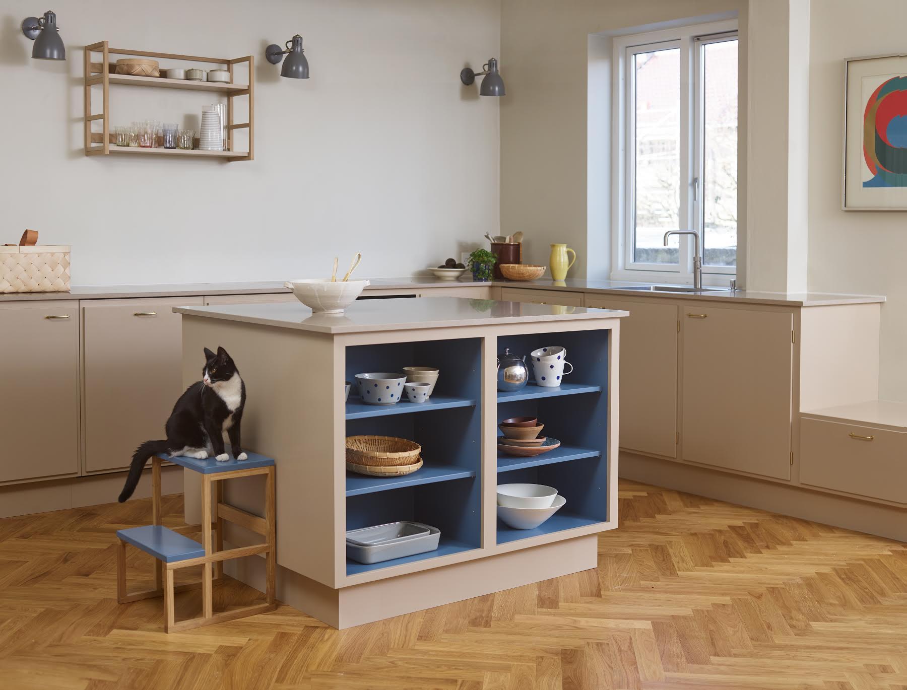
If your island has open shelving, glass doors, or display niches, a colorful interior can define it as a focal point. Keep the exterior neutral, then add a contrasting color inside the open areas. This is especially useful in open-concept kitchens because it creates interest without adding another dominant cabinet color to the room.
Balance Color With Materials, Hardware, and Lighting
A successful two-toned kitchen is not only about paint. The best spaces connect cabinet colors to materials and finishes throughout the room. Color should feel supported by its surroundings, not dropped into the cabinet box like a lost sock.
Warm metals such as brass, unlacquered brass, bronze, and antique gold work especially well with green, burgundy, terracotta, and navy interiors. Chrome and polished nickel tend to complement cool blues, clean whites, charcoal, and crisp gray-blue shades. Black hardware can bridge almost any palette, although it may look too graphic in a kitchen that already has many strong contrast points.
Lighting matters just as much. Interior cabinet lighting can make a colorful cabinet box look like a design feature rather than a shadowy cave. Soft LED strip lighting or puck lights are useful in glass cabinets, bar cabinets, and display shelving. Choose a warm light temperature for cream, wood, terracotta, olive, and burgundy palettes. Cooler lighting can work for blue-gray or contemporary white kitchens, but overly cool bulbs can make a warm, cozy color scheme feel like a refrigerator showroom.
Paint Finish and Durability: The Unsexy Part That Matters
Cabinet interiors are still working surfaces. Plates scrape shelves. Glassware shifts. Cereal boxes develop mysterious sharp corners. A beautiful color will not stay beautiful for long if it is applied over grease, dust, old varnish, or wishful thinking.
For painted cabinet interiors, use a durable cabinet-grade enamel or trim paint designed for high-touch surfaces. Clean and degrease cabinet boxes thoroughly before painting. Light sanding improves adhesion on glossy or previously painted surfaces, and a quality primer can help create a more even finish. Thin, even coats usually look better and hold up better than one heroic coat applied with the confidence of a home-renovation television host.
Finish choice affects both appearance and maintenance. Satin and semi-gloss finishes are common choices for cabinets because they are easier to clean than flat finishes. A satin sheen gives color a softer, more modern appearance, while semi-gloss reflects more light and can make the interior color feel brighter. In cabinets with glass doors, a satin finish often strikes a good balance between durability and visual calm.
Do Not Rush the Cure Time
Paint may feel dry long before it is fully cured. Give cabinet interiors enough curing time before loading them with dishes, cookware, or pantry goods. This is especially important on shelves, where the weight of plates and storage containers can leave marks in a finish that has not hardened completely. Patience is not glamorous, but neither is discovering that your serving platter has become permanently bonded to your new paint job.
Five Beautiful Neutral-and-Festive Kitchen Combinations
1. Cream Cabinets With Deep Green Interiors
This combination feels classic, warm, and slightly botanical. Pair cream cabinet doors with deep green interiors, aged brass pulls, warm white walls, and natural oak flooring. Use white dishes and clear glassware to keep the green visible and fresh.
2. White Oak Cabinets With Oxblood Interiors
White oak cabinetry gives the room a clean, natural foundation. An oxblood interior adds contrast and sophistication without becoming too formal. Add honed stone countertops, matte black or bronze hardware, and a few vintage-inspired accessories for a kitchen that feels modern but not sterile.
3. Soft Greige Cabinets With Dusty Blue Interiors
This is a calm, versatile palette for a transitional or coastal-inspired kitchen. The greige exterior keeps the room grounded, while dusty blue interiors add a quiet bit of color. Pair with brushed nickel, pale quartz, and a lightly patterned backsplash.
4. Mushroom Taupe Cabinets With Terracotta Interiors
For a warm, collected kitchen, use mushroom taupe outside and terracotta inside. The pairing works especially well with handmade tile, brushed brass, open shelving, and medium-tone wood floors. It feels worldly, relaxed, and like someone in the house owns a truly impressive olive oil collection.
5. Soft Black Cabinets With Butter Yellow Interiors
Dark neutral cabinets can feel dramatic and polished, but a buttery yellow interior keeps them from becoming too serious. Use this combination in a kitchen with generous natural light, pale countertops, and warm wood accents. It is bold without requiring every guest to wear sunglasses indoors.
Mistakes to Avoid With Colorful Cabinet Interiors
Ignoring undertones: A warm white exterior and a cool violet-blue interior can clash if the countertop and backsplash are also warm. Let the fixed finishes guide your color direction.
Using too many accents: If the cabinet interiors are colorful, the backsplash, island, walls, and rugs do not all need to audition for the same role. Pick one or two supporting accents and allow the cabinet interiors to remain the surprise.
Painting every hidden surface: Color is more effective when it has contrast. Consider painting only glass-front cabinets, open shelves, a coffee station, or the inside backs of selected cabinets.
Forgetting what will sit inside: White dishes look different against navy than they do against mustard. Test a sample board with the actual items you plan to display before choosing your final interior shade.
Choosing a color only because it is trending: Kitchen cabinets are not throw pillows. Choose a festive shade that works with your home’s architecture, your existing finishes, and the colors you genuinely enjoy seeing every day.
Experiences With the Neutral-Outside, Festive-Inside Kitchen
The first time people encounter a colorful cabinet interior, they usually do not notice it immediately. They see the neutral cabinets, the countertop, the backsplash, the pendant lights, and perhaps the suspiciously organized fruit bowl. Then someone opens a cabinet to grab a glass, and the room changes. There is often a pause followed by a delighted “Oh!” It is not a giant design gesture, but that is exactly why it works. The surprise feels personal.
One homeowner with soft white shaker cabinets chose a deep cobalt blue for the interior of two glass-front upper cabinets. From across the kitchen, the cabinets looked calm and traditional. Up close, the blue made plain white plates look almost sculptural. At night, when the cabinet lights were on, the color became richer and more dramatic. During the day, it looked fresh and crisp. The kitchen did not need a colorful backsplash or a bold island because the cabinet interiors had already done the entertaining.
Another approach works especially well in homes where the kitchen is visible from the main living area. A family with light oak cabinets wanted color but worried that dark green lower cabinets would make their open-plan room feel too heavy. Instead, they painted the interiors of their breakfast cabinet and pantry a muted olive green. The exterior stayed natural and quiet, but each time the doors opened, the kitchen gained personality. The olive also echoed leaves from the garden outside, creating a subtle connection between the interior and the view.
There is something satisfying about using color in a place that belongs to daily rituals. A brightly painted coffee cabinet can make the first sleepy reach for a mug feel less ordinary. A warm yellow pantry interior can make meal prep feel more cheerful, even when dinner is simply pasta, jarred sauce, and whatever vegetable is approaching its final hour in the refrigerator. A burgundy bar cabinet can turn pouring sparkling water for guests into a tiny ceremony.
The most successful colorful cabinet interiors are often the ones that feel intentional but not precious. They should be beautiful enough to make you smile and durable enough to survive real life. This means fingerprints, chipped mugs, moving day, children reaching for snacks, holiday cooking, and the occasional frantic search for the good serving platter five minutes before people arrive.
Colorful cabinet interiors can also grow with a home. A neutral cabinet exterior gives you room to change wall paint, hardware, stools, rugs, and decor over time. The interior color can remain a thread of personality instead of a rigid design rule. If your tastes evolve, repainting the inside of a cabinet is far easier than replacing an entire kitchen. It is a relatively small commitment with a surprisingly large emotional payoff.
In the end, this kitchen idea is not just about paint. It is about allowing a functional room to have a little hidden joy. Neutral exteriors keep the kitchen calm, flexible, and timeless. Festive interiors make it memorable. Every time you open a cabinet, you get a reminder that practical spaces do not have to be boring spaces. Even the cabinet holding the oatmeal can have a secret life.
Conclusion
A two-toned kitchen with neutral cabinets on the outside and colorful interiors on the inside is an elegant way to add personality without sacrificing versatility. Start with a neutral exterior that works with your countertops, flooring, backsplash, and lighting. Then choose an interior color that connects to the room’s materials and reflects your style. Whether you choose deep green, navy, burgundy, terracotta, mustard, or muted blue, the result can feel custom, warm, and delightfully unexpected.
Note: For the best result, test paint colors in your kitchen’s actual lighting, use a durable cabinet-grade finish, and allow painted surfaces to cure fully before loading shelves or displaying dishes.