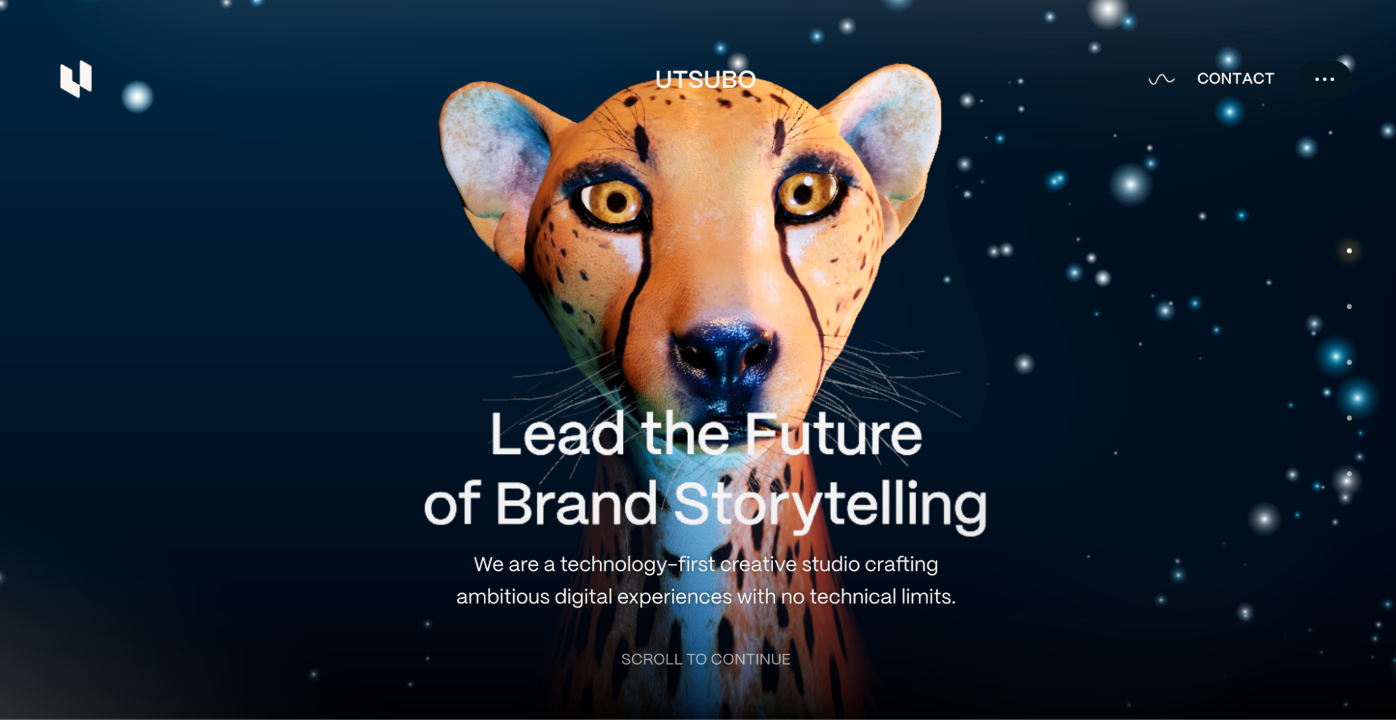
A high converting landing page is not magic, although when it works, it can feel like your website suddenly found a gym membership, a caffeine habit, and a sales coach. The truth is simpler: great landing pages remove confusion, build trust, and make the next step feel obvious. They do not try to impress everyone. They focus on one visitor, one promise, and one action.
Whether your goal is to sell a product, book demos, collect email subscribers, promote a webinar, or get people to start a free trial, the landing page has one serious job: turn traffic into measurable results. That means every headline, image, button, testimonial, form field, and section must earn its place. If it does not help the visitor say “yes,” it is probably just digital furniture.
In this guide, we will break down what every high converting landing page has, why those elements matter, and how six real-world-style examples show these principles in action.
What Is a High Converting Landing Page?
A high converting landing page is a standalone page built around a specific campaign goal. Unlike a homepage, which often introduces an entire brand, a landing page focuses on one offer. It might ask visitors to download a guide, request a quote, buy a product, join a waitlist, or schedule a consultation.
The best landing pages are not necessarily the prettiest. Beauty helps, of course, but conversion comes from clarity. A page with a crystal-clear message, believable proof, and a friction-free call to action will usually outperform a gorgeous page that makes visitors wonder, “Wait, what am I supposed to do here?” Confused visitors rarely convert. They click away, probably to check their email, then somehow end up watching a video about raccoons stealing cat food.
1. A Clear, Benefit-Driven Headline
The headline is the page’s handshake. It must tell visitors what the offer is and why they should care. A weak headline says something vague like “Innovative Solutions for Modern Teams.” That sounds polished, but it could describe software, office chairs, accounting services, or a very ambitious toaster.
A strong headline is specific. It speaks directly to the visitor’s desired outcome. For example, “Launch Your First Email Campaign in 10 Minutes” is stronger than “Powerful Email Marketing Platform.” The first headline gives a clear promise. The second simply waves a flag and hopes someone salutes.
How to improve your headline
Lead with the main benefit, not the feature. Use simple language. Avoid clever wordplay unless the meaning is instantly clear. Visitors should understand the offer within a few seconds. If they need to reread your headline three times, the conversion is already slipping away.
2. A Strong Subheadline That Explains the Value
The subheadline supports the headline by adding context. If the headline grabs attention, the subheadline answers the natural follow-up question: “How does this help me?”
For example, if the headline says, “Build Better Landing Pages Without a Developer,” the subheadline might say, “Use ready-made sections, built-in forms, and simple A/B testing tools to publish campaign pages faster.” Now the visitor understands the result and the mechanism.
A good subheadline should not become a mini novel. Keep it short, useful, and connected to the main offer. Think of it as the helpful friend standing next to your headline saying, “Here’s why this is worth your time.”
3. One Primary Call to Action
Every high converting landing page has a clear call to action, also known as a CTA. This is the button or link that tells the visitor what to do next. Examples include “Start Free Trial,” “Get My Quote,” “Download the Guide,” “Book a Demo,” or “Join the Webinar.”
The key is focus. A landing page should not ask visitors to download a guide, follow your Instagram, read your blog, browse careers, watch five videos, and subscribe to a newsletter all at once. That is not a landing page; that is a digital buffet. Buffets are fun for brunch, not for conversion strategy.
What makes a CTA convert?
A strong CTA is visible, action-oriented, and specific. “Submit” is technically a CTA, but it has the personality of a cardboard box. “Get My Free Checklist” or “See Pricing Plans” is clearer because it tells visitors what they receive after clicking.
For longer landing pages, repeat the same CTA throughout the page. The action should stay consistent, even if the button appears in multiple sections. This gives visitors several chances to convert without creating competing choices.
4. A Hero Section That Passes the Five-Second Test
The hero section is the area visitors see first, usually above the fold. It should quickly communicate three things: what you offer, who it is for, and what action the visitor should take.
A strong hero section usually includes a benefit-focused headline, a supporting subheadline, one CTA button, and a visual that reinforces the offer. The visual might be a product screenshot, a short demo image, a happy customer, or a before-and-after result. It should not be a random stock photo of people pointing at a laptop as if the laptop just told a joke.
If a visitor can glance at your hero section and understand the offer immediately, you are on the right track. If they have to scroll, decode jargon, or guess what the product does, the page needs work.
5. Trust Signals and Social Proof
People do not convert just because you say your offer is great. Every brand says that. Even the suspicious ones. Trust signals help visitors believe your promise.
Social proof can include testimonials, customer logos, star ratings, case study results, press mentions, security badges, certifications, review counts, or real customer outcomes. The best proof is specific. “This tool helped us increase qualified demo bookings by 31%” is stronger than “Great service!” The first gives substance. The second sounds like someone was being polite at a networking event.
Where to place trust signals
Place proof near moments of decision. Add customer logos near the hero section. Put testimonials close to the CTA. Include privacy reassurance near forms. If visitors feel uncertainty right before clicking, proof should be waiting there like a calm friend saying, “You’re good. This is legit.”
6. Simple, Scannable Copy
Landing page visitors rarely read every word from top to bottom. They scan. They jump between headings, bullets, buttons, visuals, and bold phrases. Your copy should respect that behavior.
Use short paragraphs, clear headings, bullet points, and benefit-focused language. Explain features through outcomes. Instead of saying “Advanced analytics dashboard,” say “See which campaigns drive leads, sales, and signups in one dashboard.” The feature is analytics. The benefit is knowing what is working.
Good landing page copy answers four questions: What is this? Why should I care? Can I trust it? What do I do next? If your page answers those questions clearly, you are already ahead of many pages that look expensive but convert like a sleepy vending machine.
7. Low-Friction Forms
Forms are where many conversions go to quietly disappear. A visitor may love the offer, trust the brand, and feel ready to act. Then the form asks for first name, last name, company, job title, phone number, budget, industry, employee count, favorite sandwich, and childhood nickname. Suddenly, the visitor remembers they have “something urgent” to do elsewhere.
Ask only for the information you truly need at that stage. For a free checklist, an email address may be enough. For a sales demo, name, email, company, and role may be reasonable. The higher the commitment, the more information you can request, but every extra field should have a reason.
How to make forms feel easier
Use clear labels, helpful error messages, and reassuring microcopy. Tell users what happens after they submit. For example, “We’ll send the guide instantly. No spam.” That small line can reduce anxiety and make the action feel safer.
8. Fast Load Speed and Mobile-Friendly Design
A slow landing page is like a salesperson who takes a nap before answering the door. Paid traffic, social clicks, and email visitors expect speed. If the page loads slowly, many visitors leave before they even see your brilliant headline.
Mobile design matters just as much. Buttons should be easy to tap, text should be readable, forms should be short, and images should fit the screen. A desktop design squeezed onto mobile is not optimization. It is a tiny obstacle course for thumbs.
Compress images, reduce unnecessary scripts, avoid clutter, and test the page on real devices. A high converting landing page should feel smooth whether someone visits from a laptop, tablet, or phone while standing in line for coffee.
9. Message Match Between Ad and Page
Message match means the landing page reflects the promise made in the ad, email, social post, or search result that brought the visitor there. If an ad promotes a “Free SaaS Pricing Template,” the landing page should immediately mention that exact template. Do not send visitors to a generic resources page and expect them to hunt for it like buried treasure.
Strong message match improves trust because the visitor feels they arrived in the right place. It also improves campaign performance because the page continues the conversation that started with the click.
10. Continuous Testing and Optimization
Even experienced marketers do not know with perfect certainty which headline, CTA, layout, or offer will perform best. That is why high converting landing pages are tested. A/B testing compares two versions of a page element to see which one performs better.
You can test headlines, hero images, button text, form length, testimonials, pricing presentation, page length, and offer framing. The goal is not to test randomly because “testing sounds fancy.” The goal is to create a clear hypothesis. For example: “If we change the CTA from ‘Submit’ to ‘Get My Free Plan,’ more visitors will complete the form because the value is clearer.”
Good landing page optimization is a cycle: research, build, launch, measure, learn, improve. Repeat until the page stops embarrassing your ad budget.
6 Examples of High Converting Landing Pages
Example 1: SaaS Free Trial Landing Page
A strong SaaS landing page usually focuses on speed to value. Imagine a project management tool with the headline “Organize Your Team’s Work in One Shared Dashboard.” The subheadline explains that teams can manage tasks, deadlines, files, and updates without chasing messages across five apps.
The page includes a product screenshot, customer logos, a short benefits list, and a CTA such as “Start Free Trial.” The form asks only for an email and password. This works because it reduces friction and lets the product demonstrate value quickly.
Example 2: Ecommerce Product Landing Page
An ecommerce landing page for a premium backpack might lead with “The Travel Backpack That Fits a Weekend Without Looking Like Camping Gear.” That headline speaks to a real desire: function without bulk.
The page shows lifestyle photos, close-up product details, customer reviews, shipping information, return policy, and a bold “Add to Cart” CTA. Trust signals such as free returns and verified reviews reduce purchase anxiety. The page converts because it answers both emotional and practical questions.
Example 3: Webinar Registration Landing Page
A webinar landing page should sell the outcome, not just the event. “Learn How to Cut Your Google Ads Waste in 30 Minutes” is more compelling than “Marketing Webinar.” The page should include the date, time, speaker credibility, key takeaways, and a simple registration form.
The best webinar pages make the value feel immediate. Bullet points such as “Find budget leaks,” “Improve landing page relevance,” and “Write CTAs that attract qualified clicks” show visitors exactly what they will learn.
Example 4: Lead Magnet Landing Page
A lead magnet page promotes a free resource such as a checklist, template, calculator, or guide. The offer must feel useful enough to trade an email address for it. A strong headline might say, “Download the 12-Point Landing Page Audit Checklist.”
The page can include a preview image of the checklist, a short explanation of who it is for, three to five benefits, and a form with one or two fields. This type of page converts well when the resource solves a specific problem quickly.
Example 5: Local Service Landing Page
A local service page, such as one for an HVAC company, law firm, clinic, or home contractor, needs trust fast. Visitors often arrive with urgent intent. The headline should match that intent, such as “Book Same-Week AC Repair in Phoenix.”
The page should include service area, reviews, license or certification details, phone number, simple booking form, and clear expectations. For local businesses, credibility and convenience are everything. Visitors want to know: Are you real? Are you near me? Can you help soon?
Example 6: Consultation or Demo Landing Page
A demo landing page is common for B2B software, agencies, consultants, and high-ticket services. The best ones do not simply say “Book a Call.” They explain why the call is worth the visitor’s time.
A stronger approach might be: “See How Much Revenue Your Funnel Is Leaking.” The page can include a short form, outcome-focused bullets, case study snippets, and a note explaining what happens during the call. The CTA might say “Schedule My Funnel Review.” This is more persuasive because it frames the demo as useful, not just salesy.
Common Landing Page Mistakes That Lower Conversions
The first mistake is trying to say everything. A landing page is not a company encyclopedia. It should include enough information to support the action, not every paragraph ever approved by the marketing committee.
The second mistake is weak proof. Generic testimonials and vague claims do not carry much weight. Specific proof, real customer language, and measurable outcomes create more confidence.
The third mistake is visual clutter. Too many colors, buttons, animations, pop-ups, and competing sections can overwhelm visitors. Good design guides attention. Bad design throws confetti into the decision-making process.
The fourth mistake is ignoring mobile. If the page is beautiful on a 27-inch monitor but painful on a phone, it is not finished. It is half finished with excellent posture.
The fifth mistake is failing to test. Launching one version and never improving it leaves money on the table. Even small changes to CTA wording, form length, or headline clarity can affect conversion rate.
Extra Experience: Practical Lessons From Building High Converting Landing Pages
One of the biggest lessons from working with landing pages is that the audience usually tells you what matters if you pay attention. Marketers often want to lead with the feature they are proudest of. Customers, however, care about the problem they want solved. That difference sounds small, but it changes everything.
For example, a software company may be excited about its “AI-powered workflow automation engine.” That sounds impressive in a product meeting. But a tired operations manager may care more about “Stop spending Friday afternoon copying data between spreadsheets.” The second message feels human. It connects to a real pain. High converting landing pages translate product language into customer language.
Another practical lesson: the first version of a landing page is usually a smart guess, not a final answer. Even when the strategy is strong, real users may surprise you. A headline you love may underperform. A button you thought was boring may win because it is clearer. A long page may beat a short page because the offer needs more explanation. Or a short page may win because visitors already understand the value and just need a fast path to action.
That is why analytics matter. Look at scroll depth, click maps, form starts, form completions, traffic source, device type, and conversion rate by audience segment. If many visitors reach the form but do not submit, the form may feel too demanding. If visitors leave before scrolling, the hero section may not be clear enough. If mobile traffic converts poorly, the issue might be layout, load speed, button size, or form usability.
It is also important to match the landing page to the temperature of the traffic. Cold traffic from ads may need more education, proof, and reassurance. Warm traffic from email may need fewer explanations and a stronger direct CTA. Returning visitors may respond well to urgency, comparison, or pricing clarity. Treating every visitor the same is convenient for the marketer but not always persuasive for the customer.
One underrated tactic is listening to sales calls, support tickets, reviews, and customer emails before writing the page. These sources contain phrases real buyers use. If customers keep saying, “I just want something easy to set up,” that phrase should influence the landing page copy. If prospects keep asking whether onboarding is included, answer that question directly on the page. Great landing page copy often comes from customers, then gets polished by marketers.
Design also works best when it supports the message instead of competing with it. A clean layout, strong contrast, generous spacing, and clear visual hierarchy can make even complex offers feel easier to understand. The goal is not to decorate the page. The goal is to guide the visitor’s eyes from problem to promise to proof to action.
Finally, conversion is not about tricking people. The best landing pages convert because they help the right people make a confident decision. They are honest, focused, useful, and easy to use. When a page respects the visitor’s time and clearly explains the value, clicking the CTA feels natural. That is the real secret. No wizard robe required.
Conclusion
A high converting landing page is built with intention. It has a clear headline, a focused offer, one primary CTA, persuasive proof, scannable copy, simple forms, fast mobile performance, strong message match, and a testing mindset. Each element works together to reduce doubt and increase confidence.
The best landing pages do not shout. They guide. They show visitors why the offer matters, why the brand can be trusted, and what to do next. Whether you are building a SaaS free trial page, ecommerce product page, webinar registration page, lead magnet page, local service page, or demo booking page, the same principle applies: make the next step obvious and worth taking.
Note: This article is written for web publishing in standard American English and is based on synthesized landing page optimization, UX, CRO, and digital marketing best practices.