Dashes Navy Wallpaper is the kind of wallcovering that quietly walks into a room, straightens its little patterned tie, and says, “Relax, I’m stylish but not trying too hard.” With its painterly dash marks, deep navy color, and handcrafted energy, this wallpaper sits beautifully between classic and modern. It feels coastal without hanging a ship wheel on the wall. It feels artistic without turning your powder room into a museum gift shop. Most importantly, it gives a room character without shouting over the furniture.
Navy wallpaper has become a favorite for homeowners, renters, designers, and anyone who has ever stared at a blank wall and whispered, “You need a personality.” The beauty of a dash pattern is its rhythm. It is simple enough to work like a textured solid, but lively enough to keep a space from feeling flat. In other words, it is the wallpaper equivalent of a crisp white shirt with excellent shoes.
What Is Dashes Navy Wallpaper?
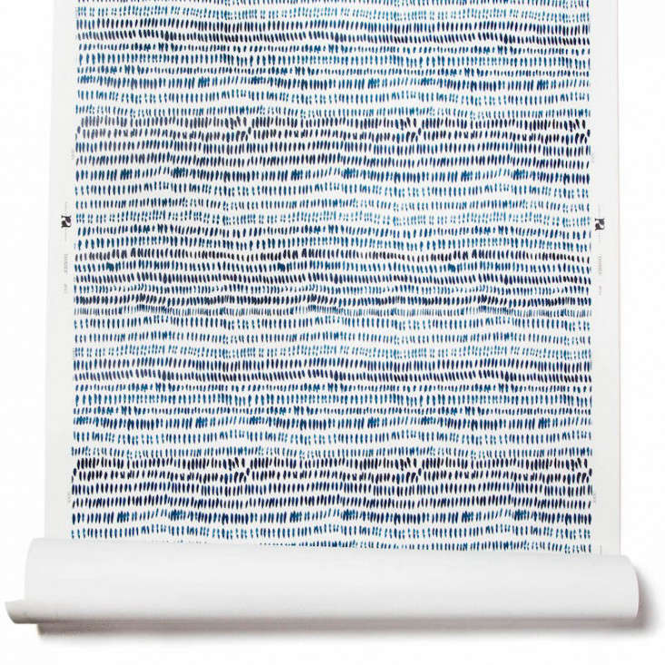
Dashes Navy Wallpaper typically refers to a navy blue wallcovering decorated with small, irregular dash marks. The look may be hand-painted, brushstroke-inspired, geometric, abstract, or subtly coastal depending on the designer and scale. One of the best-known versions is Rebecca Atwood’s Dashes Wallpaper in Navy, a design that began as a sketchbook mark-making experiment and grew into a polished yet organic wallcovering.
The appeal comes from contrast: a strong navy ground paired with lighter dashes creates movement without chaos. Unlike large florals or dramatic murals, dash wallpaper does not demand the whole room kneel before it. It plays nicely with wood, brass, linen, rattan, white trim, cream upholstery, leather seating, and even brighter accents like coral, mustard, soft pink, or green.
Why Navy Works So Well on Walls
Navy blue has unusual decorating superpowers. It is dark, but not gloomy when balanced well. It is colorful, but can behave like a neutral. It can make a bedroom feel restful, a home office feel focused, a dining room feel tailored, or a powder room feel like a tiny boutique hotel where the hand soap is suspiciously expensive.
Designers often use navy because it adds depth and structure. White walls can feel open and airy, but navy creates a backdrop. It frames artwork. It sharpens trim. It makes metallic finishes sparkle. A navy dash wallpaper adds even more softness because the repeated marks break up the darkness. Instead of one flat wall of deep blue, you get a surface with motion, texture, and a handmade mood.
The Design Personality of Dash Patterns
Dash patterns are wonderfully flexible. They can read as modern, coastal, playful, preppy, organic, or minimalist depending on what surrounds them. In a nursery, dashes feel sweet and whimsical. In a powder room, they feel fresh and designer-approved. In a bedroom, they add quiet movement behind a headboard. In an entryway, they make an immediate first impression without requiring a chandelier the size of a weather balloon.
Small Marks, Big Impact
The reason a dash pattern works so well is scale. Small repeated marks create a visual texture similar to grasscloth, ticking stripes, or block-printed fabric. From far away, the pattern may feel almost like a woven surface. Up close, the hand-drawn quality becomes more visible. That two-level effect makes Dashes Navy Wallpaper more interesting than a plain navy wall but easier to live with than a very bold print.
A Pattern That Does Not Date Quickly
Trends come and go, and some wallpaper patterns announce the year they were installed with the confidence of a dated prom photo. Dashes are safer. They belong to the family of simple marks, lines, dots, and painterly motifs that have been used in textiles and interiors for generations. The navy-and-light contrast also keeps the design crisp and timeless.
Best Rooms for Dashes Navy Wallpaper
Dashes Navy Wallpaper can work in more spaces than many people expect. The secret is deciding how much drama you want and how much natural light the room receives.
Bedroom Accent Wall
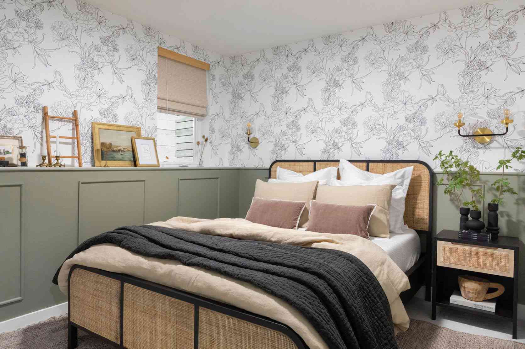
Behind a bed, navy dash wallpaper creates a natural focal point. It gives the headboard wall depth and makes bedding look more intentional. Pair it with white sheets, a cream duvet, warm wood nightstands, and brass lamps for a look that says “calm adult bedroom” even if your laundry chair strongly disagrees.
Powder Room
Powder rooms are ideal places to be brave. Because the space is small and used briefly, a darker wallpaper feels jewel-box-like instead of overwhelming. Dashes Navy Wallpaper pairs beautifully with a white pedestal sink, marble vanity top, unlacquered brass mirror, or matte black hardware.
Home Office
A navy dash pattern gives a home office focus and polish. It looks especially good behind floating shelves, a writing desk, or a video-call background. The pattern adds visual interest without becoming distracting. Your coworkers may not know what changed, but they will suddenly assume you own a very organized calendar.
Entryway or Hallway
An entryway benefits from wallpaper because it sets the tone quickly. Navy dashes can make a narrow hall feel designed rather than forgotten. Add a runner, a simple console, a mirror, and a lamp, and the space becomes a proper welcome zone instead of a shoe traffic jam.
Kids’ Room or Nursery
Dash wallpaper is playful without being babyish. That matters because children grow faster than design themes. A navy dash wall can work with a crib, a twin bed, bunk beds, or a study corner later. Add natural baskets, colorful art, and soft textiles for a room that feels cheerful but not chaotic.
How to Style Dashes Navy Wallpaper
The best styling approach is to treat the wallpaper like a patterned neutral. Let it provide rhythm, then layer in materials and colors that keep the room balanced.
Pair It With White and Cream
Navy and white is a classic combination for a reason. White trim, cream bedding, ivory curtains, or a white vanity can keep the deep blue feeling fresh. The contrast also helps the dash pattern stand out cleanly.
Add Warm Wood
Wood prevents navy from feeling cold. White oak, walnut, maple, cane, and rattan all work well with navy wallpaper. A natural wood dresser or woven chair introduces warmth and texture, which makes the room feel layered instead of overly coordinated.
Use Brass, Gold, or Bronze Accents
Metallic finishes look wonderful against navy. Brass sconces, a gold-framed mirror, bronze cabinet pulls, or a warm metal picture light can add glow. The trick is restraint. A little shine is elegant; too much shine and suddenly the room is auditioning for a yacht catalog.
Bring in Soft Color
Navy plays well with blush, dusty rose, sage green, muted coral, ochre, rust, sky blue, and lavender. These colors soften the seriousness of navy while keeping the palette sophisticated. Try them in pillows, artwork, lampshades, flowers, or a patterned rug.
Choosing the Right Wallpaper Type
Before buying Dashes Navy Wallpaper, check the material, installation method, repeat, width, and ordering format. Some designer wallpapers are traditional clay-coated papers sold by the linear yard. Others are peel-and-stick panels, prepasted rolls, or removable wallpapers designed for renters and DIY projects.
Traditional Wallpaper
Traditional wallpaper often gives the most tailored finish, especially for a high-end pattern. It may require paste, trimming, booking time, careful seam matching, and professional installation. If the wallpaper is untrimmed or has a selvedge edge, an installer may need to table-trim it before hanging. This is not the moment to grab kitchen scissors and confidence. Hire a pro when the product calls for it.
Peel-and-Stick Wallpaper
Peel-and-stick wallpaper is popular because it is removable, renter-friendly in many cases, and less messy than pasted paper. It can be a great choice for accent walls, temporary spaces, dorms, apartments, or people who enjoy decorating but fear commitment more than assembling flat-pack furniture. Still, peel-and-stick wallpaper needs clean, smooth walls and patient installation.
Prepasted Wallpaper
Prepasted wallpaper has adhesive already applied to the back and is activated with water. It can be easier than unpasted wallpaper but still requires careful measuring, smoothing, and matching. Always follow the manufacturer’s instructions because wallpaper is not one-size-fits-all.
Measuring for Dashes Navy Wallpaper
Measuring is where many wallpaper projects go from “fun weekend update” to “why is there one sad strip missing by the door?” Start by measuring the width and height of each wall you plan to cover. Then consider the wallpaper width, the vertical repeat, the pattern match, trimming waste, windows, doors, and mistakes. Yes, mistakes count. They are part of the human experience.
Order more than the exact square footage. Pattern repeat can create waste because each strip must line up with the next. If your wallpaper is printed to order, order enough at one time to avoid color variation between batches. If using a designer paper sold by the yard, ask your installer to calculate the amount in linear yards rather than square feet.
Installation Tips for a Better Finish
Good wallpaper installation is mostly preparation wearing a tool belt. The wall should be clean, dry, smooth, and properly primed if required. Holes should be filled. Bumps should be sanded. Outlet covers should be removed safely. A plumb line should be drawn so the first strip hangs straight. Starting crooked and hoping it fixes itself is a bold strategy, but walls rarely respect optimism.
Prepare the Wall
Wallpaper sticks best to smooth surfaces. Heavy orange-peel texture, dust, fresh paint that has not cured, or old wallpaper underneath can lead to bubbling and peeling. Wipe the wall clean and let it dry completely. For bathrooms or humid areas, confirm the wallpaper is suitable for that environment.
Match the Pattern Before Cutting
Lay out strips and check how the dashes align. A straight match means the pattern lines up horizontally across strips. Even with an organic dash design, matching matters because the eye notices broken rhythm at seams.
Use the Right Tools
Helpful tools include a measuring tape, level, pencil, sharp utility knife, smoothing tool, metal ruler, sponge, step stool, and patience. Patience is not sold in the wallpaper aisle, unfortunately, but it should be.
Common Mistakes to Avoid
The first mistake is skipping the sample. Always order a swatch if possible. Navy can look different in morning light, evening light, LED light, and that one mysterious corner where every color turns slightly weird. A sample helps you see the real color, texture, and scale.
The second mistake is choosing the wrong wall. A busy wall with multiple windows, doors, built-ins, vents, and outlets may interrupt the pattern too much. For a feature wall, choose the wall seen first when entering the room or the wall behind the main furniture piece.
The third mistake is under-ordering. Wallpaper math can be humbling. Pattern repeat, trimming, and mistakes require extra material. If the paper is custom printed, getting more later may not be simple or perfectly matched.
The fourth mistake is rushing the seams. Seams are where the magic either happens or files a complaint. Work slowly, smooth bubbles outward, and use a sharp blade for clean cuts.
Is Dashes Navy Wallpaper Worth It?
For many spaces, yes. Dashes Navy Wallpaper delivers pattern, color, and texture in a way that feels livable. It is bold enough to transform a room but restrained enough to pair with many decorating styles. It can dress up a small powder room, calm a bedroom, sharpen an office, or make an entryway feel finished.
The key is choosing the right product for your space and skill level. A high-end traditional paper may be best installed professionally. A peel-and-stick version may be better for renters or smaller DIY projects. Either way, the design itself is versatile, classic, and full of quiet charm.
Real-Life Experience: Living With Dashes Navy Wallpaper
There is something surprisingly satisfying about seeing Dashes Navy Wallpaper go from sample square to full wall. A tiny swatch gives you a hint, but once the pattern repeats across a room, the effect becomes much richer. The navy background creates depth, while the dash marks keep everything from feeling too heavy. It is like adding a tailored jacket to a room that was previously wearing a plain T-shirt.
In a small powder room, the transformation can feel almost instant. Before wallpaper, the room may look clean but forgettable. After navy dash wallpaper, the same sink, mirror, and light fixture suddenly look intentional. Guests notice. Some may even say, “I love this wallpaper,” which is the home-decor equivalent of applause. The room feels designed, not decorated in a panic twenty minutes before people arrived.
In a bedroom, the experience is calmer. Behind a bed, the pattern adds depth without demanding loud bedding or dramatic furniture. White sheets look brighter. Wood nightstands look warmer. A simple lamp looks more expensive than it probably was. The dash marks soften the navy so the wall feels cozy rather than cave-like. It is especially nice in the evening, when warm light makes the navy feel restful and enveloping.
One practical lesson: lighting matters. In bright natural light, navy dash wallpaper can look crisp, graphic, and almost coastal. In a room with limited light, it becomes moodier and more intimate. Neither is wrong, but the same wallpaper can behave differently from room to room. That is why testing a sample on the actual wall is not optional. Tape it up, look at it in the morning, afternoon, and night, then decide whether the navy is giving “elegant depth” or “lost submarine.”
Another lesson is that accessories should not fight the wallpaper. Because the pattern already brings movement, the best styling pieces are usually simple: a clean-lined mirror, solid curtains, textured baskets, linen bedding, a plain Roman shade, or artwork with breathing room. Too many competing patterns can make the room feel busy. But one or two companion patterns, such as a striped pillow or a vintage rug, can look fantastic if the colors connect.
Installation also teaches humility. Even a simple dash pattern requires careful alignment, straight lines, and sharp trimming. If using peel-and-stick wallpaper, it helps to peel the backing slowly and smooth as you go. If using traditional paper, professional installation can be worth the cost, especially with designer paper sold by the yard or paper that requires trimming. Wallpaper rewards patience. It does not reward “let’s just eyeball it.”
Long-term, Dashes Navy Wallpaper is easy to live with because it does not feel like a novelty. Some wallpapers are exciting for two weeks and exhausting by month three. This kind of pattern has staying power. It adds personality, but it also fades into the rhythm of daily life in the best way. You notice it when the room looks beautiful, but it does not interrupt every cup of coffee, bedtime routine, or Zoom call.
The biggest experience-related tip is to let the wallpaper lead, but not dominate. Use it as the anchor, then build the room around texture, contrast, and comfort. Add something woven, something warm, something light, and something personal. A navy dash wall with a family photo, a brass sconce, a wood frame, or a vase of branches feels collected instead of showroom-stiff.
Ultimately, Dashes Navy Wallpaper works because it solves a common decorating problem: how to make a room feel special without making it feel overdecorated. It is graphic but gentle, classic but current, polished but still playful. That is a rare combination. And frankly, any wallpaper that can make a tiny hallway, a shy bedroom, or a plain powder room feel like it finally found its voice deserves a little respect.
Conclusion
Dashes Navy Wallpaper is a smart choice for anyone who wants a wallcovering with depth, movement, and long-term style. Its navy color brings sophistication, while the dash pattern adds a handmade, approachable feel. It works in bedrooms, powder rooms, offices, nurseries, hallways, and entryways because it can shift from playful to polished depending on the styling.
For the best result, order a sample, study the scale, measure carefully, and choose the installation method that suits your space. Pair the wallpaper with white, cream, warm wood, brass, soft color, and simple textures. The result is a room that feels layered, charming, and quietly confidentbasically the interior-design version of having your life together, even if there are snacks hidden in the desk drawer.