Flat vector art has its place. Sometimes you want clean geometry, sharp edges, and colors so tidy they could host a dinner party. But other times your artwork needs a little grit, warmth, or handmade charm. That is where texture comes in. Adding texture in Adobe Illustrator can make artwork feel more tactile, more dimensional, and frankly, a lot less like it was raised in a sterile laboratory.
If you have ever looked at a poster, logo, badge, character illustration, or product graphic and thought, “This is nice, but it feels suspiciously perfect,” texture is often the missing ingredient. A good Illustrator texture can make digital work feel printed, inked, stamped, chalked, brushed, weathered, or lovingly roughed up by a designer who drinks coffee from a chipped mug and owns at least one black turtleneck.
In this guide, you will learn how to add texture to artwork in Adobe Illustrator using several reliable methods: raster texture overlays, opacity masks, clipping masks, scatter brushes, built-in effects like Grain and Roughen, and vector texture workflows. You will also see when to use each method, what mistakes to avoid, and how to keep your textured artwork looking intentional instead of accidentally dirty. There is a difference, and Illustrator will absolutely expose you if you wing it.
Why Texture Matters in Illustrator
Illustrator is a vector-first app, which is wonderful for scalability and precision. The downside is that vector art can sometimes look too clean. Texture breaks that perfection in useful ways. It adds personality to brand marks, depth to illustrations, age to vintage designs, softness to digital work, and contrast to flat color fields. Even a subtle touch of grain or distress can make an object feel less like a sterile shape and more like something with history.
Texture also helps guide the eye. When you vary the surface treatment of different elements, viewers can tell what is supposed to feel soft, bold, worn, glossy, old, organic, or handmade. In other words, texture is not only decoration. It is storytelling wearing a slightly dusty jacket.
Before You Add Texture: Know the Look You Want
Before opening the Transparency panel like a caffeinated wizard, decide what kind of texture you actually need. “Texture” is a broad word. In Illustrator, it can mean a subtle grain over flat color, a distressed print effect, rough inky edges, hand-drawn pencil strokes, halftone-style wear, paper-like overlays, or fully vectorized speckled patterns.
Common texture styles in Illustrator
- Subtle grain: Great for modern illustration, soft shading, and flat character art.
- Distressed texture: Useful for vintage badges, apparel graphics, retro logos, and worn poster designs.
- Brush texture: Ideal when you want hand-drawn energy, scribbly fills, or rough strokes.
- Edge roughness: Perfect for inked or screen-printed looks.
- Paper or photo overlay: Best when you want the whole piece to feel printed or tactile.
Once you know the mood, choosing the method gets much easier. Think of it like seasoning. You do not put powdered sugar on tacos, and you should not put heavy grunge on every cute little vector flower either.
Method 1: Add a Raster Texture Overlay with Blending Modes
This is one of the fastest ways to add texture to artwork in Adobe Illustrator. You place a raster image, such as a grainy scan, paper texture, dust pattern, or distressed photo, over your design and use blending modes or transparency settings to integrate it.
When this method works best
Use this technique when you want an overall surface feel across the entire composition. It is especially effective for poster art, social graphics, editorial illustrations, and mock vintage prints.
How to do it
- Place a texture image into your Illustrator file.
- Position it above your artwork.
- Open the Transparency panel.
- Experiment with Opacity and Blending Mode settings.
- Scale, rotate, or duplicate the texture until it feels natural.
This approach is simple, flexible, and excellent for broad atmosphere. If your art still looks too polite, a raster overlay can fix that quickly. The key is restraint. Too much texture turns your artwork into visual static. You want “beautifully tactile,” not “someone dropped the design in a gravel driveway.”
Method 2: Use an Opacity Mask for Distressed Texture
If you want a worn or knocked-out look, opacity masks are your best friend. This is the classic Illustrator move for creating distressed graphics. Instead of laying texture on top of the artwork, you use the texture to control transparency within the art itself.
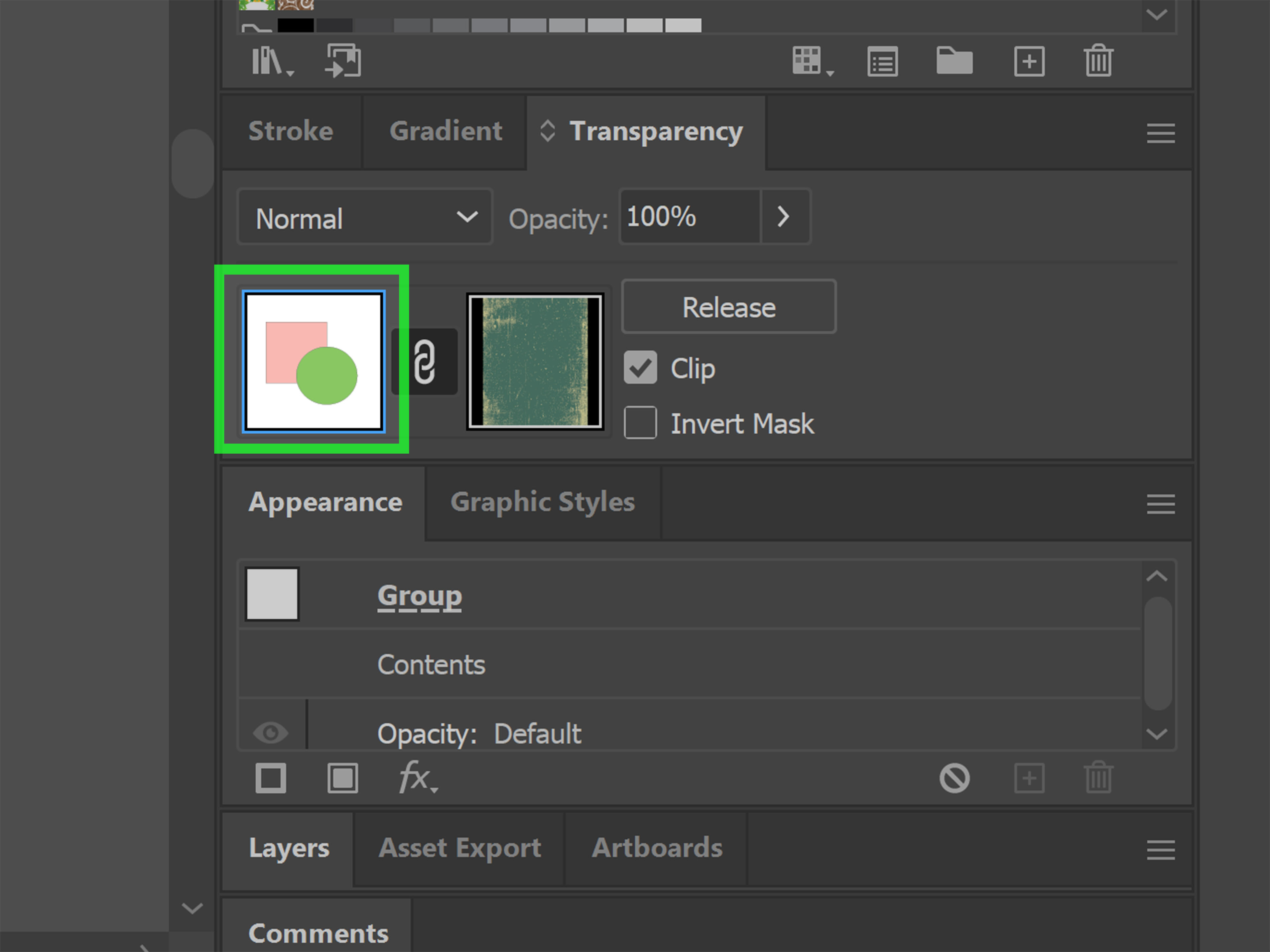
Here is the magic: in an opacity mask, white reveals, black hides, and gray creates partial transparency. That means a black-and-white texture image can punch holes through your vector artwork in a really convincing way.
Best uses for opacity masks
- Vintage logos
- T-shirt graphics
- Stamp-style badges
- Retro type treatments
- Distressed icons and emblem designs
How to do it
- Place or create the texture you want to use.
- If needed, convert the texture into cleaner black-and-white artwork.
- Put the texture on top of the artwork you want to distress.
- Select both the texture and the artwork.
- Open the Transparency panel and click Make Mask.
- Toggle Clip or Invert Mask if the result looks backwards.
This method gives you that deliciously imperfect printed look without deleting your original art. It is also easy to edit later, which is very helpful when your client says, “Can we make it a little less destroyed?” That sentence appears in the wild more often than you would think.
Method 3: Convert a Texture to Vector with Image Trace
If you want texture that stays more editable inside a vector workflow, you can trace a raster texture and turn it into vector artwork. This is useful when you want to subtract texture with Pathfinder, recolor it easily, or keep everything in a more vector-friendly format.
Image Trace works best when the source image is clean and well prepared. High-contrast textures, grayscale art, scans of ink, dry brush marks, speckle patterns, and distressed surfaces are often good candidates. The cleaner the source image, the better the vector result.
How to do it
- Find or create a texture image with clear contrast.
- Place it in Illustrator.
- Open Image Trace and test a preset that suits the image.
- Adjust threshold and advanced settings until the texture looks clean.
- Expand the trace when you are happy with it.
- Use the resulting vector texture as an overlay, mask, or subtractive shape.
This workflow is perfect when you want texture that scales with your artwork and can be manipulated with Pathfinder tools. It is also a strong choice for logo designers who want a distressed effect but still need clean production files. Nobody enjoys discovering their “vector logo” is secretly a fuzzy image in a trench coat.
Method 4: Use Clipping Masks for Controlled Texture Placement
Clipping masks are different from opacity masks. A clipping mask uses a vector shape to define what area of your artwork remains visible. In plain English, it trims the texture neatly inside the boundaries of a shape.
This is perfect when you want a texture to stay inside a letterform, badge, icon, character shape, or background block without spilling all over the artboard like an overexcited toddler with finger paint.
How to do it
- Place or create your texture.
- Position it over the shape or artwork you want to contain it.
- Make sure the clipping path is on top.
- Select both objects.
- Choose Object > Clipping Mask > Make.
Clipping masks are clean, predictable, and excellent for layout control. They do not create the same internal transparency drama as opacity masks, but they are easier when your goal is simply to keep texture inside specific boundaries.
Method 5: Add Texture with Scatter Brushes and Draw Inside
If you want more handcrafted texture, brush-based methods are terrific. Illustrator’s scatter brushes can distribute repeated bits of artwork along a path, which is useful for dots, speckles, rough debris, or organic texture. Custom brushes can also mimic pencil, dry ink, charcoal, or sketchy fill patterns.
One especially practical workflow is to select a shape and use Draw Inside. That lets you paint texture within the shape without creating a separate mask first. It feels less like file management and more like actual drawing, which is refreshing when you have already clicked seventeen panels and are beginning to question your life choices.
Brush workflow ideas
- Add dot texture to shadows in character illustration.
- Create rough edge noise on a flat icon.
- Fill leaves, petals, or abstract shapes with hand-drawn shading.
- Build repeatable grain paths for packaging or poster art.
Brush texture is excellent when you want variation, gesture, and a less mechanical look. It is especially useful in editorial illustration, children’s art styles, and handmade branding systems.
Method 6: Use Built-In Effects Like Grain and Roughen
Illustrator also includes built-in effects that can help add texture without importing anything. Two of the most useful are Grain and Roughen.
Grain
The Grain effect is useful for adding a soft textured look over shapes, fills, and shaded areas. It is especially effective when paired with gradients or subtle tonal changes. If your artwork looks too smooth, Grain can give it a more tactile and printed feel.
Roughen
Roughen modifies edges so they feel more organic and less digitally perfect. This works beautifully for vintage marks, hand-inked lettering, rugged badges, and illustrations that need slightly irregular outlines.
The secret with these effects is moderation. A little Roughen can suggest ink. Too much Roughen can make your artwork look like it lost a fight with a hedge trimmer.
A Smart Layering Strategy for Better Illustrator Texture
The best textured artwork usually combines methods instead of relying on one giant dramatic effect. For example, you might use Roughen on edges, Grain on shadow shapes, and a very light paper overlay across the entire composition. Or you might use an opacity mask for distress, then add a scatter brush inside certain objects to vary the surface.
Think in layers:
- Base texture: overall atmosphere or paper feel
- Object texture: grain or brush detail inside specific shapes
- Edge texture: irregular outlines or distress around borders
- Aging texture: opacity-mask wear for vintage appeal
This layered approach gives artwork depth without making it muddy. Texture works best when it supports the form, not when it wrestles the form to the ground.
Common Mistakes to Avoid
1. Using too much texture everywhere
If every shape has the same heavy distress, nothing stands out. Keep some clean areas so the textured areas feel purposeful.
2. Choosing the wrong texture style
Soft children’s illustration and gritty motorcycle badge art should not wear the same texture suit. Match the texture to the concept.
3. Ignoring scale
A texture that looks perfect zoomed in can feel invisible or overwhelming at actual size. Always zoom out and evaluate the full composition.
4. Tracing low-quality images
If the source texture is muddy, the vector result will often be muddy too. Start with cleaner source files whenever possible.
5. Making texture the star of the show
Texture should support the artwork, not hijack it. If the first thing viewers notice is “wow, that is aggressively dusty,” you may need to dial it back.
Example Workflows You Can Actually Use
Vintage badge logo
Create the badge as vector art, trace a distressed paper texture, and apply it as an opacity mask. Then add a tiny Roughen effect to outer edges. Result: old-school charm without sacrificing structure.
Flat editorial illustration
Use scatter brushes or a grainy custom brush in Draw Inside mode to add texture only to shadow areas and selected objects. Then apply a subtle overall paper overlay at low opacity. Result: warmth and depth without turning the illustration into a sandstorm.
Textured typography poster
Fill type with a clipping mask, layer a grain texture over background shapes, and distress selected words with an opacity mask. Result: hierarchy, attitude, and the kind of poster energy that says, “Yes, I know kerning matters.”
How Experienced Designers Describe the Process of Adding Texture in Illustrator
One thing that comes up again and again in real Illustrator projects is that texture almost never feels right on the first try. Designers often start with a strong texture because it looks exciting at first glance. Then they zoom out, look at the whole composition, and realize the texture is doing stand-up comedy in the middle of a funeral. It is stealing attention from the actual artwork. So the first real experience most people have with Illustrator texture is learning to pull back.
Another common experience is discovering that different parts of the same piece want different kinds of texture. A background may need a soft paper overlay, while the focal object needs subtle grain, and the lettering needs a distressed opacity mask. This is when texture stops feeling like a single effect and starts acting more like art direction. You are not just “adding texture.” You are deciding how each surface should feel.
Designers also learn pretty quickly that the cleanest method is not always the most convincing one. A technically perfect vector texture may still feel lifeless if it repeats too evenly. On the other hand, a messy scanned ink mark can add exactly the irregularity a piece needs. That is why experienced Illustrator users often mix vector and raster workflows instead of treating them like rival sports teams.
There is also the very relatable experience of fighting with masks. At some point, nearly everyone makes a clipping mask when they meant to make an opacity mask, or makes an opacity mask when they really just wanted a texture trapped inside a shape. Then comes the classic five-second stare at the screen, followed by muttering something deeply philosophical like, “Why is the texture upside down and gone?” This confusion is normal. Once you understand the difference, though, your workflow gets dramatically faster.
Many illustrators say the most satisfying texture moments happen late in the process, not early. After the colors, shapes, and composition are working, a little rough edge here, a grain pass there, and a touch of distress on type can suddenly make the whole piece click. The artwork starts to feel finished. Not “finished” in the sense that it is polished to a mirror shine, but finished in the sense that it has character.
There is also a practical side to experience: seasoned designers test texture at final size. What looks amazing at 300 percent zoom may disappear on a phone screen or become muddy in print. Real-world experience teaches you to stop admiring texture in isolation and start judging it in context. Does it still read from a distance? Does it support hierarchy? Does it help the mood? If yes, great. If not, back to the Transparency panel you go.
Perhaps the biggest lesson people learn is that texture works best when it respects the original design. Strong composition, clear shapes, and smart color choices still do the heavy lifting. Texture is the supporting actor, not the lead singer. When used well, it makes the artwork feel richer, more human, and more memorable. When used badly, it looks like the design was dragged behind a truck for three miles and called “vintage.” Experience teaches the difference, and Illustrator gives you all the tools to get there.
Final Thoughts
If you want to add texture to artwork in Adobe Illustrator, the good news is that there is no single correct method. The best approach depends on the result you want. Use raster overlays and blending modes for atmosphere, opacity masks for distress, clipping masks for control, Image Trace for editable vector texture, scatter brushes for handmade energy, and Grain or Roughen for quick built-in character.
The real trick is not just knowing the tools. It is knowing when to stop. Good texture adds depth, mood, and personality. Great texture feels so natural that people notice the artwork first and the effect second. That is the sweet spot. Hit that, and your vectors stop looking flat and start looking alive.