Checkboxes may be tiny, but in a Google Slides presentation, they do big organizational work. They can turn a messy slide into a clean checklist, a training deck into an action plan, a classroom presentation into an activity tracker, or a project update into something that looks like it has its life together. And honestly, who among us could not use a little more “checked-off” energy?
The good news is that learning how to make checkboxes in Google Slides is simple. The slightly sneaky news is that Google Slides does not work exactly like Google Sheets, where checkboxes are clickable data controls. In Slides, checkboxes are usually visual elements: shapes, symbols, bullets, icons, or grouped design objects. That is perfect for presentations, templates, lesson plans, progress slides, agendas, decision matrices, and printable worksheets.
This guide walks you through the best method in seven easy steps, plus faster alternatives, design tips, common mistakes, and practical examples. By the end, you will know how to add checkboxes in Google Slides that look polished, line up neatly, and do not wander across your slide like rebellious little squares.
Note: This tutorial focuses on creating visual checkboxes in Google Slides. For truly interactive checkboxes that store checked or unchecked values, Google Sheets is still the better tool.
Why Use Checkboxes in Google Slides?
Checkboxes are useful because they make information feel actionable. Instead of showing a plain list, you show progress, completion, choice, or priority. That small box tells the viewer, “Something can happen here.” In a slide deck, that visual cue is powerful.
You can use Google Slides checkboxes for weekly planning, onboarding tasks, classroom assignments, workshop exercises, product launch checklists, client approval steps, event planning, team retrospectives, and printable handouts. They are also great for “before and after” decks where you want to show completed items with checked boxes and pending items with empty boxes.
From an SEO and user-experience perspective, this kind of presentation design also matters because people search for practical, repeatable solutions. They do not just want to know whether Google Slides has checkboxes. They want to know the easiest way to make them look professional without wasting twenty minutes fighting with alignment guides. We have all been there. The square wins. The human cries. Not today.
Before You Start: Choose the Right Checkbox Style
There are several ways to create checkboxes in Google Slides, and the best method depends on what you are building. If you want maximum design control, use shapes. If you want the fastest option, use special characters. If you need a simple list, use checkbox-style bullets when available. If you want a decorative checklist, use icons or images.
For most professional slide decks, the shape method is the best choice. It lets you control size, border weight, fill color, spacing, and placement. You can also group the checkbox with text, duplicate it across slides, and create a reusable checklist layout. That is why the seven-step tutorial below uses shapes as the main method.
How to Make Checkboxes in Google Slides in 7 Easy Steps
Step 1: Open Your Google Slides Presentation
Start by opening your presentation in Google Slides. Choose the slide where you want your checklist to appear, or create a new blank slide if you are building a checklist layout from scratch. A clean slide gives you more room to work and makes it easier to control spacing.
If you are creating a task list, type your items first. For example:
- Confirm meeting agenda
- Review design draft
- Send final presentation
- Collect feedback
Adding your list before drawing the checkboxes helps you estimate how many boxes you need and how much space each row should use. Think of this step as measuring the countertop before buying the toaster. It saves embarrassment later.
Step 2: Insert a Square Shape
To create the checkbox, go to the top menu and select Insert, then choose Shape, then Shapes, and select the square or rectangle shape. Click and drag on the slide to draw a small square next to your first checklist item.
Keep the checkbox proportional. A checkbox that is too large will look cartoonish, while one that is too small may disappear during presentation mode. For most slide designs, a checkbox between 14 and 24 pixels tall works well, depending on your font size and slide layout.
If you want a perfect square, hold the Shift key while dragging. This keeps the shape from becoming a suspicious rectangle pretending to be organized.
Step 3: Customize the Checkbox Border and Fill
Click the square to select it. Use the toolbar to adjust the fill color, border color, and border weight. For a classic empty checkbox, choose a transparent or white fill and a dark border. For modern slides, try a soft gray border with a clean white fill. For branded decks, match the border color to your brand palette.
A simple style usually works best:
- Fill color: Transparent or white
- Border color: Black, dark gray, or brand color
- Border weight: 1 to 2 pixels
- Size: Similar to the height of your text
Avoid heavy borders unless your slide design is bold and graphic. A checkbox should guide the eye, not shout from the corner like it has breaking news.
Step 4: Add Text Beside the Checkbox
Next, add a text box beside your checkbox. Go to Insert, select Text box, and click near the checkbox. Type your first checklist item. Make sure the text baseline aligns visually with the checkbox. It does not have to be mathematically perfect, but it should look balanced.
For readability, use a clean font size. In presentations, 18 to 28 points is usually comfortable, depending on how far your audience is from the screen. For printable worksheets, smaller sizes may work, but do not go so tiny that the checkbox turns into a decorative speck.
You can also use an existing text box and place checkboxes beside each line. This is useful if your list is already written. Just leave enough left margin so the boxes do not crash into the words.
Step 5: Duplicate the Checkbox and List Rows
Once your first checkbox and text item look right, duplicate them. Select the checkbox and text box together, then copy and paste. You can use Ctrl + C and Ctrl + V on Windows or Command + C and Command + V on Mac.
Move the duplicated row below the first one and replace the text with the next checklist item. Repeat until your list is complete. To keep spacing consistent, use Google Slides alignment guides. These red guide lines appear as you move objects and help you line things up neatly.
For a faster workflow, create one perfect row first, duplicate it several times, and then edit the text. This is much better than drawing every checkbox manually. Manual repetition is where slide decks go to become haunted.
Step 6: Add a Check Mark for Completed Items
If you want some boxes to appear checked, you have a few options. The easiest is to insert a check mark symbol in a small text box and place it over the square. Go to Insert, choose Special characters, and search for terms like “check,” “check mark,” or “ballot box.” Select a check mark symbol, then resize and position it inside the box.
You can also type or paste common symbols such as:
- ☐ for an empty ballot box
- ☑ for a checked ballot box
- ✓ for a simple check mark
- ✔ for a heavier check mark
For a cleaner design, use the same check mark style throughout the presentation. Mixing five different check marks on one slide can make the deck feel like a tiny symbol zoo. Pick one and let it live its best life.
Step 7: Align, Group, and Reuse Your Checkbox List
After you build your checkbox list, select the objects and use Arrange options to align and distribute them. If you have multiple rows, select the checkboxes and align them to the left. Then distribute the rows vertically so the spacing is even.
When everything looks right, group related objects together. Select the checkbox and its matching text, then right-click and choose Group. Grouping keeps each row together when you move it. You can also group the entire checklist if you want to reposition it as one block.
Finally, duplicate the finished checklist for other slides or save it as part of a reusable template. This is the real productivity win. Once you design a clean Google Slides checkbox layout, you can use it for meeting decks, lesson slides, project trackers, and planning templates without starting from zero every time.
Alternative Ways to Add Checkboxes in Google Slides
Use Special Characters
If you need a quick checkbox, special characters are the fastest method. Click inside a text box, go to Insert, choose Special characters, and search for “checkbox,” “ballot box,” or “check.” Then insert the symbol you want. This method is ideal for simple lists and printable slides.
The downside is that symbols behave like text. You can resize them, recolor them, and copy them, but they may not offer the same design control as shapes. Still, for speed, they are excellent.
Use Checkbox-Style Bullets
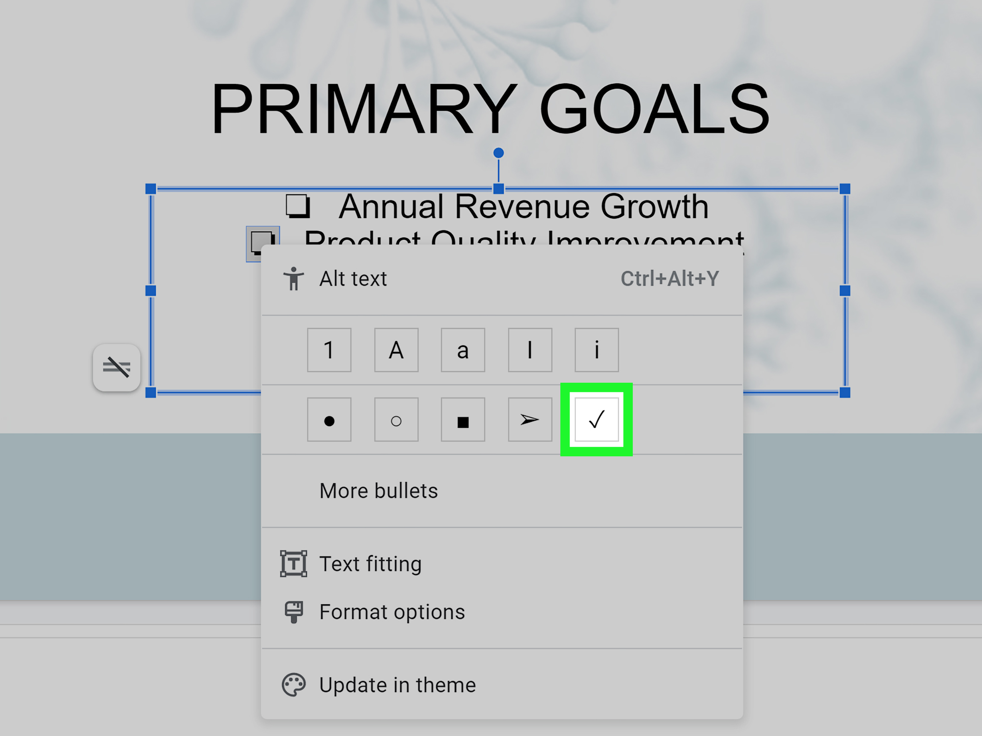
Some Google Slides layouts and bullet menus let you create square or checkbox-style bullet lists. Select your list, open the bullet formatting options, and look for a square bullet or checkbox-like style. This is useful when you want a checklist look without manually placing shapes.
However, bullet-style checkboxes are typically static. They are not the same as clickable task checkboxes in Google Sheets. Use them when appearance matters more than interactivity.
Use Icons or Images
You can also insert checkbox icons or check mark images. This works well for highly visual decks, dashboards, pitch presentations, and branded templates. Choose simple SVG-style icons or transparent PNGs when possible, then resize them consistently.
The main warning: do not use blurry icons. A fuzzy checkbox makes the whole slide feel less professional. It is a tiny detail, but tiny details are where design credibility likes to hide.
Use Tables for Structured Checklists
If your checklist needs columns, try using a table. Create a two-column table: one narrow column for checkboxes and one wider column for task descriptions. This keeps everything aligned and is especially useful for printable worksheets, training materials, and review forms.
Tables are not always the most stylish option, but they are practical. And sometimes practical wins. Not every slide needs to look like it just returned from a design conference in Brooklyn.
Best Practices for Better Google Slides Checkboxes
Keep the Size Consistent
Every checkbox in the same list should be the same size. Inconsistent box sizes can make a slide feel sloppy, even if the content is strong. Duplicate your first checkbox instead of redrawing new ones.
Leave Enough Space Between the Box and Text
Give your checkbox and text room to breathe. A small gap between the box and the checklist item improves readability. Too little space makes the slide feel cramped; too much space makes the checkbox look disconnected from the item.
Use Contrast Wisely
Make sure your checkboxes are visible against the slide background. Dark boxes on dark backgrounds and pale boxes on white backgrounds are classic presentation crimes. Choose colors that support your theme while staying readable.
Group Objects Before Moving Them
Once a checkbox and text item are aligned, group them. This prevents accidental misalignment when you move objects around. Grouping is especially helpful when you are working quickly or editing on a laptop trackpad, which is basically a tiny chaos rectangle.
Use Checked and Unchecked States Intentionally
Empty boxes suggest pending work. Checked boxes suggest completed tasks. A mix of both can show progress. Use that visual language deliberately. For example, in a project status slide, checked boxes can represent completed milestones, while empty boxes show remaining work.
Common Mistakes to Avoid
Mistake 1: Expecting Google Slides Checkboxes to Be Clickable
Google Slides is a presentation tool, not a form builder. Shape-based checkboxes and symbol checkboxes do not behave like interactive controls. You can create clickable links or animations, but the checkbox itself will not automatically change state when clicked during a normal presentation.
Mistake 2: Using Too Many Checkbox Styles
Stick with one checkbox style per deck. Do not use square bullets on one slide, emoji check marks on another, and neon icons on the next unless your presentation theme is “graphic design yard sale.” Consistency makes the deck look intentional.
Mistake 3: Forgetting Presentation Mode
Always preview your slide in presentation mode. A checkbox that looks fine while editing may appear too small on a projector or shared screen. If your audience has to squint, the checkbox is not doing its job.
Mistake 4: Ignoring Mobile Editing Limits
You can edit Google Slides on mobile, but detailed shape alignment is usually easier on a desktop or laptop. If you need precise checkboxes, build the layout on a computer first, then make minor text edits later on mobile if needed.
Practical Examples of Checkbox Slides
Project Management Checklist
Create a slide titled “Launch Readiness Checklist” and add boxes for tasks like content approval, design review, QA testing, stakeholder sign-off, and final delivery. Use checked boxes for completed steps and empty boxes for remaining work.
Classroom Activity Slide
Teachers can create a “Today’s Tasks” slide with checkboxes for warm-up, group discussion, practice activity, reflection, and exit ticket. Students instantly understand the flow of the lesson.
Workshop Planning Deck
For workshops, checkboxes can show participant goals, materials needed, or action items. A simple checklist slide can make the session feel more structured and less like everyone wandered into a meeting room hoping for snacks.
Client Approval Presentation
Use checkboxes to show approval stages such as concept approved, budget confirmed, timeline reviewed, assets received, and launch date scheduled. It gives clients a quick visual summary without forcing them to read a paragraph.
Can You Make Interactive Checkboxes in Google Slides?
You can make a slide feel interactive, but native Google Slides checkboxes are not the same as form controls. For example, you can duplicate a slide and create one version with an empty checkbox and another version with a checked checkbox. Then you can link objects between slides to simulate interaction. You can also use animations to make a check mark appear when advancing the slide.
These methods are useful for presentations, quizzes, and classroom activities. However, they do not store data or behave like real form fields. If you need actual clickable checkboxes for data collection, use Google Forms or Google Sheets. If you need a collaborative task list, Google Docs checklists or project management tools may be better.
Conclusion
Making checkboxes in Google Slides is easy once you understand the best method for your goal. For polished, flexible designs, use square shapes, text boxes, check mark symbols, alignment tools, and grouping. For quick lists, use special characters or checkbox-style bullets. For branded presentations, consider icons or reusable checklist layouts.
The key is not just adding a box. It is making that box look intentional. A well-designed checkbox list can help your audience understand tasks, priorities, progress, and decisions at a glance. It keeps slides clean, organized, and easier to follow. And yes, it gives your presentation that satisfying “we are getting things done” feeling, even if your coffee is doing most of the heavy lifting.
Experience Notes: What I Learned From Building Checkbox Slides
When creating checkbox layouts in Google Slides, the biggest lesson is that neatness matters more than complexity. A simple square beside a clear line of text often looks better than a fancy icon set with shadows, gradients, and five colors fighting for attention. The first time many people try to make checkboxes in Google Slides, they overdesign them. They add thick borders, colorful fills, oversized check marks, and decorative fonts. The result may be cheerful, but it can also be distracting. A checkbox should support the message, not audition for the lead role in the slide deck.
Another practical lesson is to build one perfect row before duplicating anything. This sounds obvious, but it saves a surprising amount of time. If the first checkbox is the right size, the text is aligned, and the spacing feels comfortable, every duplicate will look consistent. If the first row is messy, duplication simply creates a well-organized army of messy rows. It is much easier to fix one row than to repair twelve slightly different rows later.
Alignment is also where many checklist slides either succeed or quietly fall apart. Google Slides gives helpful visual guides, but it is still easy to nudge one box a little too far left or place one text item slightly lower than the rest. The solution is to select related objects and use the alignment and distribute options. These tools make the slide look professional, even when the content is simple. Viewers may not consciously notice perfect alignment, but they definitely notice when things feel “off.” Design discomfort is real, even if nobody in the meeting knows what to call it.
Using check marks also requires restraint. A checked box should communicate completion, approval, or selection. If every item is checked, the slide says, “Everything is done.” If nothing is checked, it says, “Here is what remains.” If some items are checked and others are not, it says, “Here is our progress.” That visual language is useful, but only when it is used consistently. Random check marks can confuse the viewer, especially in business or training presentations where people are scanning quickly.
For team decks, reusable checklist templates are a smart habit. Once you create a polished checkbox slide, duplicate it and save it as a layout for future use. This is especially helpful for weekly reports, sprint reviews, onboarding decks, lesson plans, and client presentations. Instead of rebuilding the same checklist every time, you can update the text and move on with your life. That may not sound glamorous, but neither does formatting boxes at 11:47 p.m. before a deadline.
The final experience-based tip is to preview the slide before sharing it. Presentation mode can reveal problems that editing mode hides. Checkboxes may look too small, text may feel cramped, or a check mark may appear slightly off-center. A quick preview helps you catch those issues before your audience does. In the end, the best Google Slides checkboxes are clear, consistent, and useful. They do not need to be complicated. They just need to help the viewer understand what is done, what is next, and what deserves attention.