Note: Clean HTML body only, ready for web publishing.
Getting a new customer to sign up is exciting. Getting that same customer to actually understand your product, use it correctly, and come back tomorrow? That is where the real game begins. Customer onboarding is the awkward first date of software: everyone wants it to go well, but one confusing screen, one boring tutorial, or one mystery button labeled “Advanced Settings” can ruin the mood fast.
That is why in-app help matters. Instead of forcing new users to leave your product, open a help center, search through ten tabs, and question their life choices, in-app help puts guidance right where the confusion happens. Done well, it reduces friction, shortens time to value, and gives customers the feeling that your product actually wants them to succeed. What a concept.
In this guide, we will break down how to use in-app help to improve customer onboarding, which tactics work best, where teams often overdo it, and how to make the whole experience feel less like homework and more like progress.
Why In-app Help Matters During Customer Onboarding
Customer onboarding is not just a welcome email and a product tour. It is the process of helping new users move from curiosity to confidence. The faster customers experience a meaningful win inside your product, the more likely they are to stick around, adopt core features, and become loyal users rather than one-week trial ghosts.
In-app help supports that process because it appears inside the product, in context, and at the exact moment a user needs it. Instead of giving every new customer the same generic instructions, you can guide them based on role, behavior, page location, product usage, or stage in the journey. That makes onboarding smarter, lighter, and much more useful.
What Counts as In-app Help?
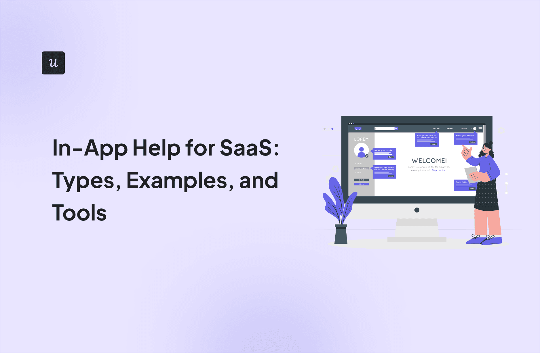
In-app help can take many forms, including welcome screens, onboarding checklists, tooltips, hotspots, interactive walkthroughs, embedded videos, searchable resource centers, chat widgets, FAQs, and short feedback prompts. The format matters less than the outcome. Good in-app help answers one question: “What does this user need right now to move forward?”
If the answer is “a quick next step,” use a tooltip. If the answer is “a structured path,” use a checklist. If the answer is “I am lost and would like assistance before I throw my laptop into the sea,” offer a resource center or chat option.
Start With the Customer’s First Value Moment
The biggest onboarding mistake companies make is treating onboarding like a feature parade. New users do not care about every button, tab, menu, integration, and dashboard on day one. They care about solving the problem that brought them to your product in the first place.
Before you build any in-app help, define the first value moment. This is the action or outcome that proves the product is working for the customer. For a project management app, that might be creating and assigning the first task. For an analytics tool, it might be connecting a data source and seeing the first report. For an email platform, it could be sending a first campaign successfully.
Ask These Questions First
- Why did this customer sign up?
- What action leads to their first meaningful success?
- What usually blocks them before they get there?
- Which questions show up repeatedly in support tickets, onboarding calls, or user interviews?
When you know the first value moment, your in-app help becomes more intentional. Instead of teaching the product from left to right like a software museum tour, you guide users toward the task that matters most.
Use the Right Kind of Help at the Right Moment
Not all onboarding friction looks the same, so not all help should look the same either. A smart onboarding experience mixes several types of in-app help, each used for a specific job.
1. Welcome Screens for Segmentation
A welcome screen is not just a polite hello. It is a chance to learn who the user is and what they want. Ask one or two useful questions, such as their role, team type, goal, or experience level. Then use that information to personalize onboarding.
For example, an HR manager and a payroll specialist may use the same product for very different tasks. If you show both of them the same onboarding flow, one of them will probably feel confused, and the other will feel mildly insulted. Segmentation helps you avoid both.
2. Checklists to Create Momentum
Checklists work because they make progress visible. A good onboarding checklist turns a vague “get started” experience into a series of clear wins. Better yet, it helps users feel accomplished before they have had time to panic.
Keep the checklist focused on a small number of high-impact tasks. Five strong items are better than fifteen tiny chores. Each task should connect to real value, not vanity completion. “Upload your logo” might be nice. “Invite your team and publish your first workflow” is better.
3. Tooltips and Hotspots for Micro-guidance
Tooltips and hotspots are ideal when a user is close to success but needs a nudge. They work best for small clarifications, feature discovery, or guidance around a specific field or button. The key is restraint. One helpful tooltip feels supportive. Twenty tooltips feel like your product is yelling.
Write tooltip copy in plain language. Be brief. Use verbs. Tell users what to do and why it matters. “Connect your calendar to schedule meetings automatically” is far more useful than “Calendar integration settings are available here.”
4. Interactive Walkthroughs for Learning by Doing
Interactive walkthroughs are most effective when they guide users through real actions inside the interface. The goal is not to show the product. The goal is to help the user use the product. That means the walkthrough should trigger actual clicks, entries, or selections tied to a meaningful task.
Whenever possible, make the walkthrough optional or dismissible. Forced tours often create fake engagement. Users click “next” until freedom returns, and nobody learns anything except how to escape.
5. Resource Centers for On-demand Self-service
Some users want guided onboarding. Others want to poke around, get stuck, and solve the problem themselves. A good in-app resource center supports both styles. It gives customers a searchable place to find FAQs, setup guides, tutorial videos, product updates, and links to contact support without leaving the app.
This is especially useful for products with multiple roles, deeper workflows, or a mix of beginner and advanced users. Instead of overloading the main onboarding flow with every possible explanation, you keep the primary path lean and let the resource center handle the extra depth.
6. Chat and Escalation Paths for High-friction Moments
Self-service is great until a customer hits a wall. When that happens, your in-app help should offer an obvious escalation path. That may be live chat, AI-assisted chat, a request form, or a quick link to book onboarding support. The important part is that users do not feel trapped.
Great onboarding does not pretend every problem can be solved with a tooltip. It recognizes when human help is the better move.
Design In-app Help Around Real Behavior
The most effective onboarding help is contextual. It reacts to what users do, where they are, and what they have already completed. This is where many teams level up from “helpful-ish” to genuinely effective.
For example, if a user created an account but has not imported any data after two sessions, show a short message with setup guidance. If they completed setup but never invited teammates, trigger help that explains collaboration benefits. If they repeatedly visit the billing page during trial, surface a quick explanation of plan differences.
Use Progressive Disclosure
Do not dump everything on the screen at once. Introduce the basics first, then reveal deeper guidance as users advance. This approach, often called progressive disclosure, keeps onboarding from becoming overwhelming. It also respects the fact that not every user needs the same information at the same time.
Think of it like teaching someone to drive. You start with the steering wheel and brakes. You do not begin with a seminar on tire rotation and advanced weather physics.
Trigger Help Based on Friction, Not Hope
Too many onboarding flows are built around optimism. Teams assume users will follow the perfect path, read every message, and click all the right buttons. Real users are much messier. They skip steps, open the wrong page, get distracted, and occasionally vanish because someone on Slack said lunch was here.
That is why behavior-based triggers matter. Use product data to identify drop-off points, repeated errors, stalled sessions, and unfinished setup steps. Then deploy in-app help precisely where those moments occur.
Keep the Content Clear, Short, and Human
Great in-app help is not just well-timed. It is well-written. New customers do not need robotic microcopy that sounds like it was approved by a committee of cautious appliances. They need language that is clear, calm, and useful.
Best Practices for In-app Help Copy
- Lead with the action the user should take.
- Explain the benefit in a few words.
- Avoid jargon unless your audience genuinely uses it.
- Keep sentences short and scannable.
- Make support content sound like a helpful human, not a legal notice.
Compare these two examples:
Weak: “This module enables account-level configuration settings for enhanced workflow optimization.”
Better: “Set your team rules here so new tasks route automatically.”
One sounds like a brochure. The other sounds like help.
Blend In-app Help With Human Onboarding
In-app help does not replace people. It makes people more effective. The best customer onboarding programs combine self-serve guidance with human support where it matters most.
For lower-complexity products, in-app help may handle most onboarding on its own. For higher-touch SaaS products, it can support the work of customer success managers by reinforcing key tasks between calls, reducing repetitive questions, and guiding users after training sessions end.
Imagine a customer success manager runs a kickoff session on Monday. On Tuesday, the customer logs in and sees a personalized checklist, a setup walkthrough, and a resource center with role-specific help. That creates continuity. It keeps onboarding moving without relying on memory, meeting notes, or the ancient corporate tradition of “just figure it out.”
Measure Whether Your In-app Help Is Actually Working
If you only track whether a tour was completed, you are measuring motion, not progress. What matters is whether in-app help improves customer onboarding outcomes.
Metrics That Matter
- Activation rate: How many new users reach the first value moment?
- Time to value: How quickly do users complete the key onboarding task?
- Checklist completion by segment: Which user groups succeed or stall?
- Feature adoption: Are users engaging with the features tied to retention?
- Support volume: Are repetitive onboarding questions decreasing?
- Resource center engagement: What help content gets used most?
- User feedback: Do customers say onboarding feels easier and clearer?
Also pay attention to what people do after they consume help content. Did they finish the task, or did they still abandon the flow? A high help-view rate can mean your support content is useful, or it can mean your product is confusing. Context matters.
Common Mistakes to Avoid
- Showing every feature too early: Early onboarding should focus on value, not exhaustive product education.
- Overusing modals and pop-ups: Helpful guidance should not feel like digital whack-a-mole.
- Ignoring segmentation: Different users need different paths.
- Creating help content nobody can search: If users cannot find answers quickly, the help might as well be in a locked drawer.
- Never revisiting onboarding flows: Products change, so onboarding should too.
- Forgetting mobile or small-screen experiences: Guidance should fit the device, not fight it.
A Simple Framework for Better In-app Help
If you want a practical roadmap, use this sequence:
- Define the first value moment.
- Identify the top onboarding friction points.
- Segment users by goal, role, or lifecycle stage.
- Match each friction point with the best help format.
- Write short, action-focused copy.
- Make deeper help searchable inside the product.
- Track activation, time to value, and support outcomes.
- Iterate based on behavior and feedback.
Simple does not mean easy, but it does mean doable. And that is usually a lot more valuable than a giant onboarding strategy deck that nobody opens after the meeting.
Conclusion
In-app help can dramatically improve customer onboarding when it is timely, contextual, and tied to real user goals. The best experiences do not overwhelm new customers with feature tours or endless instructions. They guide users toward meaningful action, support them when they get stuck, and make self-service feel like progress rather than punishment.
When you combine welcome segmentation, checklists, tooltips, walkthroughs, resource centers, and thoughtful escalation paths, you create onboarding that feels personal and practical. Add behavior-based triggers and solid measurement, and your product starts teaching itself in a way customers actually appreciate.
That is the sweet spot. New users get clarity. Support teams get fewer repetitive tickets. Customer success teams get better adoption. And your onboarding stops acting like a maze with branding.
Practical Experiences and Lessons From Real-world Onboarding Teams
Teams that succeed with in-app help usually learn the same lesson the hard way: customers do not hate learning, they hate unnecessary effort. Early onboarding often fails because companies build it from the inside out. They know the product too well, so they explain everything instead of guiding customers toward the one thing that matters first. Once teams begin watching session recordings, reviewing onboarding calls, and reading support conversations, the pattern becomes obvious. Users rarely ask for more information in general; they ask for the right information at the exact moment of confusion.
Another common experience is that the smallest pieces of help often outperform the fanciest ones. A short tooltip near a confusing field can remove more friction than a polished ten-step tour. A checklist with three meaningful tasks can outperform an elaborate onboarding academy. A searchable in-app resource center can quietly save dozens of support interactions each week simply because users do not have to leave the product to find answers. In other words, useful beats impressive.
Many onboarding teams also discover that personalization changes everything. When in-app help adapts to role, use case, or behavior, users feel understood. A marketer wants different guidance than an analyst. An admin setting up permissions has different concerns than an end user trying to complete a daily task. Companies that build one universal onboarding path often end up pleasing nobody. Companies that tailor just a few steps usually see much better momentum.
There is also a recurring lesson around tone. Help content performs better when it sounds calm, direct, and respectful. Customers are already doing mental work while learning a new product. If the guidance is stuffed with jargon, long explanations, or stiff enterprise language, it adds cognitive load instead of removing it. Teams that rewrite their in-app help in plain English are often surprised by how much smoother onboarding becomes, even without major product changes.
Finally, experienced teams stop treating onboarding as a one-time project. They revisit it constantly. Every new feature, UI change, or pricing update can create fresh friction for first-time users. Strong onboarding programs measure what is happening, collect feedback in context, and tune the experience over time. That is usually the difference between onboarding that looks good in a demo and onboarding that actually improves customer adoption. The winning teams are not the ones with the loudest welcome screen. They are the ones that keep listening, keep simplifying, and keep helping customers reach value faster.