Modern software can do astonishing things. Unfortunately, some applications introduce those things with the warmth and clarity of an airport tax form. Users sign in, face a dashboard full of mysterious buttons, and wonder whether clicking the wrong icon will launch a report or accidentally reorganize the company.
In-app guidance prevents that awkward first encounter. It gives users relevant instructions, prompts, and support while they are actively using a product. Instead of sending people to a 47-page manualor expecting them to develop telepathic communication with the product managerthe application explains what to do at the moment the information becomes useful.
When designed well, in-app guidance improves user onboarding, shortens time-to-value, encourages feature adoption, and reduces avoidable support requests. When designed badly, it becomes a parade of pop-ups that users close with the speed of competitive whack-a-mole. The difference comes down to timing, relevance, simplicity, and respect for the user.
What Is In-App Guidance?
In-app guidance is contextual assistance delivered directly inside a website, mobile app, SaaS platform, or enterprise application. It helps users understand an interface, complete a workflow, discover a feature, correct an error, or find support without leaving the product.
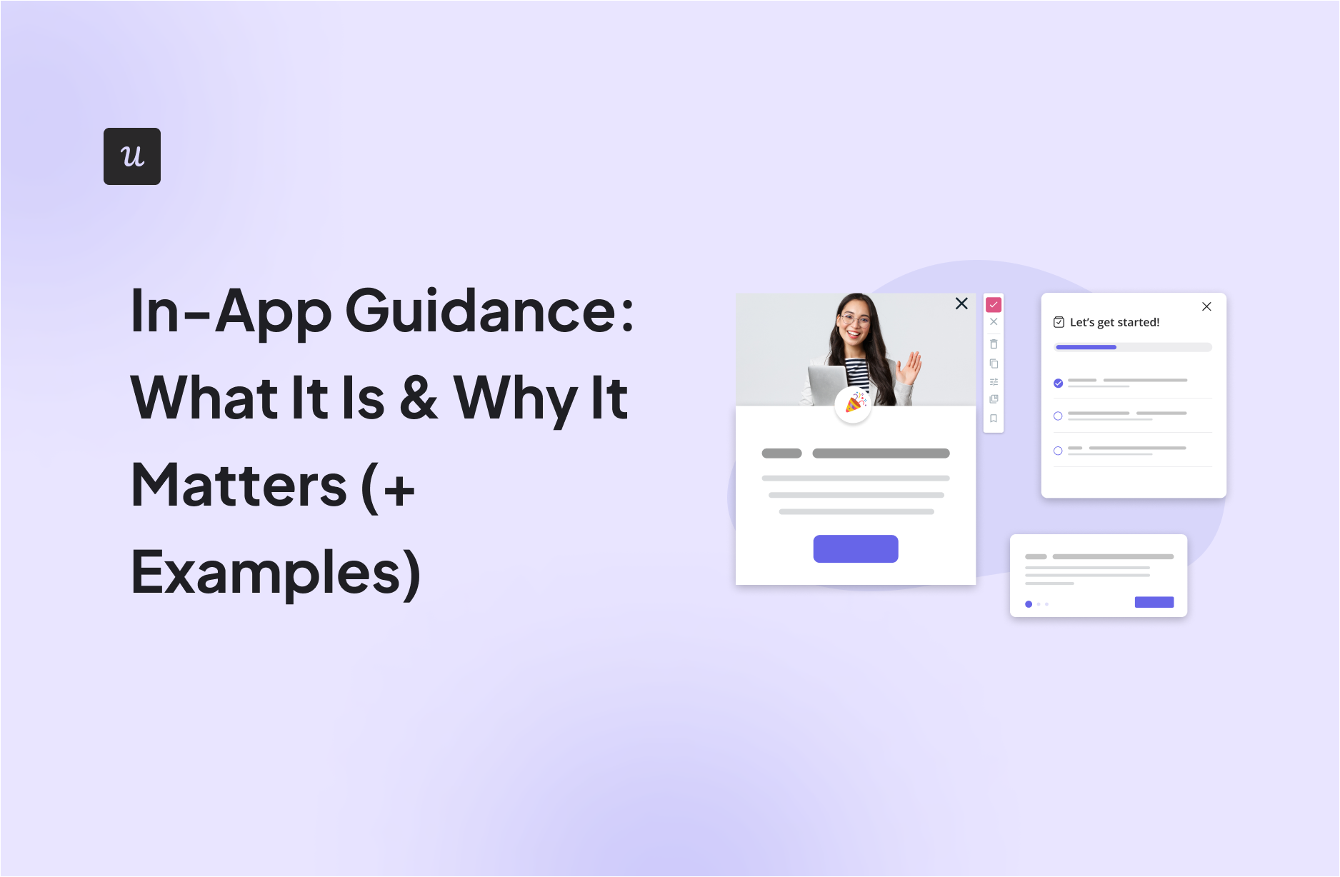
Common formats include tooltips, hotspots, onboarding checklists, welcome messages, product tours, interactive walkthroughs, embedded resource centers, progress indicators, inline validation, and targeted feature announcements. Unlike an external knowledge base, in-app guidance appears within the user’s active workflow and can respond to what the person is doing.
In-app guidance is broader than user onboarding
User onboarding usually focuses on helping a new customer reach an early success milestone. In-app guidance supports that goal, but its job continues long after the welcome screen disappears.
A returning user might receive guidance when an unfamiliar feature is released. An administrator may see an interactive walkthrough while configuring a complex permission. A customer who repeatedly abandons a workflow might receive a contextual prompt offering help. Experienced users may open an embedded resource center whenever they need a refresher.
In other words, onboarding is one chapter. In-app guidance can appear throughout the entire customer journey.
In-app guidance versus product tours
A product tour is one type of in-app guidance. Tours typically use a sequence of prompts to introduce important areas of an interface. They can be useful for orientation, but they are not the answer to every usability problem.
Long tours often ask users to memorize features before they have a reason to use them. Contextual guidance takes a more selective approach: show one relevant instruction when the user reaches the corresponding task. Apple’s interface guidance recommends interactive learning, brief optional onboarding, and context-specific tips placed near the interface area they explain. Intercom similarly advises using tours for focused product actions rather than lengthy processes that require extensive documentation.
Why In-App Guidance Matters
1. It helps users reach value faster
Customers rarely subscribe to software because they enjoy exploring navigation menus. They subscribe because they want an outcome: create an invoice, publish a campaign, organize a project, analyze data, or finally understand where Tuesday’s leads disappeared.
Good in-app guidance directs users toward the shortest meaningful path between signing in and accomplishing that outcome. A project-management application, for example, may guide a new user to create a project, add a task, assign an owner, and set a deadline. Completing that small workflow teaches more than a slideshow describing twelve features the user may not touch for another month.
This learn-by-doing approach helps users experience the product’s value instead of merely reading about it. Product-led onboarding guidance from Apple, Intercom, Appcues, and Amplitude consistently emphasizes interaction, focused actions, and fast progress toward an early success moment.
2. It improves product and feature adoption
Shipping a feature does not mean customers will notice it, understand it, or use it. Features can remain hidden behind unfamiliar icons, buried menus, or labels that made perfect sense during an internal planning meeting at 11:42 p.m.
In-app messages can introduce a feature to the users most likely to benefit from it. A reporting feature might be shown only to managers. An integration prompt might appear after a user imports data manually several times. A premium automation tool could be introduced when someone performs the same repetitive action for the fifth time.
Because the message is connected to user behavior and context, it is more useful than announcing every release to every account. Platforms such as Pendo, Amplitude, WalkMe, and Userpilot describe behavioral targeting and contextual prompts as central to improving discovery and feature adoption.
3. It reduces friction and support demand
Some support tickets are genuine technical problems. Others are users politely asking, “Where is the button that used to be over here?”
Contextual help can answer simple questions before a ticket is created. Inline validation can explain why a form cannot be submitted. A tooltip can define an unfamiliar field. An embedded help panel can recommend an article based on the page the user is viewing. An interactive walkthrough can guide someone through a multi-step process without forcing them to switch between the app and a separate tutorial.
This does not eliminate the need for human support. It lets support teams spend less time answering repetitive navigation questions and more time solving situations that require judgment, investigation, or empathy. Microsoft recommends immediate feedback such as inline validation, while Whatfix and WalkMe emphasize assistance delivered directly at the point of friction.
4. It supports more personalized experiences
A first-time user, account administrator, occasional viewer, and daily power user should not receive identical guidance. They have different goals, permissions, knowledge levels, and patience reserves.
Effective in-app guidance can be segmented by role, plan, account type, behavior, lifecycle stage, device, or completed actions. New users may receive a setup checklist, while experienced users see only an announcement about a relevant advanced capability. Customers who already adopted a feature should not be repeatedly told that the feature exists. They know. The tooltip can stop knocking.
5. It makes organizational change easier
In-app guidance is valuable not only for customer-facing SaaS products but also for internal enterprise software. Employees may need help adopting a new CRM, HR platform, expense system, or procurement workflow. Traditional training often occurs days or weeks before the employee performs the actual task, which gives everyone plenty of time to forget where the important menu lives.
Embedded guidance supports employees while they work. It can reinforce required processes, clarify data-entry rules, and help users adjust after software updates. Salesforce, Microsoft, WalkMe, and Whatfix all provide frameworks for prompts, teaching tips, walkthroughs, and embedded assistance in complex business applications.
Common Types of In-App Guidance
Tooltips
Tooltips are small messages attached to a specific interface element. They work best when they provide genuinely useful clarification, such as explaining an unfamiliar icon, metric, setting, or consequence.
A tooltip should not merely repeat the visible label. A button labeled “Export” does not need a tooltip that says “Export.” That is not guidance; it is the interface reading itself aloud. Microsoft recommends using inline labels for ordinary controls and reserving tooltips for helpful information users cannot easily infer.
Hotspots and beacons
A hotspot is a subtle visual marker that attracts attention to a new or underused area. When selected, it may reveal a short explanation or action. Hotspots are less disruptive than modal windows, making them suitable for optional feature discovery.
Interactive walkthroughs
Interactive walkthroughs guide users through a live process one step at a time. Instead of saying, “This is the campaign button,” the walkthrough asks the user to click it, choose an option, and create something real.
Walkthroughs work especially well for high-value workflows with a clear beginning and end. They become less effective when they contain too many steps, cover several unrelated goals, or trap users in a rigid sequence.
Onboarding checklists
Checklists turn a vague setup process into a visible series of achievable tasks. They may include actions such as completing a profile, connecting an integration, inviting a teammate, importing data, or publishing a first project.
A useful checklist prioritizes milestones associated with real value. It should not become a housekeeping list created solely because the product team enjoys seeing every box checked. Appcues highlights checklists, progress indicators, and small wins as effective ways to create momentum during onboarding.
Welcome modals and banners
Modals can focus attention on an important message, while banners are better for less disruptive announcements. Both should contain one clear purpose and one primary action.
A welcome modal might ask users what they want to accomplish so the product can personalize the next steps. A banner might announce scheduled maintenance or a major interface change. Neither should appear so frequently that closing it becomes the user’s most practiced workflow.
Embedded resource centers
A resource center gives users on-demand access to help articles, tutorials, videos, contact options, and relevant walkthroughs without requiring them to leave the application. It is particularly useful for products with advanced or infrequently used workflows.
Inline validation and corrective guidance
Corrective guidance appears when a user enters invalid information or misses a required step. The best messages explain what went wrong and how to fix it. “Something failed” is technically a message, but it is not a helpful one.
Real-World In-App Guidance Examples
Grammarly: Demonstrating value through interaction
Grammarly’s onboarding experience has commonly used sample text and visible writing suggestions to demonstrate the product’s core value quickly. Rather than asking users to study a feature catalog, the experience lets them see how suggestions, explanations, and corrections work in context.
The lesson is simple: when possible, let the product prove its value during onboarding.
Notion: Learning inside a usable workspace
Notion has used templates, starter content, and checklist-style instructions to help users understand pages, blocks, and workspace organization. The guidance exists inside the product environment, allowing users to edit, delete, rearrange, and experiment.
This approach reduces blank-page anxiety. A completely empty workspace may be flexible, but it also greets new users like an unfurnished warehouse.
Figma: Contextual learning in the design canvas
Figma-style onboarding demonstrates the value of teaching users inside the actual workspace. Contextual prompts can direct attention to tools and encourage immediate interaction rather than explaining an entire design system before the user draws a single shape.
Shopify: A goal-based setup path
Ecommerce platforms have numerous setup requirements, including products, payments, shipping, themes, domains, and store policies. Shopify’s setup guidance is frequently cited as an example of turning this complex process into manageable milestones that lead toward a meaningful outcome: launching a functional store.
Grammarly, Notion, Figma, and Shopify are among the onboarding examples highlighted by Appcues for using interactive demonstrations, templates, checklists, and goal-based setup flows.
Salesforce: Prompts inside a complex enterprise platform
Salesforce allows administrators to create targeted prompts and walkthroughs inside supported Lightning Experience pages. Guidance can introduce functionality, explain configuration, or lead users through a process without requiring every department to attend another hour-long screen-sharing session.
Salesforce also applies spacing controls between prompts, illustrating an important principle: more guidance is not automatically better guidance. Prompt frequency must be managed so users are not interrupted every time they move to another page.
Duolingo: Progress, celebration, and motivation
Duolingo combines progress indicators, immediate feedback, small rewards, and clear next actions. Although not every product needs cartoon celebrations, the broader principle applies widely: acknowledge progress and make the next useful step obvious.
How to Design Effective In-App Guidance
Start with a user goal, not a UI tour
Before creating a prompt, define the outcome it should help users achieve. “Show users the dashboard” is weak. “Help new managers create and share their first performance report” is actionable.
Every guidance flow should solve a specific problem, remove a known point of friction, or support an important behavior. Pendo explicitly recommends connecting guides to a business or adoption problem rather than publishing them based on intuition alone.
Use behavioral data to identify friction
Product analytics can reveal where users abandon onboarding, repeat an action, ignore a feature, or fail to complete an important workflow. Session recordings, funnel analysis, support searches, customer interviews, and ticket themes can add context.
Do not assume that users need another tooltip simply because a feature has low adoption. The feature may be irrelevant, poorly positioned, difficult to use, or unable to solve the promised problem. Guidance should address uncertainty, not disguise weak product design.
Keep each message focused
One prompt should communicate one main idea. Use a short headline, concise explanation, and clear action. Avoid placing several competing links in a tooltip the size of a postage stamp.
Make guidance contextual
Show information when the user can act on it. A detailed lesson about exporting reports is unlikely to stick during the first login if the user has not created any data yet. Present the guidance when the user opens the reporting area or completes the prerequisite action.
Allow users to skip, dismiss, or return later
Guidance should help users, not take control of the application. Make optional tours dismissible. Preserve progress when appropriate. Offer an easy way to replay important tutorials from the help menu or resource center.
Apple recommends making guided flows easy to skip or escape, while Microsoft advises against forcing users to engage with instructional UI.
Personalize carefully
Segment guidance using meaningful differences such as role, objective, behavior, plan, or lifecycle stage. Avoid personalization that feels strangely specific without providing obvious value. The ideal reaction is, “That was useful,” not, “Why does this tooltip know what I did at 2:13 a.m.?”
Design for accessibility
Guidance must work with keyboard navigation, screen readers, focus states, responsive layouts, zoom, and larger text settings. Do not communicate essential information using color alone. Tooltips triggered only by hovering can create problems for touch users and people navigating with a keyboard.
Test and maintain every flow
Interface updates can detach tooltips from their targets, break walkthrough steps, or make instructions inaccurate. Assign ownership, review guidance during product releases, and deactivate obsolete content.
How to Measure In-App Guidance Success
Completion rate is useful, but it is not enough. A user can complete a six-step tour and remember approximately none of it.
Measure whether guidance changes meaningful behavior. Depending on the objective, useful metrics may include:
- Activation rate
- Time-to-value
- Onboarding completion
- Feature adoption
- Workflow completion
- Error rate
- Support-ticket volume
- Retention by user segment
- Guide dismissal and abandonment
- User satisfaction or qualitative feedback
Compare users who received guidance with a relevant control group whenever possible. Examine downstream behavior rather than celebrating clicks alone. If a tooltip receives a thousand clicks but does not help users finish the task, it may be an extremely successful button and an unsuccessful guide.
Common In-App Guidance Mistakes
Showing everything immediately
Users do not need an encyclopedic tour during their first session. Reveal information progressively as it becomes relevant.
Using guidance to repair a confusing interface
If nearly every button requires an explanation, the interface itself may need redesigning. Microsoft’s app-help guidance stresses that help content cannot replace an intuitive, accessible product experience.
Targeting every user with the same message
Broad, repetitive prompts create banner blindness and frustration. Segment by need and suppress messages after users complete the intended action.
Interrupting active work
A modal announcing an optional feature should not appear while a user is entering payment information, presenting a report, or handling an urgent support case. Timing is part of the experience.
Failing to update guidance
Outdated instructions damage trust quickly. Nothing inspires confidence like a tooltip pointing confidently toward a button that vanished three releases ago.
Practical Experience: What Product Teams Learn After Launching In-App Guidance
The first practical lesson is that teams almost always want to explain too much. Product managers know how many decisions went into a feature, so every detail feels important. Users have a different priority: they want to finish the task currently in front of them. Successful teams gradually replace broad tours with smaller, behavior-based prompts that appear only when a person reaches a relevant moment.
Another recurring experience is that the most frequently dismissed guide is not necessarily useless. It may be appearing too early, targeting the wrong audience, or interrupting a higher-priority task. Before deleting a guide, teams should compare dismissal data with page context, account role, workflow stage, and later feature usage. A message may be valuable to new administrators but annoying to experienced contributors.
Teams also discover that copy matters more than expected. “Explore advanced analytics” sounds polished but gives users little reason to act. “Find which campaigns generated paying customers” connects the feature to an outcome. The best guidance explains the benefit first and the interface action second.
Interactive guidance generally outperforms passive explanation when users need to learn a workflow. Clicking, typing, selecting, and completing a real task create stronger understanding than pressing “Next” five times. However, forced interactivity can become frustrating when users already know the process. Experienced teams provide a visible exit and remember that dismissal.
Maintenance is another surprise. In-app guidance looks lightweight, but it becomes part of the product. When navigation, permissions, field names, or page layouts change, the guidance must change too. Mature teams include guides in release checklists and assign clear ownership across product, customer success, support, or enablement teams.
Measurement often evolves as well. Early programs focus on guide views and completion rates because those numbers are easy to collect. Later, teams connect each guide to a meaningful outcome such as account activation, report creation, integration completion, reduced errors, or lower ticket volume. This shift prevents “engagement theater,” where a flow generates many clicks without improving the customer experience.
Finally, product teams learn that restraint creates trust. Users become more willing to engage with guidance when previous messages have been timely and useful. When every login produces another announcement, even valuable guidance gets ignored. In-app communication has a reputation, and each prompt either strengthens or weakens it.
The strongest programs therefore treat in-app guidance as a product capability rather than a collection of pop-ups. They research user friction, define a measurable objective, choose the least disruptive pattern, test with real users, monitor behavior, and improve the experience over time. The result feels less like a tutorial pasted onto the interface and more like the product quietly helping at exactly the right moment.
Conclusion
In-app guidance helps users understand software while they are using it. Through contextual tooltips, checklists, product tours, walkthroughs, resource centers, and inline feedback, products can reduce confusion and guide customers toward meaningful outcomes.
Its value extends beyond the first login. Well-targeted guidance supports feature discovery, digital adoption, employee enablement, self-service support, and long-term engagement. The best experiences are brief, relevant, accessible, measurable, and easy to dismiss.
The goal is not to explain every pixel. It is to remove the right obstacle at the right moment. When guidance does that, users barely notice the mechanism. They simply accomplish what they came to dowhich is generally preferable to staring at the dashboard and considering a career in software archaeology.