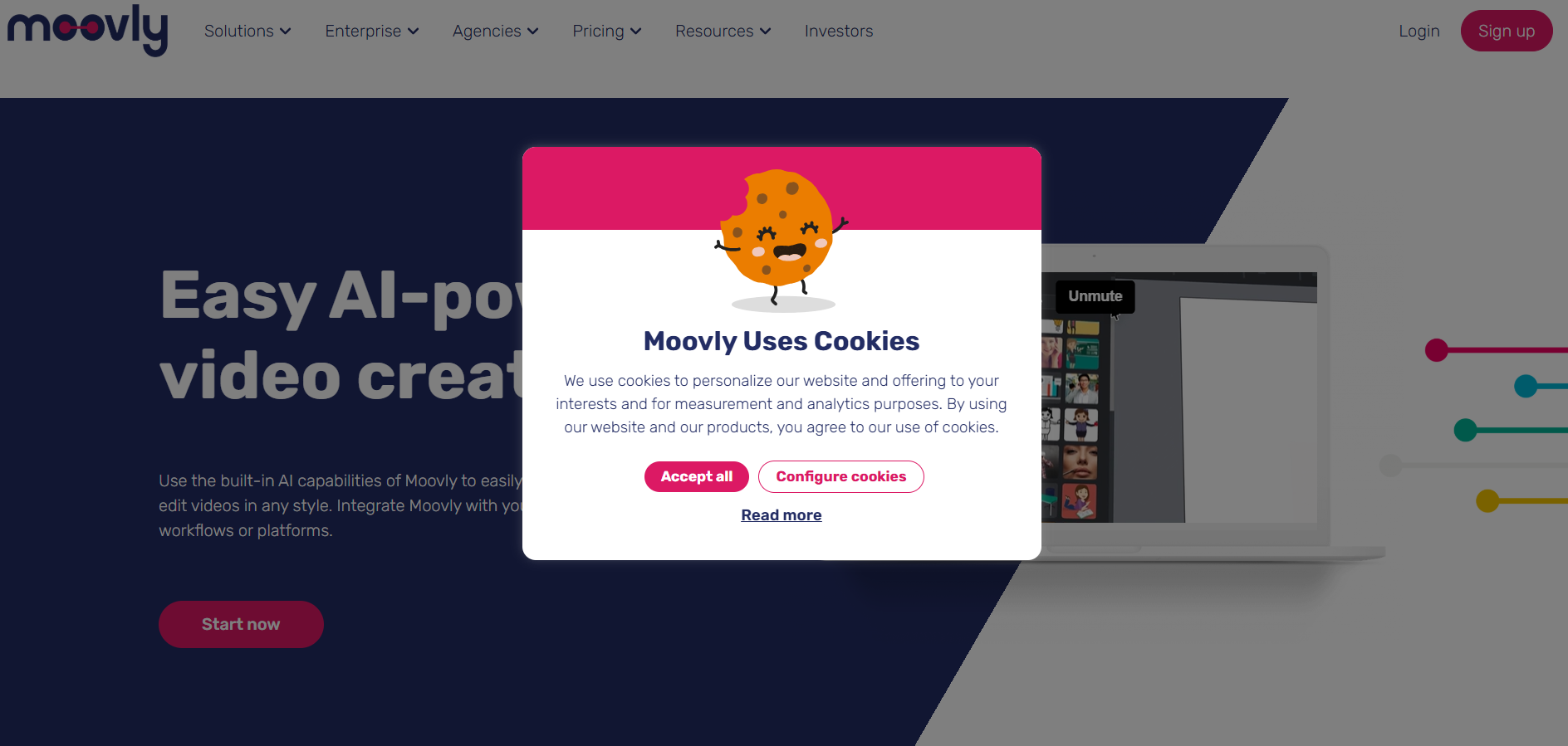
A cookie banner is a tiny box with a surprisingly large job. It has to explain tracking, ask for consent where needed, respect privacy choices, support legal compliance, stay accessible, and somehow not make visitors want to close the tab with the force of a superhero landing. No pressure.
The good news: a cookie banner does not have to be a digital speed bump. When written and designed well, it can feel like a polite doorman instead of a bouncer with a clipboard. The best cookie banner copy is short, honest, useful, and easy to act on. It tells visitors what cookies do, gives them real choices, and gets out of the way.
This guide explains what to put on a cookie banner so visitors are not annoyed, confused, or suspicious. It covers wording, button labels, cookie categories, UX mistakes, accessibility, privacy expectations, and real-world examples you can adapt for your own website.
Why Cookie Banners Annoy Visitors in the First Place
Most people do not wake up thinking, “I hope today brings me a rich, layered discussion of third-party tracking technologies.” They come to a website to read, shop, book, learn, compare, or get something done. A cookie banner interrupts that mission.
The annoyance usually comes from four things: vague language, too many clicks, manipulative button design, and banners that block the page like a couch in a hallway. Visitors can tolerate a privacy notice. What they dislike is being cornered by a wall of legal fog with one giant “Accept All” button and a “Manage Your Data Processing Destiny” link hidden in mouse-gray text.
A better cookie consent banner reduces friction by answering the visitor’s silent questions immediately: What are you tracking? Why? Can I say no? Can I change my mind later? Is this going to take forever?
What A Cookie Banner Should Actually Say
A strong cookie banner includes five essential pieces of information: a plain-language headline, a brief explanation, clear choices, a settings link, and a privacy or cookie policy link. That is it. The banner is not the place to publish your company’s 47-page data philosophy. Save that for the privacy policy, where legal paragraphs may roam freely in their natural habitat.
1. A Simple, Human Headline
The headline should tell visitors what the notice is about without sounding robotic. Good examples include:
- “We use cookies”
- “Your cookie choices”
- “Help us personalize your experience”
- “Choose how we use cookies”
Avoid dramatic or overly cute headlines like “Freshly Baked Cookies!” unless your website actually sells cookies. Privacy choices are not the ideal place for a dad joke with frosting.
2. A Short Explanation of Cookie Use
The body copy should explain what cookies do on your website. Keep it specific, but not exhausting. Visitors should understand whether cookies are used for essential site functions, analytics, personalization, advertising, or remembering preferences.
A good example:
“We use essential cookies to make our site work. With your permission, we also use analytics and advertising cookies to understand site performance and improve your experience. You can accept all, reject non-essential cookies, or manage your choices.”
This works because it is direct. It separates necessary cookies from optional cookies. It tells the visitor what choices are available. It does not hide behind phrases like “enhance experience,” which can mean anything from “remember your language preference” to “follow you across the internet like a raccoon with Wi-Fi.”
3. Clear, Balanced Button Labels
Your cookie banner buttons should be obvious and balanced. The most visitor-friendly setup is usually:
- Accept All
- Reject Non-Essential
- Manage Choices
These labels are plain, scannable, and honest. They do not shame the visitor. They do not make refusal harder than acceptance. They also avoid vague labels like “OK,” “Got It,” or “Continue,” which may not clearly indicate whether the user has consented to optional cookies.
If your website uses a “Save Preferences” button inside the settings panel, make sure it saves both opt-ins and opt-outs. A visitor who rejects advertising cookies should not have to solve a privacy escape room just to leave.
Cookie Categories Visitors Understand
If you offer granular cookie settings, group cookies into categories that normal people can understand. The goal is not to impress your legal department with complexity. The goal is clarity.
Essential Cookies
These cookies are required for the website to function. They may support security, page navigation, shopping carts, login sessions, or fraud prevention. Since they are necessary, they are usually always active.
Example copy:
“Essential cookies keep the website working, including security, checkout, and account login features. These cannot be turned off through this banner.”
Analytics Cookies
Analytics cookies help website owners understand how visitors use the site. They may track page visits, traffic sources, errors, and performance. The key is to explain that analytics are used to improve the website, not to personally greet visitors by name from the bushes.
Example copy:
“Analytics cookies help us understand which pages are useful, how visitors move through the site, and where we can improve.”
Personalization Cookies
Personalization cookies remember preferences such as location, language, saved items, or content recommendations. Visitors usually appreciate these when the benefit is clear.
Example copy:
“Personalization cookies remember your preferences, such as language, region, and saved settings, so the site feels more relevant to you.”
Advertising Cookies
Advertising cookies are often the most sensitive category because they may involve third-party partners, targeted ads, retargeting, or cross-site tracking. Do not bury this in cozy language. Be clear.
Example copy:
“Advertising cookies may be used by us and our partners to show more relevant ads and measure ad performance across websites.”
What Not to Put On A Cookie Banner
Some cookie banners annoy visitors because they appear to offer choice while quietly pushing one answer. This is where dark patterns enter the room wearing tap shoes.
Avoid Manipulative Button Design
Do not make “Accept All” bright, huge, and friendly while “Reject” looks like a forgotten basement link. If users have a real choice, the visual design should reflect that. Buttons should be comparable in size, contrast, and placement.
Avoid Pre-Checked Optional Cookies
Optional cookies should not be pre-selected when consent is required. Pre-checked boxes can make consent feel automatic instead of intentional. Visitors should actively choose optional tracking, especially for advertising or sharing with partners.
Avoid Vague Phrases
Words like “improve experience,” “business purposes,” and “trusted partners” are often too broad by themselves. They may be acceptable in a longer policy, but a banner should use specific everyday language. Say “measure traffic,” “remember settings,” or “show relevant ads.” Your visitors should not need a law degree and a flashlight.
Avoid Endless Vendor Lists on the First Screen
If your site uses many ad or analytics partners, do not dump the entire vendor list into the first banner view. Put detailed vendor information inside a settings panel or cookie policy. The first layer should be short; the second layer can be detailed.
Best Cookie Banner Examples You Can Adapt
Simple Blog or Publisher Banner
“We use cookies to keep this site running, measure traffic, and improve our content. You can accept all cookies, reject non-essential cookies, or manage your choices.”
Buttons: Accept All | Reject Non-Essential | Manage Choices
Ecommerce Cookie Banner
“We use essential cookies for checkout, security, and account features. With your consent, we also use analytics and advertising cookies to improve our store and show relevant offers.”
Buttons: Accept All | Reject Optional Cookies | Customize Settings
SaaS Website Cookie Banner
“We use cookies to secure our platform, remember preferences, analyze product usage, and support marketing. Choose what works for you below.”
Buttons: Accept All | Reject Optional | Set Preferences
Minimal Privacy-First Banner
“We use only essential cookies by default. You can allow analytics cookies to help us improve the website.”
Buttons: Allow Analytics | Keep Essential Only
How to Make A Cookie Banner Less Annoying
The best cookie banner is not only well written. It is well behaved. Think of it like a houseguest: polite, brief, useful, and not blocking the refrigerator.
Keep It Small and Non-Obstructive
A bottom banner or compact pop-up is usually less annoying than a full-screen takeover. Avoid blocking the main content unless legally necessary for your situation. On mobile, keep the banner short enough that visitors can still understand where they are.
Make Choices Available in One Click
If users can accept all in one click, they should also be able to reject non-essential cookies in one click. Making rejection require five screens sends a message: “We technically respect your choice, but we hope you get tired first.” That is bad UX and bad trust-building.
Let Visitors Change Their Mind
Add a persistent “Cookie Settings” link in the footer or privacy center. Visitors should be able to update preferences later without clearing their browser data or summoning an IT wizard.
Respect Browser-Based Privacy Signals
More privacy laws and regulators are paying attention to universal opt-out mechanisms such as Global Privacy Control. If a visitor has already sent a browser-level opt-out signal, your banner and consent system should respect that signal where required. For users, this feels dramatically better because they do not have to repeat the same privacy choice on every site.
Cookie Banner Accessibility Matters
An accessible cookie banner is not a luxury feature. It is part of a usable website. Visitors using keyboards, screen readers, zoom, voice control, or assistive technologies must be able to read the banner, understand the choices, and activate the controls.
Use real buttons, not clickable text pretending to be buttons. Provide visible focus states. Make sure the banner can be navigated by keyboard. Do not trap focus unless you are using a properly built modal dialog. Maintain readable color contrast. Avoid tiny text, especially on mobile. If your banner becomes a giant sticky wall at 200% zoom, congratulations: you have invented a privacy duvet.
Where to Place Cookie Policy Links
Your banner should include a clear link to your cookie policy or privacy policy. The link text should be specific, such as “Cookie Policy,” “Privacy Policy,” or “Learn More About Cookies.” Avoid vague links like “More” or “Click Here.”
The policy page should explain what cookies are used, why they are used, who sets them, how long they last, and how visitors can manage choices. The banner gives the summary; the policy gives the full menu.
How Cookie Banner Copy Affects Trust and SEO
Cookie banner wording is not a direct magic button for Google rankings, but it does influence user experience. A confusing banner can increase bounce rates, block content, frustrate mobile users, and make a brand feel sneaky. A clear banner supports trust, accessibility, and smoother engagement.
For SEO, avoid banners that cover important content, delay page interaction, or create layout shifts. Search engines care about user experience signals, mobile usability, and page performance. Visitors care about not being ambushed by a privacy notice the size of a garage door. Conveniently, those goals overlap.
A Practical Cookie Banner Formula
Use this structure when writing your own cookie banner:
Sentence 1: Say What You Use
“We use essential cookies to make this website work.”
Sentence 2: Say What Is Optional
“With your permission, we also use analytics and advertising cookies to improve our site and show relevant content.”
Sentence 3: Say What Visitors Can Do
“You can accept all, reject non-essential cookies, or manage your choices.”
Buttons: Offer Equal Choices
Accept All | Reject Non-Essential | Manage Choices
This formula is short, specific, and visitor-friendly. It avoids legal fog while still giving meaningful information.
Common Cookie Banner Mistakes
Mistake 1: Saying “By Continuing, You Agree”
This wording can be risky and confusing when active consent is required. Continuing to browse is not always the same as giving clear permission, especially for optional tracking.
Mistake 2: Hiding the Reject Option
If visitors cannot easily reject non-essential cookies, they will feel manipulated. Even worse, regulators may view that design as unfair or deceptive in certain contexts.
Mistake 3: Using Too Much Legal Language
A banner should not read like it escaped from a courthouse printer. Replace “data processing activities conducted for legitimate commercial optimization purposes” with “we use analytics to improve our site.” Everyone exhales.
Mistake 4: Forgetting Mobile Users
On mobile, space is limited. Keep the copy short, stack buttons clearly, and make tap targets large enough. A cookie banner should not require the thumb precision of a concert pianist.
Mistake 5: Not Testing the Banner
Test your banner across devices, browsers, screen sizes, zoom levels, and assistive technologies. Also test whether cookies actually behave according to the visitor’s choice. A beautiful banner that ignores preferences is just theater with JavaScript.
of Practical Experience: What Actually Works in the Real World
In practice, the least annoying cookie banners are the ones that respect the visitor’s time. When reviewing website experiences, one pattern becomes obvious: people do not mind making a privacy choice when the choice feels fair. They do mind when the interface feels like it was designed by a committee of raccoons trying to protect an advertising budget.
The best-performing banners usually share a few traits. First, they appear after the page loads smoothly, not before the visitor even understands what site they landed on. Second, they use simple wording. A visitor should be able to read the banner in five seconds and understand the difference between essential cookies and optional cookies. Third, the buttons are visible and honest. “Accept All” and “Reject Non-Essential” should sit near each other, not in separate zip codes.
One practical lesson is that clarity often improves consent quality. If a website says, “We use analytics cookies to see which articles people read most,” visitors understand the tradeoff. If it says, “We leverage identifiers for enhanced digital journey optimization,” visitors hear, “Something suspicious is happening behind the curtain.” Plain language does not make a brand look less professional. It makes the brand look less exhausting.
Another lesson: fewer categories are usually better. A small business website may not need ten toggles. Essential, Analytics, Personalization, and Advertising are often enough. More options can be useful for complex ad ecosystems, but too many choices can create decision fatigue. When visitors see a giant settings panel full of vendors, toggles, acronyms, and mysterious data purposes, they often choose whatever makes the panel disappear. That is not meaningful engagement; that is digital surrender.
Mobile testing is also where many cookie banners reveal their true personality. A banner that looks elegant on desktop may become a full-screen blanket on a phone. If users cannot see the headline, tap the reject button, or scroll the settings panel without accidentally opening three accordions, the design needs work. Mobile visitors are often impatient because they are doing something else at the same time: commuting, shopping, waiting in line, or pretending to listen during a meeting. Respect that context.
Accessibility testing is equally important. Keyboard users should be able to reach every control. Screen reader users should hear a clear heading and button labels. Focus should not vanish into the void after a choice is saved. If your banner uses a modal, it must behave like a proper modal. If it is a simple banner, do not trap users inside it. Privacy choices should not become an obstacle course.
Finally, remember that the cookie banner is a brand moment. It may be one of the first things a visitor sees. A clear banner says, “We are organized, respectful, and honest.” A manipulative banner says, “We hope you do not notice the tiny gray opt-out link.” Visitors notice. Maybe not every technical detail, but they notice the feeling. The goal is not to make cookie consent exciting. The goal is to make it painless, trustworthy, and quick. In the world of privacy UX, that is basically a standing ovation.
Conclusion
So, what should you put on a cookie banner so visitors are not annoyed? Put the truth, but keep it short. Explain essential and optional cookies. Use plain language. Offer clear buttons for accepting, rejecting, and managing choices. Avoid dark patterns. Make the banner accessible. Link to your privacy or cookie policy. Let people change their settings later.
A good cookie banner does not beg, trick, block, or lecture. It simply says what is happening and gives visitors control. That is better for privacy, better for trust, better for user experience, and much better for everyone’s blood pressure.
Note: This article is for general informational and publishing purposes only. Cookie banner requirements vary by jurisdiction, business model, tracking setup, and data practices, so legal review is recommended before implementation.