Note: Kitchen colors change dramatically with daylight, cabinet sheen, countertop undertones, and even the light bulb above your sink. Always test large paint samples before committingyour kitchen is not a mood ring, but it can certainly behave like one.
The best kitchen color schemes do something quietly heroic: they make the hardest-working room in the house look polished without begging for attention. A timeless kitchen does not have to be plain, sterile, or afraid of personality. It simply needs balance. The colors should flatter the architecture, work with natural light, complement permanent finishes, and still feel inviting after trends have marched in, taken selfies, and marched back out.
Whether you are planning a full remodel or just trying to rescue tired cabinets from their “builder-grade beige” era, choosing the right palette matters. Cabinets, walls, countertops, backsplashes, flooring, hardware, and appliances all share one visual conversation. When the colors get along, the whole kitchen feels intentional. When they do not, even the coffee maker looks confused.
Below are 13 kitchen color schemes that never go out of style, along with practical ways to use them in real homes. These palettes lean on classic neutrals, grounded greens, confident blues, natural wood tones, warm whites, soft grays, black accents, and earthy shades that have proven they can survive more than one decorating decade.
What Makes a Kitchen Color Scheme Timeless?
A timeless kitchen color scheme usually has three ingredients: a reliable base, a natural contrast, and a flexible accent. The base might be warm white, cream, greige, soft gray, or pale blue. The contrast can come from navy cabinets, walnut shelves, black hardware, charcoal tile, or deep green island paint. The accent might be brass, copper, terracotta, marble veining, woven stools, or vintage artwork.
The key is restraint. Timeless does not mean colorless; it means the palette has breathing room. If the cabinets are dramatic, keep the walls soft. If the backsplash has movement, simplify the cabinet color. If your countertops already have strong veining, let them be the diva. Every kitchen needs one star, not an entire Broadway cast fighting over the spotlight.
13 Kitchen Color Schemes That Always Look Fresh
1. Warm White, Natural Wood, and Soft Gray
This is the little black dress of kitchen color schemesexcept it is white, wooden, and probably covered in pancake batter by Sunday morning. Warm white cabinets or walls create a clean backdrop, natural wood adds soul, and soft gray introduces a quiet layer of sophistication. Try creamy white Shaker cabinets, white oak open shelves, gray-veined quartz or marble, and brushed nickel or aged brass hardware. This palette works beautifully in farmhouse, transitional, coastal, Scandinavian, and modern kitchens because it feels bright without looking cold.
2. Classic White and Navy Blue
White and navy is crisp, confident, and endlessly adaptable. Use white upper cabinets with navy lower cabinets, a navy island with white perimeter cabinets, or navy walls behind warm white cabinetry. The contrast gives the room structure while still feeling elegant. Navy pairs especially well with brass pulls, marble countertops, white subway tile, and medium wood flooring. It is also a smart choice for homeowners who want color but do not want to wake up one morning and wonder why the cabinets look like a tropical smoothie.
3. Cream, Greige, and Aged Brass
Greigepart gray, part beige, all grown-uphas become a favorite because it softens a kitchen without making it feel sleepy. Pair greige cabinets with cream walls, warm stone counters, and aged brass fixtures for a palette that feels refined but approachable. This color scheme is excellent for kitchens with limited natural light because it offers warmth while still feeling neutral. Add linen Roman shades, ceramic pendant lights, or a zellige-style backsplash to give the room texture. The result is cozy, layered, and quietly expensive-looking.
4. Sage Green, White, and Oak
Sage green has earned its place among timeless kitchen colors because it brings nature indoors without shouting, “I just discovered plants.” It works on cabinets, islands, pantries, or even a tiled backsplash. Pair sage with warm white walls and oak accents for a balanced, earthy palette. White countertops keep the look fresh, while wood floors or stools prevent the green from feeling too cool. This scheme is especially effective in cottages, Craftsman homes, traditional kitchens, and new builds that need instant character.
5. Black, White, and Warm Wood
Black and white kitchens are dramatic, but the timeless version uses black strategically. Think black lower cabinets with white uppers, a black island, black window frames, or matte black hardware against white cabinetry. Then add warm wood to keep the palette from feeling too severe. Walnut shelves, oak floors, butcher-block accents, or wood bar stools bring balance. This kitchen color scheme is bold enough to feel current but classic enough to survive changing trends. The secret is moderation: black should anchor the room, not swallow it whole like a very stylish cave.
6. Pale Gray, Ivory, and Marble
Pale gray and ivory create a soft, elegant kitchen that feels calm rather than clinical. This palette works especially well when the gray appears in natural stone, tile grout, island paint, or lower cabinetry. Ivory keeps the space warm, while marble or marble-look quartz adds movement. Add polished nickel, chrome, or brushed brass depending on the mood you want. For a traditional look, choose raised-panel or Shaker cabinets. For a modern look, use flat-front cabinetry, simple slab counters, and minimal hardware.
7. Forest Green, White Stone, and Brass
Deep forest green is rich, grounded, and surprisingly versatile. It feels classic because it connects to historic interiors, nature, and traditional cabinetry. Use it on lower cabinets or a kitchen island if you want a strong focal point. Pair it with white stone countertops, creamy walls, and brass or bronze hardware. The white keeps the green from becoming heavy, while metal accents add warmth. This color scheme is perfect for homeowners who want a kitchen with personality but not a palette that screams for attention every time someone opens the fridge.
8. Taupe, Soft White, and Matte Black
Taupe is one of those colors that quietly solves problems. It warms up cool kitchens, tones down bright spaces, and works with both gray and beige undertones. Pair taupe cabinets with soft white walls and matte black accents for a polished, modern-traditional look. Black pendant lights, black cabinet pulls, or a black range hood add definition without overpowering the room. This palette looks especially good with limestone, quartz, white oak, and textured ceramic tile. It is neutral, but never flat.
9. Dusty Blue, Cream, and Walnut
Dusty blue gives a kitchen a gentle dose of color while still behaving like a neutral. Unlike bright blue, which can feel playful or coastal in a very specific way, dusty blue has a muted quality that works across traditional, cottage, and transitional spaces. Pair it with cream walls, walnut shelves, and white or light gray countertops. The walnut adds richness, while the cream keeps the blue soft. This scheme is ideal for a breakfast nook, butler’s pantry, island, or full cabinet refresh.
10. Charcoal, White, and Pale Wood
Charcoal is softer than black but stronger than gray, making it a smart choice for homeowners who want depth without harsh contrast. Use charcoal on lower cabinets, an island, or a range hood, then balance it with white walls and pale wood accents. White oak, ash, maple, or light bamboo can keep the palette from feeling too urban or heavy. This kitchen color scheme works beautifully with stainless steel appliances, concrete-look counters, and simple pendant lighting. It feels modern, but not trendy in a here-today-gone-by-next-Tuesday way.
11. Butter Yellow, White, and Natural Stone
Butter yellow is cheerful without being loud, especially when used in a muted, creamy shade. It brings warmth to kitchens that need a little morning sunshine, even before the coffee has agreed to participate. Pair soft yellow walls or cabinets with white trim, natural stone counters, and wood accents. Avoid neon or lemony shades if longevity is the goal. The best timeless yellows have a little cream, ochre, or beige in them. They feel nostalgic, welcoming, and surprisingly elegant when paired with simple cabinetry and classic hardware.
12. Earthy Clay, Cream, and Bronze
Earthy clay tonesthink terracotta, muted rust, warm cinnamon, or soft adobebring depth and comfort to the kitchen. Used with cream cabinetry and bronze hardware, clay feels grounded rather than trendy. Try a clay-colored tile backsplash, a painted island, Roman shades, bar stools, or a small accent wall. This palette works well with natural materials like limestone, oak, handmade tile, and plaster finishes. It is especially effective in Mediterranean, Southwestern, Spanish-style, and organic modern kitchens.
13. White, Stone Blue, and Brushed Nickel
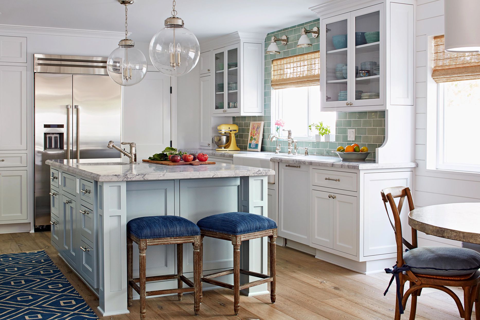
Stone blue is a classic alternative to gray. It has enough color to feel interesting but enough softness to remain timeless. Use it on cabinets, walls, or a kitchen island, then pair it with white counters, white tile, and brushed nickel or polished chrome fixtures. The result is fresh, clean, and quietly sophisticated. This scheme works particularly well in kitchens with coastal, New England, cottage, or traditional influences. Add woven textures, glass pendants, or open shelving to keep the look relaxed and livable.
How to Choose the Best Timeless Kitchen Palette for Your Home
Before falling in love with a kitchen color scheme, look at what you cannot easily change. Your flooring, countertops, backsplash, appliance finish, and natural light should guide the palette. A warm oak floor may look better with cream, sage, navy, or taupe than with a chilly blue-gray. A heavily veined countertop may need simpler cabinets. A dark galley kitchen may benefit from warm white or pale blue instead of charcoal.
Also consider how the kitchen connects to nearby rooms. In open-concept homes, the kitchen palette should harmonize with the living room, dining area, and entryway. It does not need to match everything, but it should feel like part of the same story. A navy island can connect to blue pillows in the living room. Brass hardware can echo a dining room chandelier. Wood shelves can repeat the tone of a coffee table or floor.
Finally, think about maintenance. White cabinets are classic, but they show tomato sauce crimes. Black cabinets are stunning, but they may reveal dust and fingerprints. High-gloss finishes bounce light but can highlight imperfections. Satin or semi-gloss cabinet finishes often offer a practical middle ground. A timeless kitchen should not only photograph wellit should survive breakfast, homework, snack attacks, and whatever happens when someone says, “I saw this recipe online.”
Real-Life Experience: What Timeless Kitchen Colors Teach You Over Time
After looking at many kitchens, living with color samples taped to cabinet doors, and watching homeowners second-guess paint chips under every possible light, one lesson becomes clear: timeless color is usually less about the exact shade and more about the relationship between materials. A white kitchen can look warm and charming or flat and icy. A navy kitchen can look elegant or heavy. A green kitchen can feel calm and classic or oddly muddy. The difference often comes down to undertones, lighting, and balance.
One of the most common experiences people have during a kitchen update is falling in love with a paint color online, buying a sample, and discovering it looks completely different at home. That creamy white may turn yellow next to a cool quartz countertop. That perfect gray may look blue beside warm wood floors. That sage green may become dull in a north-facing room. This is why testing matters. Paint a large sample board and move it around the kitchen throughout the day. Look at it in morning light, afternoon light, and evening artificial light. Colors are sneaky little creatures; they change outfits when you are not looking.
Another useful experience is noticing that the most successful kitchens usually have contrast, but not chaos. A kitchen with white cabinets, white counters, white walls, and white tile can feel bright, but it may also feel unfinished if there is no texture or warmth. Add wood stools, a woven shade, gray veining, brass hardware, or a patterned runner, and suddenly the room has depth. On the other hand, a kitchen with dark cabinets, dark counters, dark floors, and dark walls can feel luxurious in a magazine but gloomy during weekday dinner prep. Even dramatic kitchens need moments of relief.
Homeowners often worry that choosing a timeless palette means giving up personality. In reality, the opposite is true. A classic base gives you more freedom to change the mood later. Warm white cabinets can handle colorful art, seasonal flowers, patterned rugs, or bold bar stools. Navy or sage cabinets can shift traditional, modern, farmhouse, or coastal depending on hardware and accessories. Greige and taupe can lean rustic with wood beams or refined with marble and polished nickel. Timeless colors are not boring; they are flexible.
The best practical advice is to treat permanent features like the foundation of the palette and decorative pieces like the fun part. If you adore trendy colors, use them on items that are easier to change: dishware, stools, curtains, artwork, small appliances, or a painted island. Save the most enduring colors for cabinets, walls, counters, and tile. That way, your kitchen can evolve without needing a full renovation every time the internet decides a new shade is “the moment.” A well-chosen timeless kitchen color scheme should feel beautiful today, comfortable tomorrow, and still respectable years from noweven if your drawer full of takeout menus says otherwise.
Conclusion
The most timeless kitchen color schemes are not trapped in one style. They work because they balance light and dark, warm and cool, classic and personal. Warm white and wood feel inviting. Navy and white create crisp contrast. Sage and oak bring nature indoors. Black and white add drama. Greige, taupe, pale gray, dusty blue, clay, and butter yellow all offer ways to add character without chasing trends too aggressively.
If you want a kitchen that never goes out of style, start with colors that complement your fixed finishes and make the room feel good in everyday life. Then layer in texture, hardware, lighting, and accessories. The goal is not to design a kitchen that looks untouched by time. The goal is to create one that ages gracefully, cooks beautifully, and still makes you happy when you stumble in for coffee.