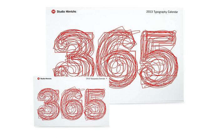
Some calendars simply tell you what day it is. The 365 Typography Calendar, 2013 Edition does something more charming: it reminds you that even Tuesday can have excellent letterspacing. Designed by Studio Hinrichs and rooted in the long-running calendar project associated with Kit Hinrichs, this edition turned the humble date grid into a year-long celebration of typefaces, letterforms, and the designers who make words look smarter than they sometimes behave.
At first glance, it looks like a beautifully organized design calendar. Look closer, and it becomes a compact course in typography. Each month highlights a different typeface, the calendar includes short descriptions and designer biographies, and the days themselves become a gallery of visual rhythm. It is practical, yes, but also educational, decorative, and just nerdy enough to make a graphic designer cancel plans in order to admire a numeral.
The 2013 edition matters because it sits at a fascinating moment in design culture. Print was not dead, despite the internet’s repeated attempts to hold a funeral. Smartphones were everywhere, digital calendars were becoming the default, and yet designers, architects, art lovers, and typography fans still wanted a physical object that made time feel crafted. The 365 Typography Calendar did exactly that.
What Is the 365 Typography Calendar, 2013 Edition?
The 365 Typography Calendar, 2013 Edition is a print calendar created for people who see type not merely as letters, but as design, voice, texture, and personality. Produced by Studio Hinrichs, the calendar presents 12 selected typefaces across the year, pairing each month with typographic information, designer context, holidays, and notable birthdays connected to type design.
Unlike novelty calendars that rely on puppies, beaches, inspirational quotes, or suspiciously cheerful stock photography, this one relies on the beauty of letterforms. The attraction is subtle but powerful. A capital “R” can be elegant. A lowercase “g” can be dramatic. A numeral “5” can look like it knows jazz. Typography gives ordinary information emotional tone, and the calendar uses that idea every day.
The 2013 edition was part of an ongoing series that had already built a following among creative professionals. Design publications described it as a favorite among designers and modern design enthusiasts, and for good reason. It was useful enough to hang near a desk, handsome enough to frame mentally, and informative enough to count as professional development if anyone asked why you were staring at February for seven minutes.
The Design Story Behind the Calendar
Kit Hinrichs, the designer behind the calendar’s concept, is widely known in American graphic design for his work in branding, publishing, packaging, environmental graphics, and visual storytelling. He was a longtime partner at Pentagram before founding Studio Hinrichs, and his broader body of work reflects a deep interest in narrative design. That philosophy is visible in the calendar: every typeface has a story, and every page gives that story a place to stand.
The original idea behind the 365 Typography Calendar was simple but surprisingly profound: people read words constantly, yet they often overlook the typefaces carrying those words. We notice the message, but not the messenger. The calendar flips that habit. It invites the viewer to slow down and ask: Why does this letter look formal? Why does that typeface feel playful? Why does one alphabet whisper while another walks into the room wearing tap shoes?
The 2013 edition also reflects the influence of serious design culture. The typefaces associated with the calendar were selected with input from major figures in graphic design, including members of Alliance Graphique Internationale, an elite international design organization. Names connected with the selection process included celebrated designers such as Stefan Sagmeister, Ivan Chermayeff, Tom Geismar, Massimo Vignelli, Michael Vanderbyl, Louise Fili, and others. That gives the calendar credibility beyond its good looks: it is curated, not randomly assembled.
Why Typography Lovers Still Talk About It
Good typography has a strange superpower. When it works, most people do not notice it. When it fails, everyone suddenly becomes a critic. A bad font choice can make a restaurant menu look like a haunted daycare flyer. A great font choice can make a brand feel timeless, trustworthy, witty, luxurious, or rebellious before a single sentence is read.
The 365 Typography Calendar understands this power. It does not treat type as decoration sprinkled over content like design confetti. Instead, it treats typography as content. The calendar’s daily function becomes the delivery system for a deeper lesson: typefaces are designed objects, shaped by culture, technology, history, and human taste.
For designers, the calendar served as a daily spark. For students, it offered a friendly introduction to typographic variety. For non-designers, it made visible something usually hidden in plain sight. That is the magic. You do not need to know the difference between a humanist sans serif and a geometric sans serif to enjoy it. But after spending time with the calendar, you may start noticing those differences anyway. Congratulations: you have been gently recruited into the type club.
Key Features of the 2013 Edition
1. Twelve Curated Typefaces
The 2013 edition featured 12 typefaces, one for each month. This monthly structure gave the calendar a steady rhythm. Rather than overwhelming the viewer with a chaotic buffet of fonts, it allowed each typeface room to breathe. A full month is enough time to notice shapes, proportions, moods, and quirks.
2. Typeface Descriptions
Each typeface included a short description, helping viewers understand why it mattered. These notes made the calendar more than a visual object. It became a small reference tool, a teaching aid, and a conversation starter. If someone asked, “Why are you looking so intensely at the wall?” the owner could answer, “I’m studying typographic history,” which sounds much better than “I forgot what day it is.”
3. Designer Biographies
The calendar also highlighted the people behind the letters. This is important because typefaces are often treated as anonymous menu options inside software. But every typeface has a designer, and every designer makes choices. The biographies helped connect the finished forms to human creativity, professional craft, and historical context.
4. Holidays and Type-Designer Birthdays
Like any useful calendar, the 2013 edition noted major holidays. But it also included birthdays of type designers, a delightful detail for anyone who believes Matthew Carter, Adrian Frutiger, or other legends deserve at least as much calendar respect as National Donut Day. The result was both functional and culturally specific.
5. Desk and Wall Appeal
The calendar was offered in formats suitable for desks and walls, making it flexible for studios, home offices, classrooms, and creative workspaces. Its physical presence mattered. A typography calendar on the wall does not vanish behind browser tabs. It sits there, quietly improving the room and judging your font choices.
Typography as Daily Inspiration
One of the smartest things about the 365 Typography Calendar is its pacing. It does not demand that you sit down and study an entire typography textbook. It simply appears every day, offering a small moment of visual attention. That is how good design education often works: not through one dramatic revelation, but through repeated exposure.
Over time, the calendar trains the eye. You begin to notice contrast. You see how one typeface feels architectural while another feels literary. You recognize that spacing can change mood. You realize that a serif is not just a tiny foot on a letter; it is part of a historical and stylistic system. Before long, you are silently critiquing the typography on cereal boxes. This is normal. There is no known cure.
The 2013 edition also reminds us that calendars are not just tools for scheduling. They are objects we live with. A calendar hangs in our peripheral vision for 365 days. It becomes part of the room’s personality. Choosing a typography calendar is a way of saying that the visual environment matters, even in small daily rituals.
Why the 2013 Edition Felt Special
The year 2013 was a transitional period for design. Digital products were booming, responsive web design was gaining momentum, and designers were thinking more seriously about how type behaved across screens. Web fonts were no longer exotic. Brands were becoming more typographically aware. At the same time, print objects with strong craft value felt more precious.
That context made the 365 Typography Calendar, 2013 Edition especially appealing. It was analog, but not old-fashioned. It celebrated print, but it also spoke to digital designers. Whether someone worked in editorial design, branding, UX, packaging, architecture, or advertising, the calendar reinforced a shared truth: typography is never just cosmetic. It shapes meaning.
The edition also carried the authority of curation. In an era when anyone could download thousands of fonts with a few clicks, selection became more valuable than abundance. The calendar did not say, “Here are all the fonts.” It said, “Here are 12 worth spending time with.” That restraint is part of its elegance.
Design Lessons from the 365 Typography Calendar
Typography Creates Voice
Words do not arrive naked. They arrive dressed in type. A sentence set in a refined serif may feel literary or established. The same sentence in a friendly rounded sans serif may feel casual and approachable. The calendar makes that lesson visible month by month.
Good Design Rewards Repetition
Because the calendar is viewed daily, it shows how design can remain interesting through repetition. A strong grid, thoughtful hierarchy, and beautiful type do not get boring quickly. They become dependable. That is a useful lesson for brand systems, websites, magazines, packaging, and interfaces.
Details Are Not Decoration
The calendar proves that details carry meaning. The curve of a letter, the weight of a stroke, the spacing between characters, and the relationship between numbers and text all affect how information feels. Typography is detail work, but detail work is not small work.
Print Still Has Power
Digital calendars are efficient, but they rarely create affection. A print calendar can become part of a ritual: turning a page, checking a date, pausing over a letterform, noticing the month’s mood. That tactile experience gives the object staying power.
Who Should Appreciate This Calendar?
The obvious audience is graphic designers, typographers, art directors, illustrators, architects, and design students. For them, the calendar functions as both inspiration and reference. It belongs in studios, classrooms, agencies, and offices where people casually say things like “the ampersand is doing a lot of work here.”
But the calendar is also for people outside the design profession. Writers can appreciate how type influences tone. Marketers can learn how visual voice supports messaging. Small-business owners can understand why choosing a brand font matters. Teachers can use it to introduce visual literacy. Anyone who loves books, posters, packaging, maps, menus, magazines, or old signs can find something to enjoy.
In other words, the 365 Typography Calendar is not only for people who know typography. It is also for people who are ready to start noticing it.
How It Compares with Ordinary Calendars
An ordinary calendar answers one question: “What day is it?” The 365 Typography Calendar answers that question, then adds, “Would you also like to appreciate the structural dignity of this numeral?” This may sound excessive, but that is exactly the point. It elevates a common object without making it impractical.
Most wall calendars rely on images that change monthly: landscapes, animals, art prints, travel photography, or themed illustrations. The 365 Typography Calendar relies on typographic systems. It is more restrained, more intellectual, and more useful for creative professionals. It also ages better than many trend-heavy design objects because type history is deep, not disposable.
That makes the 2013 edition collectible in spirit, even if someone originally bought it just to keep track of meetings. Older editions of design calendars often become references, keepsakes, or studio artifacts. They capture not only a year, but a design conversation happening at that moment.
Experience: Living with a Typography Calendar
Spending a year with a calendar like the 365 Typography Calendar, 2013 Edition changes the way you look at ordinary words. At first, you may treat it as a handsome object. You hang it on the wall, admire the layout, and feel slightly more sophisticated. Then, slowly, it starts interfering with your life in the best possible way.
You notice the numerals first. Calendar numerals are surprisingly expressive. Some are crisp and rational, like they keep their receipts in labeled folders. Others are elegant, dramatic, or playful, as if they have dinner reservations somewhere expensive. Seeing dates rendered through different typefaces makes time feel less mechanical. Monday is still Monday, unfortunately, but at least it can be beautifully set.
After a few weeks, the calendar becomes a quiet design coach. You begin comparing the month’s typeface with signs around town, websites you visit, packaging in the grocery aisle, and the menu at your favorite café. Suddenly, the world is full of typographic decisions. Some are brilliant. Some are confusing. Some appear to have been made during a printer emergency in 1997.
For designers, this daily exposure can loosen creative blocks. When you are stuck on a logo, poster, newsletter, or website layout, looking at a strong typeface can reset your eye. It reminds you that good design does not always require more elements. Sometimes it requires better proportion, better rhythm, or the courage to let letters do the work.
For students, the experience is even more valuable. Typography can feel intimidating when presented as a dense subject full of terminology: x-height, ascenders, apertures, terminals, contrast, kerning, tracking, leading. A calendar softens the entry point. You do not have to master everything at once. You just meet one typeface, then another, then another. By the end of the year, you have absorbed more than you realize.
There is also something satisfying about the physical ritual. Digital calendars are excellent for alerts, but they do not offer much pleasure. They remind you of appointments with the emotional warmth of a parking ticket. A printed typography calendar is different. Turning the page feels intentional. Checking a date becomes a small visual pause. In a busy workspace, that pause can be surprisingly grounding.
The calendar also works as a social object. Visitors notice it. Designers comment on it. Non-designers ask questions. Someone may point to a letter and say, “Why does that look expensive?” That opens the door to a conversation about type, branding, history, and perception. Few office accessories can do that. A stapler rarely sparks a discussion about visual culture, unless it is missing again.
Owning the 2013 edition would have been especially enjoyable because it belonged to a moment when print and digital design were actively negotiating their relationship. A physical calendar about type felt both classic and current. It celebrated the old pleasures of ink, paper, grids, and letterforms while remaining relevant to anyone designing for screens. That combination gave it depth.
The most memorable experience, however, is the way it teaches attention. Typography rewards people who look twice. The first glance gives you information. The second glance gives you design. The 365 Typography Calendar encourages that second glance every day, and over a full year, that habit becomes part of how you see.
Conclusion
The 365 Typography Calendar, 2013 Edition is more than a way to track dates. It is a year-long tribute to typography, curated design, and the people who shape the letters we read every day. With its 12 featured typefaces, designer biographies, holiday listings, and type-designer birthdays, it turns a practical object into a compact design education.
Its lasting appeal comes from balance. It is useful but beautiful, informative but not dry, serious about design but not allergic to charm. For graphic designers, it offers daily inspiration. For students, it provides approachable learning. For anyone with an eye for visual culture, it proves that even a calendar can become a small museum of letterforms.
Note: This article was written as an original, web-ready synthesis based on real public information about Studio Hinrichs, Kit Hinrichs, the 365 Typography Calendar series, and reputable design coverage of the 2013 edition. No source links or citation placeholders are embedded in the article body.