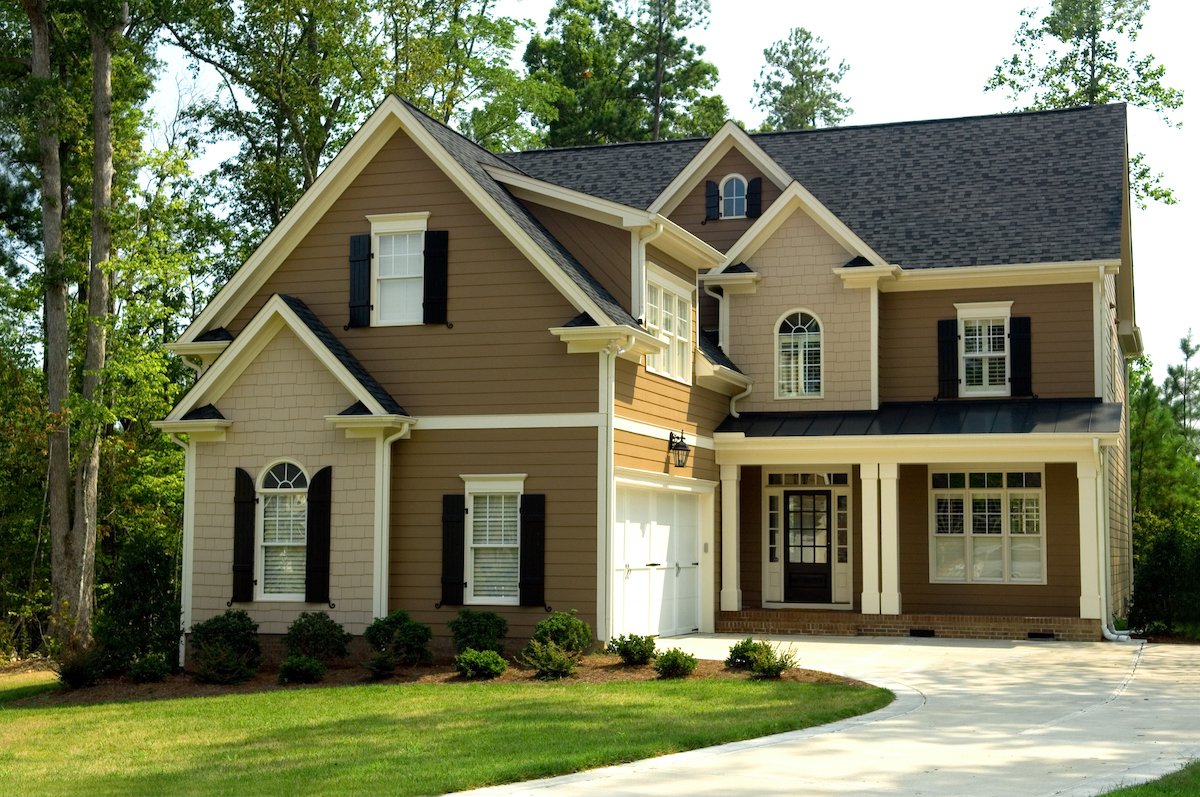
Your house has been quietly introducing you to the neighborhood for years. It deserves better than saying, “Hello, I am Beige Number Seven and I have given up.” The right exterior house color combination can sharpen architectural details, make a modest entry feel welcoming, and give your curb appeal the kind of confidence usually reserved for homes with immaculate hedges.
Choosing exterior paint colors is not simply a matter of picking three shades that look nice on tiny paper chips under fluorescent store lights. Your roof, brick, stonework, landscaping, sunlight, porch materials, and home style all get a vote. The best exterior house colors work with these permanent elements rather than picking a fight with them.
This guide includes 15 timeless and fresh exterior color schemes for everything from cottages and Colonials to Craftsman homes, ranch houses, and modern builds. Each combination includes a main body color, trim direction, and accent idea so you can move from “I like blue” to an actual plan.
How to Choose an Exterior House Color Scheme Before You Buy Paint
A successful exterior palette usually has three players: a field color for the largest surfaces, a trim color for window frames, fascia, columns, and railings, and an accent color for the front door, shutters, or select architectural details. Think of the field color as the leading actor, trim as the excellent supporting cast, and the front door as the person who enters late but somehow gets all the applause.
Before narrowing your choices, study what cannot easily change. A charcoal shingle roof, red brick chimney, limestone foundation, black windows, or warm cedar porch ceiling should influence the palette. These features are part of your home’s permanent color story, so forcing a clashing paint scheme around them is like wearing formal shoes with swim fins: technically possible, emotionally confusing.
Always test large paint samples outdoors. Look at them in morning sun, afternoon glare, shade, cloudy weather, and at dusk. Exterior color is a bit of a shapeshifter. A gray that seems calm on a sample board may reveal blue, purple, or green undertones once it covers an entire wall.
1. Warm White, Charcoal, and Natural Wood
Best for: Modern farmhouses, transitional homes, cottages, and traditional exteriors.
Warm white siding paired with charcoal trim is one of the most dependable exterior house color combinations because it feels polished without becoming sterile. Choose a creamy white rather than a sharp blue-white, especially if your roof has brown, bronze, or warm gray notes. Add stained wood on the front door, porch ceiling, shutters, or beams for warmth.
This palette works particularly well when the home has black light fixtures, dark window frames, or a gray roof. The wood element keeps the scheme from looking like it wandered out of a black-and-white movie and forgot to come back.
2. Greige, Crisp White, and Soft Black
Best for: Suburban Colonials, ranch homes, craftsman-inspired houses, and resale-friendly updates.
Greige sits comfortably between gray and beige, which makes it unusually cooperative with stone, brick, asphalt shingles, and most landscaping. Use it as the main siding color, brighten the trim with a clean white, and add soft black shutters or a black front door.
The key word is soft. A slightly warm black or deep charcoal is often easier on the eye than a harsh, inky black. This combination gives a home structure and contrast while keeping the overall look calm, versatile, and hard to regret three summers from now.
3. Navy Blue, White, and Brass
Best for: Coastal homes, traditional houses, Cape Cods, and classic two-story facades.
Navy blue siding with white trim is a classic for a reason: it has enough contrast to define the architecture, yet it does not shout at passing traffic. A deep navy can look nearly black in shadow and beautifully blue in direct sunlight, creating dimension without requiring a circus-level color commitment.
Finish the look with warm brass, aged bronze, or polished nickel hardware. A natural wood door also works beautifully. For a playful variation, choose a muted red or deep green front door, but let the navy remain the star of the show.
4. Sage Green, Cream, and Deep Bronze
Best for: Craftsman homes, bungalows, cottages, and houses surrounded by mature trees.
Sage green has become a favorite exterior paint color because it feels connected to nature without disappearing completely into the yard. Pair a muted sage body color with creamy trim rather than bright white, then add deep bronze or dark brown accents on the door, shutters, porch railings, or light fixtures.
This palette looks especially good alongside stone foundations, weathered wood, warm gray roofs, and native landscaping. It has a peaceful, grounded feeling that says, “We compost,” even if your most advanced gardening technique is buying a fern and hoping for the best.
5. Blue-Gray, White, and Brick Red
Best for: Coastal cottages, traditional homes, clapboard siding, and houses with red brick chimneys.
A blue-gray exterior creates a soft, relaxed backdrop that feels more interesting than standard gray but less committed than bright blue. Pair it with white trim to keep the facade clean, then use a brick-red or muted burgundy door for a welcoming accent.
This is an especially smart choice for homes that already have red brick steps, chimneys, or walkways. Instead of trying to hide those warm tones, the red door repeats them intentionally and makes the entire exterior look planned rather than patched together.
6. Forest Green, Warm White, and Medium Wood
Best for: Woodland homes, cabins, historic houses, and modern builds with natural materials.
Deep forest green is dramatic, but it is also surprisingly timeless when balanced properly. Use it on the body of the home, then lighten the trim with warm white or pale cream. A medium walnut or cedar front door adds texture and prevents the palette from becoming too heavy.
Forest green works well against stone, brick, and dark roofs. It can make a simple house look more substantial, especially when architectural details are limited. Keep landscaping neat, because a dark exterior paired with overgrown shrubs can quickly drift from “storybook cottage” to “the mansion in the mystery novel.”
7. Taupe, Black, and Terracotta
Best for: Mediterranean-inspired homes, stucco houses, desert landscapes, and warm-climate exteriors.
Warm taupe is a flexible main color that feels richer than plain beige and more welcoming than cool gray. Pair it with black or dark bronze trim for definition, then introduce terracotta through the front door, planters, tile, or porch accessories.
This exterior paint combination works beautifully with clay roof tiles, tan stone, desert landscaping, and warm sunlight. The terracotta accent adds personality without taking over the entire facade. It is a little spicy, but not “I painted my whole house pumpkin orange” spicy.
8. Charcoal, Pale Wood, and Off-White
Best for: Contemporary homes, Scandinavian-inspired designs, and modern cabins.
For a bold but sophisticated modern exterior, use charcoal as the primary color and balance it with pale wood cladding, cedar slats, or a light natural front door. Add off-white trim sparingly around windows or roof edges if the home needs more visual separation.
The secret is proportion. Too much white trim can interrupt the clean modern lines, while too much charcoal without wood can feel severe. Natural wood softens the palette and helps the architecture feel intentional, especially against large windows and simple rooflines.
9. Cream, Mocha Brown, and Black
Best for: Traditional homes, brick houses, ranch homes, and formal front elevations.
Cream siding with mocha brown trim creates a warm, traditional exterior that works well in nearly every season. Add black shutters, a black front door, or black metal hardware for contrast. This is a particularly good option for homes with brown roofs or reddish brick details.
The cream and brown foundation gives the house warmth, while black keeps it from looking overly sweet. It is the exterior equivalent of a good blazer with great shoes: classic, comfortable, and quietly confident.
10. Dusty Blue, Ivory, and Dark Navy
Best for: Farmhouses, cottages, coastal homes, and historic residences.
Dusty blue is softer than navy and less expected than gray. Use it for siding, pair it with ivory trim, and reserve deep navy for shutters, a front door, or porch furniture. The layered blue approach adds depth without relying on loud contrast.
This scheme looks best when the blue has a gray undertone rather than a bright turquoise cast. It pairs well with white railings, weathered decking, gravel paths, and coastal-style landscaping. The overall effect is calm, welcoming, and a little bit vacation-ready.
11. Soft Black, White, and Cedar
Best for: Modern farmhouses, contemporary homes, and bold renovation projects.
A black house can be striking, but the most successful versions use a softened black, dark charcoal, or black-brown instead of a glossy jet-black finish. Pair the body color with white trim or pale window frames, then introduce cedar around the entry, garage door, soffit, or porch ceiling.
Dark exteriors make architectural shapes feel crisp and graphic. They are also less forgiving of dirt, fading, and poor maintenance, so choose a durable exterior finish and keep an eye on sunny walls. A black exterior is elegant; a sun-baked, chalky black exterior is just tired eyeliner.
12. Olive Green, Stone Gray, and Copper
Best for: Craftsman homes, mountain houses, and exteriors with stone or brick details.
Olive green brings depth and earthiness to a house without becoming too dark. Pair it with stone gray trim and use copper, aged bronze, or warm metal details around lighting, gutters, house numbers, and the front entry.
This palette feels particularly natural when a home has fieldstone, gray masonry, or a slate-colored roof. It is a good example of an exterior color scheme that looks refined because it borrows from materials already found outdoors: leaves, stone, bark, and weathered metal.
13. Butter Yellow, White, and Deep Green
Best for: Historic homes, cottages, traditional houses, and sunny neighborhoods.
A muted butter yellow exterior can feel cheerful and timeless when it is soft enough to avoid looking fluorescent. Pair it with bright white trim and deep green shutters or a green front door. This combination has a vintage charm that works beautifully on homes with symmetrical windows, covered porches, and traditional proportions.
Choose a yellow with ochre, cream, or golden undertones instead of a lemony shade. The deeper green accent gives the palette visual weight and helps the yellow feel elegant rather than overly sugary.
14. Warm Beige, White, and Teal
Best for: Beach houses, ranch homes, stucco exteriors, and homes that need a lively entry.
Warm beige is a reliable main color when you want a neutral exterior with a little more personality. Pair it with white trim, then use teal on the front door or shutters. The teal accent gives the home a fresh focal point without requiring a full-color overhaul.
This combination works especially well in sunny regions, near water, or in neighborhoods with relaxed architecture. Keep teal limited to smaller areas so it reads as a cheerful invitation rather than an accidental aquarium theme.
15. White Brick, Black Trim, and a Red Door
Best for: Brick homes, Colonial-style houses, traditional facades, and high-contrast curb appeal.
White-painted brick paired with black trim offers crisp, classic contrast. Add a deep red front door for warmth and a strong focal point. The result is formal enough for a traditional home but flexible enough to work on a more updated exterior.
Use a red with depth, such as oxblood, burgundy, or brick red, rather than a bright stop-sign red. The richer shade complements the black-and-white palette while feeling more durable and less likely to become a trend regret. A red door should say “welcome,” not “emergency exit.”
Exterior Color Mistakes That Can Spoil a Great Palette
The most common exterior paint mistake is ignoring undertones. A cool gray siding color may clash with creamy stone, while a yellow-beige trim can make a blue-gray body look unexpectedly purple. Test all colors together, not one at a time.
Another mistake is adding too many competing accents. A bright door, striped awning, colorful shutters, bold planters, patterned tile, and decorative flags may all be lovely separately, but together they can turn a front porch into a committee meeting. Choose one or two places for personality and let the rest of the facade breathe.
Finally, do not forget the roof. It covers a huge visual area and can lean warm, cool, brown, gray, red, or nearly black. Your paint should coordinate with it, not pretend it does not exist. The roof is not an accessory; it is the large, silent roommate in every exterior color decision.
Extended Experience: What Homeowners Learn After Choosing Exterior Paint Colors
People often expect exterior paint selection to be a quick errand: look at a few swatches, choose a favorite, schedule a painter, admire the result. In reality, the best exterior house color combinations usually come from slowing down and observing the home as it actually lives throughout the day.
A color that looks perfect at noon may feel completely different under a covered porch or on the north side of a house. Warm whites can become creamy in direct sunlight. Blue-grays can look almost silver under clouds. Deep greens can seem wonderfully moody at sunset, then nearly black by evening. That is why large sample boards are far more useful than tiny paint chips. Move them around the facade, stand back near the curb, and look at them beside the roof, driveway, stonework, and landscaping.
Many homeowners also discover that the front door is the safest place to be brave. Repainting the siding is a major commitment. Repainting a door is a Saturday project, a few paintbrushes, and perhaps one mildly dramatic conversation about whether the color is “more coral than red.” A bold door lets you add charm without locking the entire home into a trend.
Another lesson is that landscaping affects exterior color more than people expect. A sage-green house surrounded by yellow flowers may look warmer. A cream house framed by dark evergreens may appear brighter. A charcoal exterior can look polished against pale gravel but heavier against dense shade. The house, yard, driveway, fence, and porch furniture all appear in the same picture, so it helps to view them as one complete composition.
Homeowners also tend to appreciate contrast after they see it in action. A nearly monochromatic palette can be serene, but a little separation between siding and trim helps architectural details show up from the street. White trim around dark siding can sharpen windows. Dark shutters against a pale facade can give a simple house more rhythm. Even a subtle shift between a warm body color and a cooler trim can make a home look more tailored.
The final experience-based rule is simple: choose a palette you will enjoy seeing on an ordinary Tuesday. Exterior paint is not only for listing photos, holiday decorations, or the moment guests pull into the driveway. It is the backdrop for bringing in groceries, checking the mail, walking the dog, and coming home after a long day. The best exterior color combination is the one that makes you look back at your house for one extra second before you go inside.
Conclusion
The best exterior house color combinations balance personality with practicality. Begin with the fixed features of your property, choose a dependable field color, use trim to define the architecture, and save your boldest choice for a manageable accent such as the front door. Whether you prefer a warm white farmhouse, a sage-green bungalow, a navy Colonial, or a dramatic charcoal modern home, the goal is the same: create an exterior that feels like it belongs exactly where it is.