Some interiors shout for attention. Others perform complicated visual gymnastics, hoping nobody notices that the chair is uncomfortable and the only practical storage space is a lonely basket under the console. Workstead takes a different route. Its rooms are beautiful, certainly, but they also appear to understand that people need to sit, sleep, gather, cook, read, work, and occasionally hide everyday clutter before guests arrive.
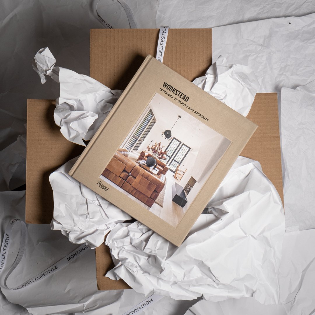
Workstead: Interiors of Beauty and Necessity captures this unusually grounded philosophy. The studio’s work combines historic architecture, modern forms, expressive lighting, honest materials, and furniture that looks capable of surviving both changing trends and an energetic family dinner. Rather than treating function as beauty’s less glamorous assistant, Workstead makes necessity part of the aesthetic.
The result is an approach to modern interior design that feels warm without becoming sentimental, restrained without appearing empty, and refined without requiring visitors to whisper.
A Design Book About More Than Pretty Rooms
Published by Rizzoli in October 2021, Workstead: Interiors of Beauty and Necessity is a 240-page hardcover monograph with text by architecture and design writer David Sokol. It surveys Workstead’s historic renovations, new construction, custom furniture, lighting, residential interiors, and influential hospitality projects. The book measures 10 by 11 inches, giving its photography enough room to breathe without turning the volume into a coffee table that happens to contain pages.
The title is not simply a handsome phrase selected during a particularly poetic branding meeting. Beauty and necessity describe two standards that Workstead applies simultaneously. A room must offer atmosphere, proportion, texture, and visual pleasure. It must also solve practical problems, respond to its location, support daily rituals, and age with dignity.
That combination makes the monograph useful to more than professional designers. Homeowners can study it for renovation ideas, architects can examine its treatment of existing structures, and dedicated design enthusiasts can spend an unreasonable amount of time analyzing the placement of a single brass sconce. Everyone has a hobby.
Who Is Workstead?
Workstead began in 2009 with architect-designers Stefanie Brechbuehler and Robert Highsmith, later expanding its leadership with Ryan Mahoney. The multidisciplinary American design studio developed a practice spanning architecture, interiors, furniture, hospitality, real estate development, and architectural lighting. Its reputation grew through projects that retained the emotional character of older buildings while giving them a confident contemporary life.
The studio’s official philosophy emphasizes a disciplined process that combines precedent, modern form, honest construction, history, landscape, and human needs. Its buildings and interiors practice is based in Brooklyn, while its lighting operation creates expressive luminaires designed as functional tools, visual statements, and tactile objects.
That broad scope matters. Workstead does not approach an interior as a decorated box. Architecture establishes rhythm and proportion. Millwork organizes movement and storage. Furniture supports behavior. Lighting affects mood, focus, and scale. Even a door threshold can participate in the story.
The Meaning of Beauty and Necessity
Beauty Comes From Depth, Not Decoration
In Workstead interiors, beauty rarely depends on piling up fashionable objects. It develops through relationships: a rounded opening against a straight wall, a dark green room beside a pale corridor, a substantial stone threshold beneath a delicate light, or an antique chair placed near crisply detailed millwork.
The rooms often look collected rather than purchased in one heroic shopping spree. Vintage pieces coexist with contemporary furniture. Familiar architectural forms are enlarged, simplified, or given unexpected materials. Color is used deliberately, sometimes quietly and sometimes with the confidence of someone who has already decided that yes, the entire library should be blue-green.
Necessity Is Not an Apology
Practical requirements are treated as design opportunities. A movable light becomes both an interactive tool and a sculptural presence. Curtains provide softness while controlling glare and privacy. A sequence of smaller rooms creates different degrees of concentration and sociability. Built-ins hide equipment without pretending modern technology has vanished from human civilization.
This thinking was evident in Workstead’s Raleigh headquarters for workplace consultant PMC. Instead of defaulting to one enormous open office, the studio developed interconnected rooms with varying levels of privacy. Residential comforts, transformable curtains, diffused light, and hospitality-inspired amenities supported both collaboration and focused work.
Historic Buildings Are Partners, Not Problems
One of the most compelling themes in Interiors of Beauty and Necessity is Workstead’s relationship with historic architecture. Old structures are not treated as fragile museum pieces, nor are they stripped until only an exposed brick wall remains as proof that the past once existed.
Instead, the studio studies what gives a building its identity: ceiling height, construction method, circulation, moldings, windows, masonry, accumulated patina, or even the cultural history of the neighborhood. New interventions are legible, but they usually communicate with the original structure rather than attempting to defeat it in architectural combat.
The Wythe Hotel: Industrial History With Human Warmth
Workstead’s public interiors for the Wythe Hotel helped establish the studio’s reputation. Inside the historic Williamsburg building, rough wood, barrister bookcases, midcentury furnishings, and tailored details connected Brooklyn’s industrial past with its newer creative economy. At the rooftop Ides Bar, a bowed bar structure referred to the area’s nautical associations while framing views toward Manhattan.
The project demonstrates how contextual design can avoid becoming a theme park. The industrial references feel integrated rather than pasted on. Guests experience history through material and proportion, not through a decorative parade of gears, factory signs, and suspiciously spotless vintage toolboxes.
Rivertown Lodge: Local Craft as a Design Language
For Rivertown Lodge in Hudson, New York, Workstead transformed a modest 27-room property into an expression of Hudson Valley craft. The design combined utilitarian forms with rich materials and locally made elements, including custom cherry beds, brass lighting, woodwork, and furniture from regional makers.
The lodge does not imitate a grand country estate. Its atmosphere is more democratic and relaxed: communal spaces, warm wood, vintage furniture, straightforward rooms, and carefully controlled light. The experience feels special because the details are thoughtful, not because every surface is competing for a luxury award.
The Dewberry: Southern Modernism Without the Costume
At The Dewberry in Charleston, Workstead helped transform a former 1960s federal office building into a hotel that balances midcentury design with Southern warmth. The interiors combine carefully sourced stone, Scandinavian-influenced furniture, custom lighting, rich wood, and polished hospitality. The later Citrus Club rooftop lounge added terrazzo, cherrywood, melon-colored upholstery, updated vintage seating, and a playful neon citrus motif.
This is a useful lesson in regional design. A Southern interior does not need to arrive wearing every available floral print at once. Place can be communicated through material, color, pace, craftsmanship, and hospitality rather than cliché.
Twin Bridges House: New Architecture in Conversation With the Old
Twin Bridges House in Copake, New York, pairs a restored 1860 residence with a new pavilion. The contemporary addition reinterprets regional Dutch and Shaker traditions at a larger scale, while rounded forms respond to the neighboring Victorian structure. Inside the older house, blue-green rooms and patterned wallpapers create a more decorative sequence, producing a deliberate dialogue between restraint and exuberance.
The project argues that preservation does not require freezing a property in one period. A new chapter can be unmistakably modern while remaining courteous to the chapters that came before it.
Workstead Lighting: Function You Want to Look At
Lighting is central to the Workstead design identity. The studio approaches a fixture as illumination, architecture, furniture, and human-scale sculpture at the same time. Many designs reveal how they operate. Joints pivot. shades adjust, chains invite a pull, and visible structures explain how weight and balance are managed.
Early Workstead lamps repurposed articulated industrial joints so shades and arms could rotate across multiple axes. Later families such as Signal, Lodge, Orbit, Chamber, Archetype, Hieroglyph, and Lantern developed distinct visual languages using globes, wood frames, metal discs, nested cylinders, conical shades, and tailored silk.
Some collections grew directly from interior commissions. Orbit evolved from a fixture designed for Rivertown Lodge, while Signal was developed through work connected to The Dewberry. That relationship explains why the lights rarely feel like jewelry added after a room is finished. They are part of the architecture’s logic.
The best Workstead lighting also includes a small element of theater. A fixture may cast light upward and downward, shift from a broad glow to a focused pool, or turn a plain wall into a composition. Fortunately, this is the useful kind of dramathe kind that helps someone read a booknot the kind involving a chandelier so low that dinner guests must develop evasive maneuvers.
A Material Palette Designed to Age
Workstead interiors frequently employ wood, brass, bronze, stone, plaster, cane, linen, leather, terrazzo, and substantial textiles. These materials possess variation and tactile character. They can reveal the hand of the maker, respond to light, and develop patina rather than simply looking increasingly tired.
This preference does not mean every room is rustic. Workstead’s spaces may be polished, formal, urban, or highly contemporary. At One Prospect Park West, for example, the conversion of an 11-story Beaux-Arts building uses deep thresholds, discrete rooms, Giallo Siena marble, reclaimed pine, limestone, bronze tones, and burled wood to reinterpret prewar grandeur through a modern lens.
The key is material honesty. Stone is allowed to feel heavy. Wood expresses grain. Metal provides structure or reflection. Fabric softens sound and light. Materials are not selected only because they photograph nicely during the first week after installation; they are expected to participate in years of use.
Why Workstead Interiors Feel Comfortable
Comfort is often confused with softness. Add a large sofa, six pillows, and a throw blanket, and the room is declared cozy even when its lighting resembles an interrogation scene. Workstead takes a broader view.
Visual comfort comes from balanced proportions and controlled contrast. Physical comfort depends on useful furniture and circulation. Emotional comfort grows from recognizable forms, personal objects, regional references, and materials that feel familiar to the hand. Social comfort requires spaces that support both gathering and retreat.
The studio describes its interiors as balancing social activity with repose. That concept can be seen in connected rooms, window seats, libraries, communal tables, intimate bars, and seating groups that make conversation possible without forcing everyone into one giant open-plan arena.
These rooms feel composed, but not untouchable. A person can imagine setting down a coffee cup, moving a chair, opening a book, or spending an entire rainy afternoon indoors. That sense of permission is one of the most valuable forms of luxury.
How to Apply the Workstead Approach at Home
Begin With the Building
Before selecting a paint color or ordering furniture, identify what is already distinctive. It might be an awkward alcove, an old floor, a generous window, a narrow hallway, or a molding profile. Preserve the features that carry character and let new work clarify them.
Give Every Room a Job
A beautiful space becomes frustrating when it cannot support real life. Decide what activities belong in each area, what must be stored, how people will move, and where light is needed. Function should guide the plan before decoration attempts to distract everyone.
Use Fewer, Stronger Materials
Choose a limited palette with enough texture to remain interesting. Wood, plaster, stone, woven fiber, and aged metal can create depth without relying on dozens of finishes. Repeating materials across rooms also gives a home visual continuity.
Mix Eras Instead of Buying a Matching Set
Combine contemporary pieces with antiques, inherited objects, or vintage finds. The goal is not randomness. Look for shared proportions, colors, construction details, or material relationships. A restrained modern table can give ornate chairs room to shine, while a sculptural new lamp can wake up a traditional cabinet.
Treat Lighting as Architecture
Use multiple sources at different heights. Combine ambient illumination with task lights, wall sconces, pendants, and lamps. Consider how a fixture looks when switched off, how it directs the eye, and whether it can be adjusted. One carefully positioned light often contributes more than an army of ceiling downlights marching in formation.
Leave Space for Life to Accumulate
A successful interior should not be complete in the sense of being sealed forever. Allow shelves for books collected later, walls for future art, and surfaces for objects with personal meaning. A room gains depth through use, memory, and gradual change.
Experiencing the Workstead Philosophy in Everyday Life
The most revealing way to understand Interiors of Beauty and Necessity is to imagine living with its principles rather than merely admiring its photographs. The experience begins quietly. A room organized around natural movement requires fewer unconscious negotiations. The path to a window is clear. A chair sits where the afternoon light is useful. The table accommodates breakfast, work, and conversation without needing to be dramatically restyled between each activity.
Lighting changes the experience first. Replacing one overly bright ceiling source with several lower fixtures immediately creates zones. A wall light can make a reading corner feel intentional. A shaded lamp softens the transition into evening. An adjustable sconce supports a task and then turns toward the wall to provide atmosphere. The room has not become larger, yet it feels more generous because light gives each activity a place.
Materials create the next shift. A solid wood surface feels different from a printed imitation, particularly after months of use. Minor marks become evidence of meals, projects, and ordinary routines. Brass darkens where hands touch it. Linen relaxes. Leather develops variation. This aging process can reduce the anxiety that often surrounds expensive-looking interiors. Instead of constantly defending the room from life, the room begins recording it.
Another noticeable experience comes from mixing old and new. A vintage chair may introduce an unfamiliar silhouette or a repair completed decades ago. Beside a simple contemporary desk, it stops looking like a historical prop and becomes useful again. A modern lamp placed on an inherited chest has the opposite effect: it brings the older piece into the present. These combinations create conversation because they contain time, personality, and a little productive friction.
Color also behaves differently under the Workstead approach. Rather than scattering many accent shades around a neutral room, one area can receive a deeper commitment. A small library, hallway, or dining room painted in a saturated blue-green or earthy red develops a distinct identity. Passing from a pale room into the darker space becomes an experience of compression and release. The home starts to possess rhythm instead of functioning as one continuous beige sentence.
Living with more clearly defined rooms may also change behavior. Open plans are convenient, but they can make every activity visible and audible at once. Creating smaller zones with shelving, curtains, furniture, or partial partitions introduces degrees of privacy. Someone can read while another person cooks. A work area can feel separate without becoming isolated. A curtain can conceal a screen when it is not needed, allowing technology to serve the room rather than permanently dominate it.
The Workstead philosophy encourages a slower relationship with furnishing. Instead of buying everything immediately, essential pieces come first: a reliable table, comfortable seating, useful storage, and good light. Art, rugs, side tables, and decorative objects arrive gradually. This pace can be frustrating for anyone who wants a finished reveal by Saturday afternoon, but it often produces a more personal interior. The room becomes assembled through discoveries rather than completed through a single transaction.
Most importantly, beauty and necessity begin reinforcing each other. The cabinet is attractive because its proportions are calm, but it is beloved because it holds the objects used every day. The lamp is sculptural, but its movable shade makes evening reading easier. The old floor is visually rich, but it also survives muddy shoes without suffering an identity crisis. Beauty stops being a separate layer applied after practical decisions. It becomes the visible result of those decisions being made carefully.
Why the Workstead Monograph Still Matters
Workstead: Interiors of Beauty and Necessity offers an antidote to disposable design culture. Its projects do not depend on one seasonal color, one viral object, or one photogenic trick. They draw strength from context, construction, craftsmanship, and the habits of the people who use them.
The book also shows why multidisciplinary design can produce unusually coherent environments. When architecture, furniture, lighting, color, and material are considered together, fewer elements feel arbitrary. Each decision supports the larger experience.
Workstead interiors are not minimal in the strict sense, nor are they traditionally decorated. They occupy a more interesting territory where historic detail can meet modern geometry, practical objects can become sculptural, and hospitality can shape private homes. The rooms possess polish, but they also possess patience.
Ultimately, the lesson is straightforward: an interior should be worth looking at and worth living in. Achieving both is harder than it sounds, which is probably why the results are so satisfying.